Comparing the Dividend Yield of Select Asian Equity Markets

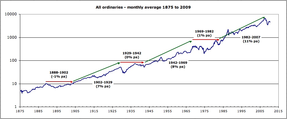
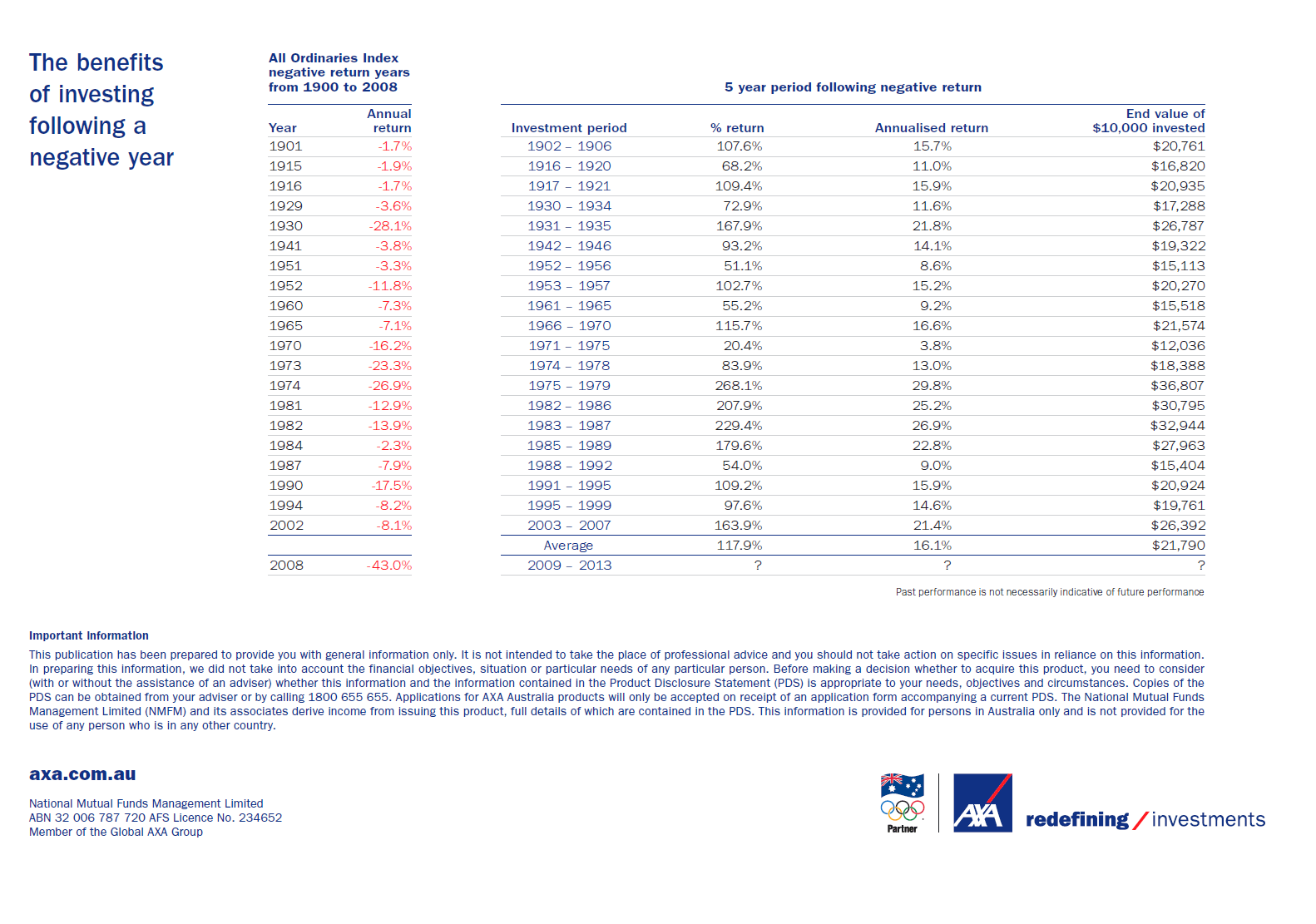
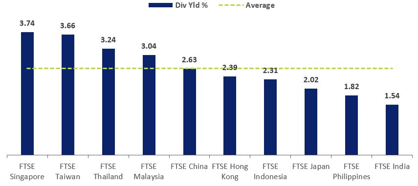
Singapore’s has the highest dividend yield among Asian markets. The dividend yield of 3.7% based on the FTSE index for Singapore is the highest relative to other countries in Asia as shown in the chart below:

Click to enlarge


Source: Singapore’s High Dividend Yields Grab Spotlight Again,SGX

Of the countries shown above, India has the lowest dividend yield.

None of the Singapore firms trade on the US exchanges. However investors willing to add Singapore stocks have plenty of options on the OTC market. Some of the stocks that investors can consider for further research are: DBS Group( DBSDY), United Overseas Bank(UOVEY), Singapore Airlines (SINGY), etc.

The complete list of Singapore ADRs can be found here.

Disclosure: No Positions

The Long-Term Decline of US GDP Growth: Chart

The fundamental long-term trend of the US economy is a slow downward slope according to a recent article by Prof. John Ross at Renmin University of China. The average annual growth rate of the US economy fell from 4.4% in 1969, to 4.1% in 1978. Then it fell again to 3.2% in 2002. By the first quarter of this it reached a low of 2.2%.

The following chart shows the US long-term annual growth rate:

Source: Why the US economy remains locked in slow growth, Key Trends in Globalisation, June 12, 2017

Though the economy has slowed down considerably since the 70s the equity markets have had multiple bull markets since then including the most recent bull market after the global financial crisis.

The Historical Average Annual Returns of Australian Stock Market Since 1900

The 124 historical returns from 1900 to 2023 of the Australian stock market is shown in the chart below. The average annual return was 13.0%. In addition, for the majority of the years shown Aussie stocks earned a positive return. In 2023, the market had a return of 13%.

For the latest chart click: Average Annual Returns of Australian Stock Market from 1900 to 2024

Click to  enlarge

-Updated on Jan 23, 2024 with 2023 data.

Source: Market Index

Download the 124 historical returns of the Australian Market in pdf format:

____________________________________________________________________________________________

Older posts:

Australia is one of the top-performing equity market especially in the long run. As a developed country Australia offers many of the advantages of a typical developed market such as transparency and the rule of law.

Investors looking to diversify by holding international stocks should consider Aussie stocks. This is because not only they have one of the highest dividend yields in the world but also in the long run their performance is excellent.

Update(2/19/19): An earlier version of this chart incorrectly showed the average annual returns as 9.96%.

The following graphic shows the historical annual returns of Australian stocks from 1990 thru 2018:

Click to enlarge

Notes:

  • The returns shown above are total returns (i.e. share price returns + dividends).
  • The returns shown are in the local currency.
  • The returns are for the All Ordinaries Index.

Source: Australian Sharemarket – 117 Years of Historical Returns, MarketIndex.com.au

Since 1990, Aussie stocks have returned an average of 13.1% per year. A return of this magnitude is indeed great. In most of the years the market yielded positive returns.

Related ETF:

  • iShares MSCI Australia ETF (EWA)

Download: Australian Sharemarket – 119 Years of Historical Returns (in pdf)

See Also:

Updated – 6/5/21:

1)All Ordinaries Accumulation Index returns from 1900 to 2010:

Click to enlarge

Australia Stock Market Growth From 1876 To 2018:

Source: CuffeLinks

2) History of Australian Share Market From 1900 Thru 2010:

Source: Sapience

3. All Ordinaries Cycles from 1875 to 2007:

Click to enlarge

Source: Fusion Investing

4.Annual Real Return from Australian Stock Market by Decade from 1900:

Source: 10 years of investing in Australia, Allan Gray

5.All Ordinaries Index Real Returns since 1875:

Source: The Dow Hitting 20,000 And What It Hides, Investing,com

6.Australian Equity Price 1897:

Source: RBA

7.Australia Bull and Bear Markets since 1970:

Source:  Zurich Australia

8.Australia All Ordinaries Index Vs SP 500 from 1980 to 2012:

Source: dshort.com

9.Australian All Ordinaries Accumulation Index from 1979 to 2019:

Source:  Livemarkets

10.Australia All Ordinaries Price Index Returns from 1900 to early 2020:

Source: ABC News

Disclosure: No Positions

11) 111 Years Returns of the Australia Stock Market:

Source: Macrobusiness

12.Dividend and Capital Gains contributions to Total Returns in Select Countries:

Source: Property vs shares? The long-term verdict,  Westpac

13.Australian Stock Market since 1938:

Source: Market Index

14) 109 years of Australian sharemarket returns and the benefits of investing following a negative year:

Click to enlarge

Source: Merideon

15) Australian Shares Total Returns Since Federation – Under Right and Left Political Parties:

Click to enlarge

Source:  Which political party is best for share prices?,  Firstlinks

16) ASX All Ordinaries sharemarket annual returns:

Click to enlarge

Source: Allan Gray

17)Long Term Average Return vs. yearly Returns:

Click to enlarge

Source: APW Partners

__________________________________ _______________________________

Checkout also:

You may also  like:

  1. The Complete List of Australian ADRs 
  2. The 2021 Andex Chart for Australian Investors: Chart
  3. The Australian ASX Index Returns by Year
  4. Bear Markets in Australian Stocks since 1900
  5. Australian Stock Market Intra-Year Gains and Declines vs. Calendar Year Returns 2001 To 2017
  6. Real Total Returns From Stocks – Australia vs. USA Since 1900: Chart
  7. Australian Stocks: Dividend Contribution to Total Returns Since 1900
  8. Australian vs. Global Share Returns in 30 Years: Chart
  9. The Economy of Australia: Infographic
  10. Why Australia Is Attractive For Dividend Stock Investors

The 2017 GDP Forecast For Top 29 Economies

The top 29 global economies based on forecast 2017 GDP in terms of purchasing-power parity are listed in the graphic below:

Click to enlarge

Source: In the world’s GDP ‘trillionaire’s club,’ Canada is looking pretty feeble, Financial Post, June 1, 2017

China is projected to have the largest GDP this year followed by the EU and US. The combined GDP of the US states of California and Texas is higher than the GDP of Russia.

Readers should note that the above chart is purely based on GDP figures. So even though Russia is shown as slightly better than Indonesia, it does not mean Indonesia is almost equal to Russia in any way.