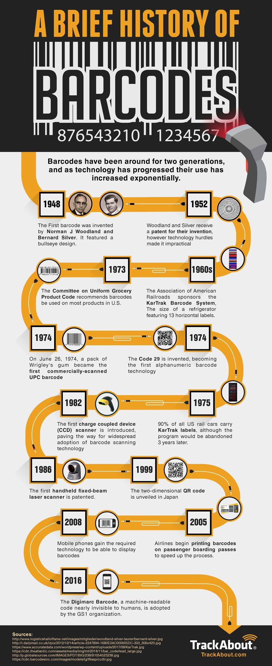
US Average Effective Tariff Rate is Now Highest Since 1909: Chart

The US average effective tariff rate has reached the highest level since 1909 with the raft new tariffs announced by President Trump according to Yale Budget Lab. According to their estimates, the rate has reached 22.5%. Frank Holmes at U.S. Global Investors notes 1909 is the year President Howard Taft proposed the idea of an income tax to Congress !

Click to enlarge

Source: America’s Tariff Rate Hits the Highest Level Since 1909—And That’s Before Retaliation, U.S. Global Investors

The US Tariff rate was much higher back in 1800s and up to early 1900s. However back then concepts like globalization were not a thing. So it is not wise to compare current rates to the rates in those years.

Click to enlarge

Source: Where We Stand: The Fiscal, Economic, and Distributional Effects of All U.S. Tariffs Enacted in 2025 Through April 2, The Budget Lab, Yale University

While China has quickly retaliated, it remains to be seen how other countries take action to deal with the tariffs announced by the US.

Update (4/5/25):

1.Trump’s Average Tariff Rate would be highest since 1937:

Click to enlarge

Source: Trump Tariffs: The Economic Impact of the Trump Trade War, Tax Foundation

2.From an earlier post in 2019:

3.Trump’s Reciprocal Tariff Rates 2025:

Source: via Thinking out loud, Syz Private Banking

Bull vs. Bear Markets for Global Stocks from 1980 to 2024: Chart

Markets go thru many phases of bull and bear markets over decades. Though bear markets are difficult to handle, bull markets tend to be longer. For example, from 1980 to 2024 global stocks as represented by the MSCI World Index had bull markets whose duration were four times that of bear markets. In addition, the average total return was much higher during bull markets than the losses during bear markets.

Click to enlarge

Source: When markets are volatile, it pays to stay invested, Vanguard Australia

Mining is Essential: Infographic

The province of Ontario in Canada is rich in many natural resources. Mining companies there extract a variety of minerals such as Silver, gold, Nickel, Copper, etc. I recently came across an infographic that shows how mining helps us in our everyday lives. For example, copper is used in hospital equipment and devices to reduce the risks of infection.

Click to enlarge

Source: Ontario Mining Association

The Trading Power of China: Chart

China is the second largest economy in the world with a nominal GDP of about $18.5 Trillion in 2024. The Chinese economy has had tremendous growth every year until a few years ago. One of the industries that contributed to the growth is the manufacturing sector. Products made in China are found in most of the markets in the world. Chinese companies have not conquered the markets in the developed world but also in most emerging and frontier markets. I recently came across an interesting article at Der Speigel that I had bookmarked last October. The article discussed if the German economic model is in trouble and if this is the end of Globalization. Two charts from the piece caught my eye.

The following chart titled “The Trading Power of China” shows that most countries depend on China for their imports in 2022. Though the US was the largest importer with good worth over $575 billion, most countries in Africa, Latin America and Asia also had huge imports from China. For instance, Brazil imported about $68 billion worth of goods from China.

Click to enlarge

Source: The End of Globalization? Germany’s Successful Economic Model Could Be Finished, Der Spiegel

One factor that is helping China with becoming a major trade partner for many countries in the world is its “Belt and Road Initiative” thorough which China is investing heavily in infrastructure projects around the world. The following chart shows the member countries of this initiative in 2023:

Click to enlarge

Source: The End of Globalization? Germany’s Successful Economic Model Could Be Finished, Der Spiegel

There are many other fascinating details in the above linked article.

Asset Class Returns From 2010 To 2024: Chart

In earlier posts we looked at the return charts for emerging markets, developed markets and the S&P 500 for 2024. In this post, let’s review the annual returns chart for asset classes from 2010 to 2024. Last year, large caps were the top performers while the worst performer was high yield bonds with a return of just 1.3%.

Click to enlarge

Source: Novel Investor

Developed stocks outside of the US also had poor returns with a return of 4.4%. For many years in a row foreign developed markets have under-performed the S&P 500. However so far this year they are ahead of the US markets. It remains to be seen if they indeed beat the S&P 500 this year.

Related ETFs:

  • SPDR S&P 500 ETF (SPY)
  • iShares Core S&P 500 ETF (IVV)
  • Vanguard S&P 500 ETF (VOO)
  • SPDR Portfolio S&P 500 ETF (SPLG)
  • Vanguard Developed Markets Index Fund ETF (VEA)

Disclosure: No positions