One of the smart ways to diversify globally is to invest in multiple countries. With this approach it is possible to capture the top returns from one equity market and reduce the impact from a poor or worse returns from another market. Just like the return of various individual companies, the equity returns of individual countries also vary from year to year and also in an year. For instance, the top performing country in one year might turn into the worst performer the following year. Since predicting which country will yield the top return next year it is wise to avoid picking a potential winner and instead spread one’s funds over many countries.
The variance in returns among countries is show with the year-to-date returns of countries in Latin America and Canada. The YTD returns of select indices are as follows:
- Argentina’s Merval: 44.81%
- Brazil’s Bovespa: -4.82%
- Canada’s S&P/TSX Composite: 17.03%
- Chile’s Santiago IPSA: 2.13%
- Mexico’s IPC: 15.97%
Someone that invested purely in Latin America’s largest market – Brazil, would have missed the decent returns from other countries shown above.
The top and worst developed markets based on annual returns from 2001 to 2020 are shown in the chart below:
Click to enlarge
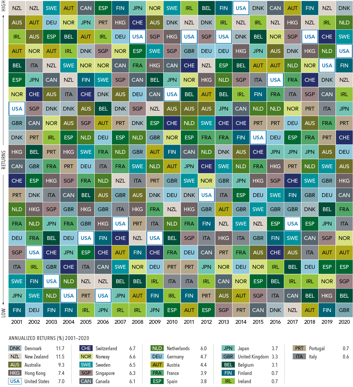
Past performance is no guarantee of results. In USD. MSCI country indices (net dividends) for each country listed. Does not include Israel, which MSCI classified as an emerging market prior to May 2010. MSCI data © MSCI 2021, all rights reserved.
Source: Which Country Will Outperform? Here’s Why It Shouldn’t Matter, Dimensional Fund Advisors LP
In the 20 year period, the US ranked as the top performer only in one year. It is not surprising that Italy has the worst annualized returns at just 0.6%.
Australia and New Zealand had higher annualized returns than major European markets like the UK and Germany.
Related ETFs:
- SPDR S&P 500 ETF (SPY)
- iShares MSCI Germany Index Fund (EWG)
- iShares MSCI Canada Index Fund (EWC)
- iShares MSCI Australia Index Fund (EWA)
- iShares MSCI United Kingdom Index (EWU)
- iShares MSCI Singapore Index (EWS)
Disclosure: No Positions
You may also like:
- The Callan Periodic Table of Investment Returns 2001 To 2020
- The Callan Periodic Table of Investment Returns From 2000 to 2019: Chart
- The Callan Periodic Table of U.S. Equity Investment Returns 1999-2018
- Single Country Periodic Table of Investment Returns: Emerging Markets 2001 – 2010
- Single Country Index Returns: Developed and Emerging Markets 2002 – 2011
- Single Country Annual Total Returns Of Developed Markets From 2003 To 2017
- Single Country Equity Market Returns for Developed Countries 1999 Thru 2018