A Comparison of U.S. and Canada Equity Market Returns

The Canadian stock market has been one of the worst performing markets in the world in the past decade according to a recent article in The Globe and Mail. One of the main reasons from the poor performance of Canadian stocks relative to their American peers is the global crash in commodity prices. From the article:

The stock-market correction was made in America, then promptly exported to Canada. Overheated U.S. stocks were the starting point for a week of unnerving market tumult, which quickly turned into an indiscriminate global sell-off sparing no major market.

Canadian stocks were hardly due for a major slump, but were punished regardless in a return to an unwelcome but familiar form.

Already badly trailing the rest of the world, the latest setback in domestic equities has dragged the S&P/TSX composite index into negative territory since the precrisis peak nearly 10 years ago.

-Not counting dividends, the main Canadian benchmark is now trading below its 2008 peak just prior to the onset of the global financial crisis.

As the U.S. stock market was transformed into a madhouse of volatility, the cross-border transmission of fear has dragged the S&P/TSX composite down by 5.2 per cent over the past week or so.

For Canadian investors, it has been a smoother, slightly shallower decline, as the domestic losses haven’t been quite so drastic, and the swings in U.S. benchmarks not quite so violent here.

But Canadian stocks may have been less vulnerable to a correction simply because they lagged  so badly up to that point, sitting out what has been a powerful uptrend in stock prices almost everywhere but here.

Source: Dead last: As Canadian stocks lag, long-term returns prove paltry, The Globe and Mail

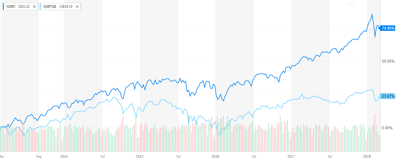
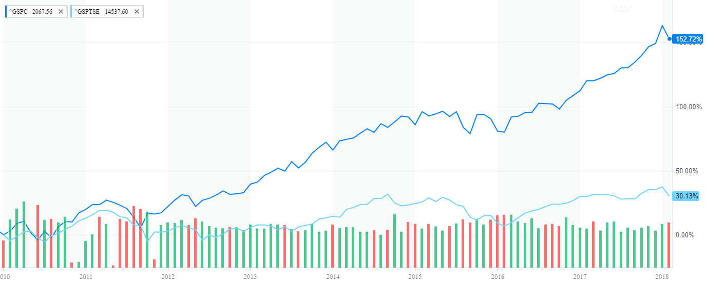
Many investors, including myself, may not know how much Canada has under-performed US in the past few years. So I compared the performance of S&P 500 and the TSX composite Index in different time periods.

The chart below shows the performance of S&P/TSX Composite vs. S&P 500 in the past 5 years:

Click to enlarge

10-Year return chart:

Source: Yahoo Finance

The above charts show the magnitude of difference in returns between the markets. The takeaway for Canadian equity investors is that diversification beyond home markets is important.

Related ETFs:

  • SPDR S&P 500 ETF (SPY)
  • iShares MSCI Canada Index Fund (EWC)

Disclosure: No Positions

Relative Sizes of Global Equity Markets 1899 vs. 2017

The Credit Suisse Global Investment Returns Yearbook 2018 has been published recently. The summary edition of this annual study contains a few fascinating charts. The following chart shows the Relative Sizes of Global Equity Markets end-1899 vs. end-2017:

Click to enlarge

Source:The Credit Suisse Global Investment Returns Yearbook 2018 , CS

Download:

US Stock Valuations Are High Compared To Global Stocks

US stocks have had a multi-year bull market until recently. Even after the recent shakeup stocks have recovered and are again rising strongly. However in terms of valuations, American equities are expensive relative to their foreign peers. While US stocks have always enjoyed a premium over other developed markets, in terms of performance US stocks and global stocks take turns every few years. Or to put it another way, in some years US outperforms other developed markets while in other periods, other markets beat the US market.

Global stock are attractive relative to their US peers from a valuation perspective. From a recent article at Hartford Funds:

An Open Call

Movie producers aim to discover and groom a young actor or actress before he or she becomes a big star. The same goes for investors looking to buy equities. (FIGURE 4).
After taking their valuations into consideration, EM and developed markets (DM) appear to be inexpensive when compared with their US equivalents. Add in their dividend growth and dividend yield, and it may potentially be worth taking another look at these regions.

FIGURE 4

Global Equities Characteristics(12/31/2017)

 WP419_4

Based on the percent of total holdings of the MSCI ACWI Index. Data Source: FactSet, 1/18. Estimates are subject to change.

 Tomorrow’s Marquee Names?

Paying too much to hire a big name star, who ultimately fails to put people in seats, is a regular occurrence in Hollywood. Sometimes the less-hyped talent end up surprising everyone. Likewise, the developed markets with higher country returns may not be what many would expect (FIGURE 5).

While returns have generally been strong across the board, many other countries fared as well or better than the US. Surprisingly, other countries typically associated with being some of the world’s economic generators also returned less. They had forward Price/Earnings (PE) ratios9 higher than less expensive countries that provided better returns over the past year. That means those big name markets are predicted to cost investors more, but may offer less in returns.

FIGURE 5

International Markets Have Offered Attractive Valuations

1-Year Performance and Forward P/E Ratios

WP419_5

Data Source: FactSet, 1/18. As of 12/31/17. Performance data quoted represents past performance and does not guarantee future results. Returns and P/E based on the individual region/country returns of the MSCI ACWI Index. Countries listed by market-cap size. A simple average was used to calculate the return and P/E for countries in the “Other” category. Country portfolios are capitalization-weighted with free-float market cap. The portfolios are theoretical and assume no fees, trading costs, or any short selling restrictions. Actual results may differ significantly. Performance is based on annual “total returns,” which includes reinvested dividends but not interest, capital gains, taxes, or transaction costs. MSCI performance is shown net of dividend withholding tax. Index is unmanaged and not available for direct investment. Please see the back page for representative index definitions.

Source: A Reboot for International Equities, Hartford Funds, Jan 2018

The complete article linked above is worth a read.

The Dividend Yields of Developed Markets

The dividend yield of the US equity market as referenced by the S&P 500 has hovered around the 2% mark for many years now. This is one of the low yields among the major developed markets.

At 4.18% for the S&P/ASX 200 Index, Australia has the highest dividend yield of all developed markets. Norway has thesecond highest at 4.08% followed by the UK at 4.02%. The linked Bloomberg article notes that Australia has consistently yielded over 4% or more in dividend yields this decade.

Click to enlarge

Source: Singapore Loves Dividends, Australia Most Generous, Bloomberg

The key takeaway for American income investors is that they need to cast a wide to gain higher yields. One way to do this is to diversify across many developed markets especially high-yielding ones like Australia and Norway.

The World’s Top 10 Dividend Payers in 2017

Dividend payout reached another record in 2017 according to a study by Janus Henderson. The trend is likely to continue and they predict dividend payouts to increase by 8% this year.

The following firms were the top 10 dividend payers in 2017:

Rank Company
1 Royal Dutch Shell
2 China Mobile
3 Exxon Mobil
4 Apple
5 Microsoft
6 AT&T
7 HSBC
8 China Construction Bank
9 Verizon Communications
10 Johnson & Johnson
Total $120.5bn
% of total 9.60%

Two of the top dividend payers in the world are from China. The rest of them are from either the US or developed Europe. After years of struggling oil majors are starting to generate decent profits and are slowly rewarding their shareholder with higher payouts. From an article at U.S. Funds:

Big oil is generating as much profit at 60 dollar oil as it was at 100 dollars

Major Oil Producers Are Rewarding Investors and Have Been Growing Dividends
  • As the above chart demonstrates, oil companies are leaning up. In the final quarter of 2017, profits were back to 2014 levels due to CEOs focusing on squeezing more out of each dollar through slowing projects, renegotiating contracts and shrinking the workforce.
  • Although oil production has been flat for the past few years between the five supermajors, companies are focusing on earning more per barrel rather than boosting production volume.
  • Companies have also been rewarding shareholders by using cash to increase dividends. Major producers Exxon, Shell and Chevron have been boosting their dividends and have 5-year dividend growth of 7 percent, 4.3 percent and 4.2 percent, respectively, as of 12/31/2017.

Among the tech giants, Apple(AAPL) and Microsoft(MSFT) are now sought after for their dividend income by investors. This is a huge shift from the dot com days when most tech firms paid no dividends and were mainly considered for their growth prospects.

Disclosure: No Positions