The 20th century is widely called as the “American Century” in honor of the role the U.S. played in world politics. The Wikipedia definition of the term:
American Century[1][2] is a characterization of the 20th century as being largely dominated by the United States in political, economic and cultural terms. The United States’ influence grew throughout the 20th century, but became especially dominant after the end of World War II, when only two superpowers remained, the United States and the Soviet Union. After the dissolution of the Soviet Union in 1991, the United States remained the world’s only superpower,[3] and became the hegemon, or what some have termed a hyperpower.[4]
According to a white paper by the Australian Government, the 21st century is the Asian Century. From the report:
Within only a few years, Asia will not only be the world’s largest producer of goods and services, it will also be the world’s largest consumer of them. It is already the most populous region in the world. In the future, it will also be home to the majority of the world’s middle class.
In this post let us review a few charts from this report.
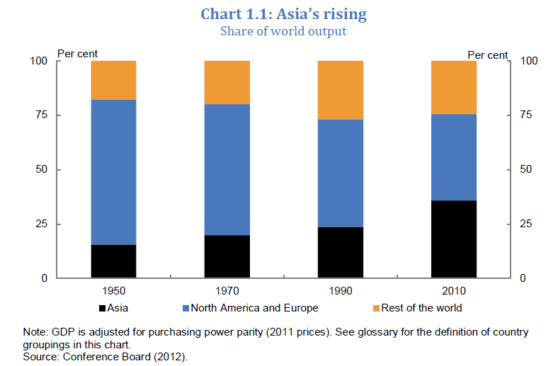
1) Asia’s Share of World Output
Click to enlarge
In the last 20 years, one-third of Asia’s population has re-engaged the world. Standard of living for billions of people has improved. According to one study, between 2000 and 2006, one million people were lifted out of poverty every week in East Asia alone. It took the UK over 50 years to double its income per person during the industrial revolution. In contrast, China and India recently doubled their income per person within a decade.
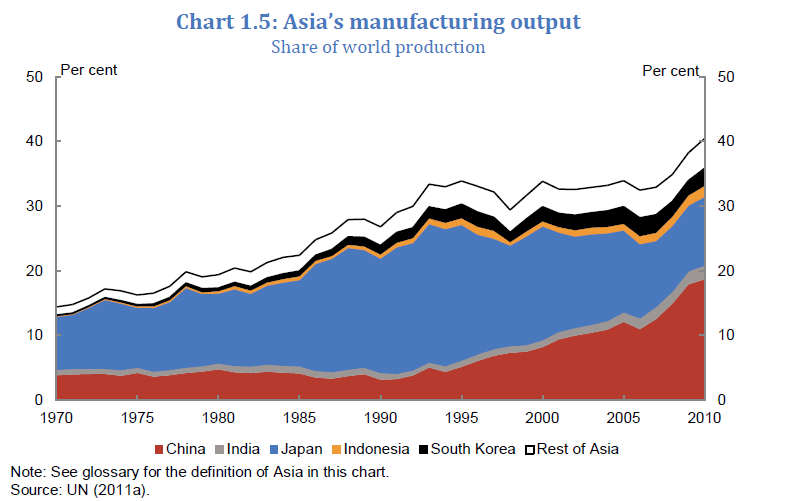
2) Growth of Manufacturing Industry in Asia
Asia is the manufacturing engine for the world. Initially Japan led Asia in manufacturing. Then production when costs rose, low-cost manufacturing moved to Singapore, Taiwan, Hong Kong and South Korea and the highly skilled production remained in Japan. Later as production costs rose in those countries, businesses moved their production facilities to ASEAN countries and then to China. Today China has become the factory floor for the world not only in producing cheap low-cost goods but also high-cost electronic products. Other Asian countries such as India are also catching up with manufacturing but at a slower pace than China.
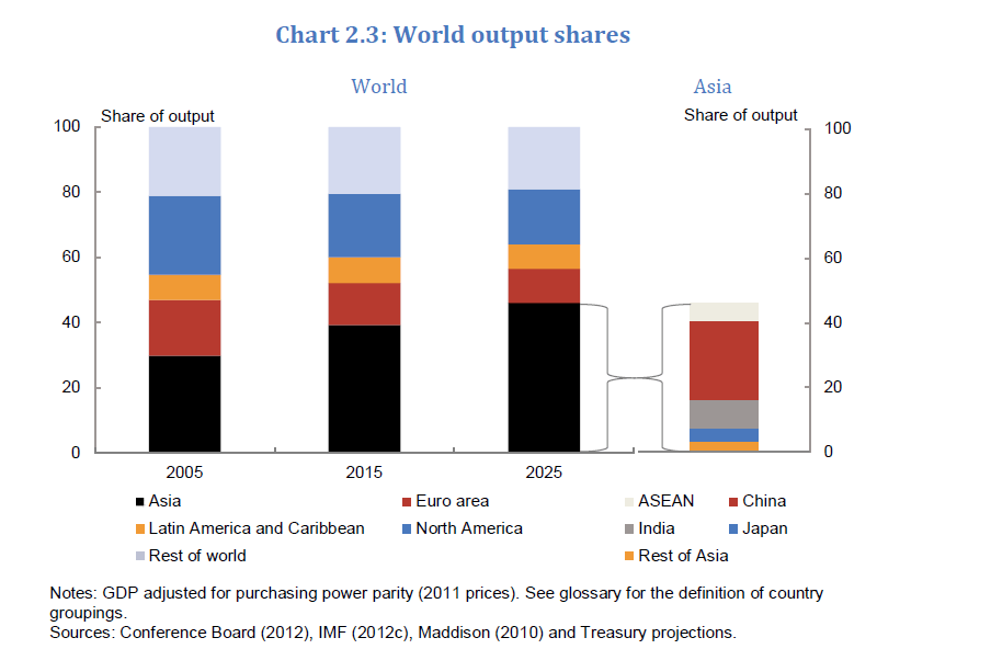
3) Asia’s Share of World Output Projection
By 2025, four of the 10 largest economies will be in Asia – China, India, Indonesia and Japan. Asia is projected to account for half of the world’s output with China alone accounting for half of that.
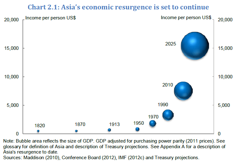
4) Asia’s GDP per capita Projection
The world total population is 7.0 billion and the U.S. population is 314.0 million. Asia has more than half of the world’s population at about 3.8 billion. As the income per person grows in Asian countries the middle class population is bound to expand further.
Source: Australia in the Asian Century, Australian Government
Related ETFs:
- iShares MSCI Pacific ex-Japan Index Fund (EPP)
- iShares S&P Asia 50 Index Fund (AIA)
- SPDR S&P Emerging Asia Pacific ETF (GMF)
- iShares MSCI All Country Asia ex Japan Index Fund (AAXJ)
Disclosure: No Positions
