The divergence between the economic growth of emerging markets and development markets is projected to continue next year. As in the recent few years, economic growth in emerging economies is estimated to outpace growth in developed economies.
The graph below shows the Real GDP Growth for Emerging Asia and Latin America relative to developed markets:
Click to enlarge
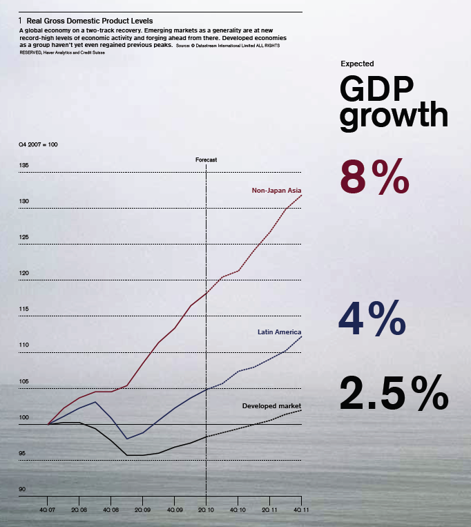
Source: Bulletin, The Credit Suisse Magazine
The following chart shows the real GDP, growth for various economies and their contribution to the World GDP:
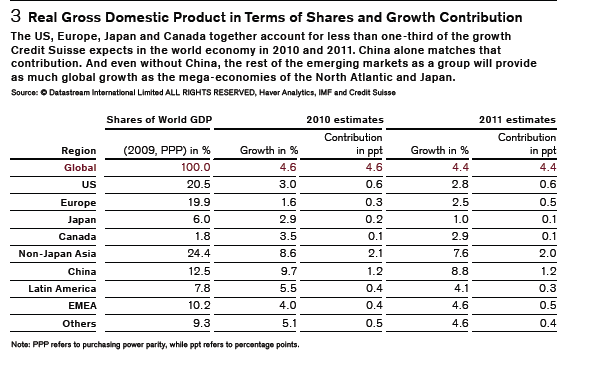
Source: Bulletin, The Credit Suisse Magazine
In 2009, the U.S. accounted for just about one-fifth of the world GDP.Credit Suisse estimates that growth from the developed world would account for less than one-third of the global growth in 2011.Based on this logic, emerging markets are a better bet for investment than developed markets. However this assumes that strong economic growth leads to higher investment returns.
Related ETFs:
iShares MSCI Emerging Markets Index (EEM)
Vanguard Emerging Markets ETF (VWO)
SPDR S&P 500 ETF (SPY)
SPDR STOXX Europe 50 ETF (FEU)
Disclosure: No positions