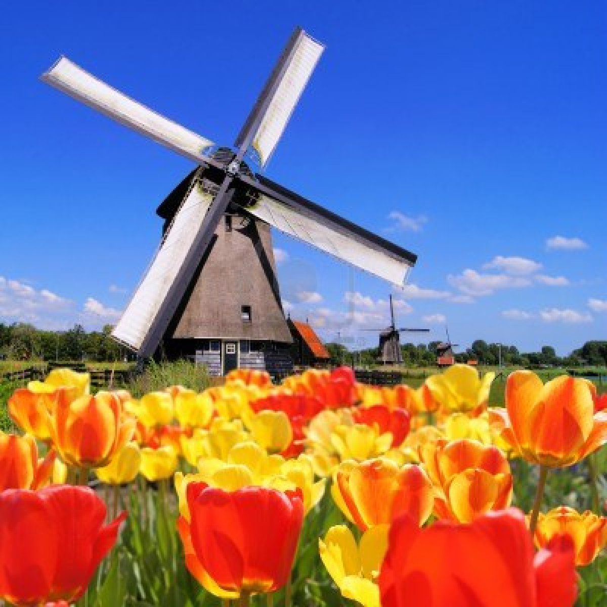
A Short Review of Labor Market in MENA Region

The labor market in the Middle East and North Africa (MENA) region is the most inefficient according to the World Economic Forum’s Global Competitiveness Index. Rising youth population and high unemployment rates is a chronic issue in the region. The IMF notes that Egypt has to create 700,000 new jobs every year to keep its current unemployment rate the same. It is highly unlikely that Egypt would be able to create such high number of jobs per year.

One of the main reasons for lack of job growth in the MENA region is the bloated public sector according to a research report by Deutsche Bank. This is not surprising since in many emerging and frontier markets the state is the largest employer. In the MENA region the dependence on state for employment opportunities become even more severe since private sector growth is limited. The regimes in the region also employ a high percentage of the working population in order to prevent social unrest.

Click to enlarge

MENA-Bloated-Governments

From the Deutsche Bank report:

Perhaps more importantly, the public sector accounts for an outsized portion of employment in the Middle East, 9.8% of GDP compared with the global average of 5.4% (see chart 12).Taking only non-agricultural employment, in 2010 public employment constituted 42% of total employment in Jordan and 70% in Egypt.On average, public-sector salaries accounted for 35.5% of government expenses in 2009 for regional governments.

In addition to crowding out the private sector, this system has created an environment in which young job-seekers find working in the public sector more desirable. The 2003 Syrian Unemployment Survey indicated that 80% of young unemployed persons found a public-sector job preferable to a private-sector position.

The large public sector has also bred a lack of economic dynamism in the region, further setting back employment gains.

Related ETFs:

Market Vectors Gulf States (MES)

PowerShares MENA Frontier Countries ETF (PMNA)

Disclosure: No Positions

Relationship Between Federal Reserve’s Balance Sheet And Stock Prices

The Federal Reserve has provided an ocean of liquidity since the great recession that followed the global financial crisis through the QE1, QE2 and QE3 programs. In fact, the Fed’s balance sheet has grown significantly due to these programs. Total assets have soared from just $869.0 billion in August 2007 to well over $3.0 Trillion as of February 20, 2013.

Click to enlarge

Fed-Balance-Sheet

Source: The Federal Reserve

Equity prices have increased strongly in line with rising liquidity. The following chart shows the correlation between Fed’s growing balance sheet and the S&P 500:

Fed-Balance-Sheeet-vs-SP500

Source: The Week Ahead, February 25 – March 1, 2013, CIBC World Markets

Related ETF:

SPDR S&P 500 ETF (SPY)

Disclosure: No Positions

Ten Express Delivery Industry Stocks To Consider


The Air Courier and Express Delivery industry is a multi billion dollar industry in the U.S. Here are a few facts about this industry as of 2011:

  • Number of firms: Over 7,000
  • Same-day Market: $8.7 billion
  • Total Market: $14.5 billion

Source: Industry Profile,  MCAA

Antonov-Plane

Antonov An-225 – The largest airplane in the world

Competition is fierce in the industry. On this topic the MCAA article notes:

1.2.3 Value of competition in the sector
Courier firms provide an invaluable service because the “big four” (DHL, UPS, FedEx and USPS) in the delivery business simply do not provide same-day delivery services uniquely designed to meet specific individual customer needs. Expedited delivery firms also prevent the big four from having a complete monopoly on deliveries that must be completed in a short period of time. This competition, both among couriers and with the big four, has greatly increased the quality and professionalism of the industry, while also ensuring reasonable rates for customers. These 7,000 plus small businesses also help to keep the pricing competitive and the big four honest. Additionally, the courier industry consists almost entirely of small, locally owned and operated businesses, ensuring that revenue is retained within the community served, rather than siphoned off by a multi-national corporation.

Ten Express Delivery Industry Stocks are listed below with their current dividend yields for further research:

1.Company: Air Transport Services Group Inc (ATSG)
Current Dividend Yield: No Regular Dividends Paid

2.Company: Air Transport Services Group Inc (AIRT)
Current Dividend Yield: 2.58%

3.Company: Forward Air Corporation (FWRD)
Current Dividend Yield: 1.06%

4.Company: FedEx Corporation (FDX)
Current Dividend Yield: 0.53%

5.Company: United Parcel Service, Inc.(UPS)
Current Dividend Yield: 2.99%

6.Company: Atlas Air Worldwide Holdings Inc(AAWW)
Current Dividend Yield: No Regular Dividends Paid

7.Company:C.H. Robinson Worldwide (CHRW)
Current Dividend Yield: 2.42%

8. Company:Expeditors International of Washington Inc (EXPD)
Current Dividend Yield: 1.37%

9.Company: Pacer International Inc (PACR)
Current Dividend Yield: No Regular Dividends Paid

10.Company: Hub Group Inc (HUBG)
Current Dividend Yield: No Regular Dividends Paid

Note: Dividend yields noted are as of Feb 22, 2013

Disclosure: No Positions


Is the U.S. Government Spending High Relative to Other G-7 Countries ?

The U.S. Federal Spending for Fiscal Year 2012 was about $3.5 Trillion.On a percentage basis, healthcare and social security payments accounted for 45% of total spending. Defense expenditures amounted to 19% of total spending. Net interest paid on outstanding public debt added another 6% according to data provided by Congressional Budget Office (CBO).

U.S. Federal Spending – FY 2011

Click to enlarge

U.S._Federal_Spending_-_FY_2011


Source: Wikipedia

The public perception on U.S. spending is that the Federal government is too large and that spending is out of control leading to deficits year after year. All the conservatives and even some democrats would agree that government spending has to be reined in in order for the economy to move forward.

In reality how does the U.S. government spending compare to other G-7 countries?

U.S. government spending is not high compared to other G-7 countries. This is because unlike other countries, the Federal government in the U.S. spends most of the spending and not the state and local governments. In Germany or Japan for example, the sub-national governments dole out much of the spending pie. Hence even though the U.S. Federal spending as a share of GDP looks higher among G-7 countries the actual spending by other G-7 countries is much higher.

Click to enlarge

US-vs-G7-Countries-Spending-2


One of the suggested solutions put forth by conservatives is drastically cutting down the size of the government. Austerity is the new buzzword among the proponents of a lower government who propose to slash government services such as social programs and other entitlements. Despite the failure of austerity programs in many European countries, conservatives in the U.S. steadfastly believe that austerity is the panacea for solving the U.S. deficit. Here again their proposed solution is incorrect and bound to fail. This is because all government spending(federal, state and local) in the U.S. as a percentage of the GDP is still the lowest among G-7 countries as shown in the chart below. So slashing government spending when the country is barely recovering from the worst recession in decades is not a sensible strategy. Instead of focusing on slashing desperately needed social programs at this time, lawmakers should try to stimulate economic growth by implementing growth-oriented policies.

US-vs-G7-Countries-Spending

Source: US in Debtors’ Prison: A Life Sentence? by Emanuella Enenajor and Andrew Grantham, Economic Insights, January 29, 2013, CIBC World Markets

Sources of Electricity Generation in the U.S.

The following chart shows the major sources of power generation in the U.S. in 2011:

Click to enlarge

US-Sources-of-Electricity-Generation

Source: Energy in Brief, U.S. Energy Information Administration

Coal is the major source for power production followed by Natural gas at about 25%. Nuclear power accounted for about 19% which is lower than countries such France that depend on nuclear power for most of its electricity needs. Renewable sources which includes hydro power accounted for about 13% of the total power production. This is interesting since one would expect U.S. to produce more power from hydro as there is abundance of water resources in the country. Here again, countries like Canada and Brazil produce a higher percentage of their electricity from hydro power. Much of the hydro power produced in the U.S. comes from dams which were built before the mid-1970s and operated by Federal agencies. So it appears no new hydro power plants have been built in the past 40+ years.  However on a positive note, power production from wind increased from about 6 billion kilowatthours in 2000 to about 120 billion kilowatthours in 2011 according to EIA data.

Five electric utilities yielding more than 3% dividends are listed below for further research:

1.Company: Dominion Resources Inc (D)
Current Dividend Yield: 3.99%

2.Company: Duke Energy Corp (DUK)
Current Dividend Yield: 4.41%

3.Company: Southern Energy (SO)
Current Dividend Yield: 4.38%

4.Company: NextEra Energy Inc (NEE)
Current Dividend Yield: 3.63%

5.Company: Exelon Inc (EXC)
Current Dividend Yield: 6.89%

Note: Dividend yields noted are as of Feb 22, 2013

Disclosure: No Positions