Royal Bank of Scotland Stock Is Dead Money

The Royal Bank of Scotland Group (RBS) started trading on the NYSE in late 2007. Since then the stock has been as disaster for investors. The global financial crisis crushed RBS. But while other global banks have recovered since then RBS stock continues to be dead money.

The long-term chart below shows the disaster that is Royal Bank of Scotland:

Click to enlarge

RBS Long Term

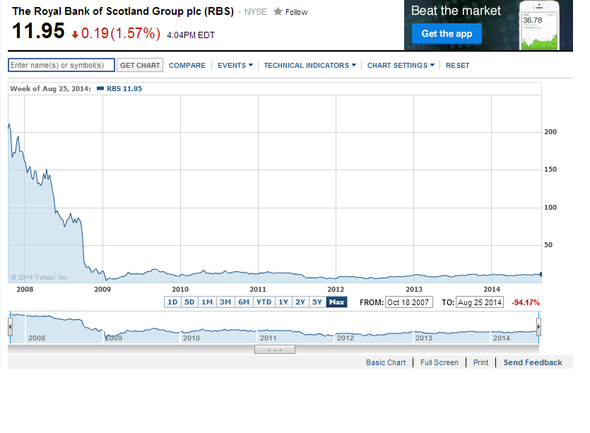
Source: Yahoo Finance

RBS is down over 97% for the period shown. The last time the bank paid any dividend was in May 2008. 

In November, 2008 the bank implemented a 1 for 20 reverse split. Even after that split the stock price has plunged and continues to struggle. The stock price has practically gone nowhere in the past few years.

Investors waiting for a turnaround can consider taking the losses and move on to other alternatives.

Disclosure: No positions

S&P 500 Index Calendar-Year Returns and Market Corrections 1980–2013

The S&P 500 closed at a record 2,000 yesterday. The index first crossed that milestone the day before. The following quote from The Heard on the Street column in  The Wall Street Journal puts this figure in perspective:

As Howard Silverblatt of S&P Dow Jones Indices points out, it has taken 16 years for the benchmark to get from 1,000 to 2,000 points. In one respect, that might seem quick: For example, it took 30 years to get from 100 to 1,000 points. Then again, that was a 10-fold increase rather than a mere doubling. On that basis, the latest milestone really doesn’t compare with the 1990s: Getting from 500 to 1,000 points—by February 1998—took the S&P 500 less than three years.

Source: Overheard: S&P 2K, The Wall Street Journal, Aug 26, 2014 Reaching this milestone has not been easy for the index.In fact it has been a rough ride for investors over the past years. Over the long term the S&P 500 has experienced strong rises but also dramatic falls even within the same year. For investors navigating such up and down market has been a challenge to say the least. However patient investors have been rewarded by U.S. stocks as represented by the S&P 500 index since the index has continued its uptrend trend and has touched 2,000.

The chart below shows the S&P 500 calendar-year returns and market corrections from 1980 to 2013:

Click to enlarge SP 500 Calendar year returns and correctionsSource:  Managing risk factors to build a better portfolio, Deutsche Asset & Wealth Management

For example, more recently in 2009 the index plunged by 26.7% on an intra-year basis but still ended the year with a solid positive return of 23.5%. The performance of the index was similar in 2010, 2011 and 2012 as well. The key takeaway from the above chart is that patience and having a long-term horizon is the key to investing in equities. Trying to time the market and panic selling after major declines is not a wise strategy.

Related ETF:

  • SPDR S&P 500 ETF (SPY)
  • Vanguard Mid-Cap Growth ETF (VOT)
  • iShares Dow Jones Select Dividend ETF (DVY)
  • SPDR S&P Dividend ETF (SDY)
  • Vanguard Dividend Appreciation ETF (VIG)

Disclosure: No positions

The Top 25 Global Public Companies by Cash on Balance Sheet

The Global Finance magazine published the  second annual Global Cash 25 ranking last month. This ranking is based on the cash and cash equivalents held by public companies on their balance sheets. The 25 companies were selected from a list of 70,000 listed companies worldwide.

The Top 25 Global Public Companies by Cash on Balance Sheet are shown below:

Click to enlarge

Top Global Cash Hoarding Companies

Source: Global Finance

US-based General Electric(GE) tops the list hoarding over $88.0 billion according to data analyzed by Global Finance. From an investor perspective GE stock has been dead-money for years. The company’s glorious days are long gone and is not worthy of any investment. Because the conglomerate operates in so many unrelated businesses from washing machines to aircraft engines it is basically run with no particular vision or goal to be a leader in one thing. Despite all the failings GE has has a market capitalization of over $262.0 billion. The current dividend yield on the stock is 3.37% which is higher than the S&P 500’s dividend yield but the performance of the stock has been pathetic for years as I mentioned before.

The other companies in the top five are Microsoft(MSFT), Verizon Communications(VZ), Cisco Systems (CSCO) and Petronas. Of these Petronas is the state-owned oil company of Malaysia. Similar to GE, Cisco is another company that is best avoided. The former hi-tech darling from the dot-com era faces tough competition from start-ups and its stock has also been dead-money since the dot-com crash.

Excluding Petronas and US firms the rest of the top global cash hoarding firms are from the developed world.

Disclosure: No positions

A Review of the Russian Blue Chip Index

The S&P 500 is up by just over 9.0% year-to-date. The MICEX Index, the benchmark of the Russian equity market is basically flat year-to-date.

One of the indices on the Moscow Stock Exchange is the Blue Chip Index.  Here is the description of the index from the exchange site:

Moscow Exchange Blue Chip Index is an indicator of the market of the most liquid stocks of Russian companies. The index is calculated on the basis of the stocks of the 15 most liquid and capitalized issues of Russian stock market. The Index is based on the prices of shares, denominated in rubles. 

Currently 17 companies constitute this index. No individual stock is allowed to exceed 20% in weight of the index. As of last month the largest sector weighting in the index was the oil & gas sector accounting for 56.47% of  the index.  The other major sectors in the index were financials with 20.87% and consumer goods and retail with 8.30%. The dominance of the oil&gas sector in the Russian Blue Chip index is not surprising since the Russian economy is mainly a resource-based economy with oil&gas being the largest component.

The constituents of the index are listed below with the ticker on the domestic market and the weights:

S.No.CompanyTicker on the Moscow ExchangeWeight
1JSC "GAZPROM", Ordinary sharesGAZP17,41%
2OAO "LUKOIL", Ordinary sharesLKOH16,29%
3Sberbank, Ordinary sharesSBER14,95%
4Sberbank, Preferred sharesSBERP1,17%
5OJSC "Magnit", Ordinary sharesMGNT7,68%
6"Surgutneftegas" OJSC, Ordinary sharesSNGS3,83%
7"Surgutneftegas" OJSC, Preferred sharesSNGSP2,50%
8"OJSC "MMC "NORILSK NICKEL", Ordinary sharesGMKN5,68%
9JSC "NOVATEK", Ordinary sharesNVTK5,45%
10Rosneft, Ordinary sharesROSN5,17%
11MTS OJSC, Ordinary sharesMTSS5,14%
12JSC VTB Bank, Ordinary sharesVTBR4,35%
13Sistema JSFC, Ordinary sharesAFKS2,71%
14JSC "TATNEFT", Ordinary sharesTATN2,53%
15JSC "Transneft", Preferred sharesTRNFP2,23%
16OJSC Uralkali, Ordinary sharesURKA1,80%
17OJSC "Rostelecom", Ordinary sharesRTKM1,11%


Source: Moscow Stock Exchange

None of the blue chips listed above trade on the U.S. stock exchanges.Some of the them trade on the OTC market including Gazprom(OGZPY), Lukoil(LUKOY), Norilsk Nickel(NILSY), Surgutneftegaz(SGTZY) and Tatneft (OAOFY). The full list of Russian ADRs can be found here.

Another simple and easy way to gain exposure to large Russian companies is via the Market Vectors Russia ETF (RSX). The fund is down about 17% year-to-date.

Download: Russian Blue Chip Index Components (in Excel)

Disclosure: No Positions

Australian Household Debt Remains High

The Australian economy has performed relatively well among the developed economies. In fact, Australia escaped largely unscathed during the global financial crisis of 2008-09 when Europe and the U.S. economies went into a  tailspin. According to  a report by J.P.Morgan Australia has avoided recession for 23 years even beating the performance of The Netherlands.

Australia’s economy has had positive growth for the past 23 years. The Dutch economy had 27 years of growth until the global  financial crisis broke the record run when the GDP growth fell by 4.2%.

The JP Morgan report does not forecast a recession for the Australian economy. However it does point out certain negative factors that could cause a recession. One of the negative factor that investors need to be worried about is that the household debt remains excessive compared to corporate debt (measured relative to  GDP) as shown in the chart below:

Click to enlarge

BEST-Australia Corporate vs Household Debt

Source:  JPM Global Data Watch, J.P. Morgan

Australian companies have reduced their debt from 78% of GDP in 2008 to 69% now. But households have continued to accumulate debt at a steady pace over the years.Currently the debt to income ratio stands at 1.5 times and is among the world’s highest.

With global demand for natural resources continuing to decline the unemployment rate could spike from current low levels leading to problems in the housing market. Hence investors in Australian equity markets have to be cautious and hedge their bets accordingly.

Related ETFs:

  • iShares MSCI Netherlands (EWN)
  • iShares MSCI Australia Index (EWA)

Disclosure: Long EWN