Infographics: The US Stock market and Election Cycles

The US Presidential Election is in full swing with both the candidates trying hard to gain voters.The equity market does not care whether a Republican or a Democrat ends up in The White House. To that end, Charles Schwab published the following infographic showing the performance of stock markets during presidential election cycles.

Click to enlarge
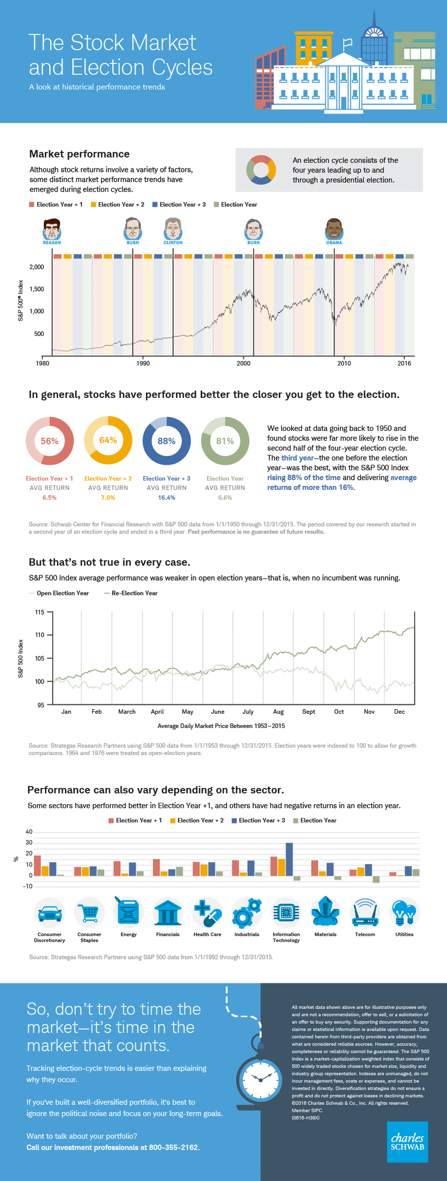
the-us-stock-market-and-election-cycles

Source: The Stock Market and Election Cycles, Charles Schwab, Oct 12, 2016
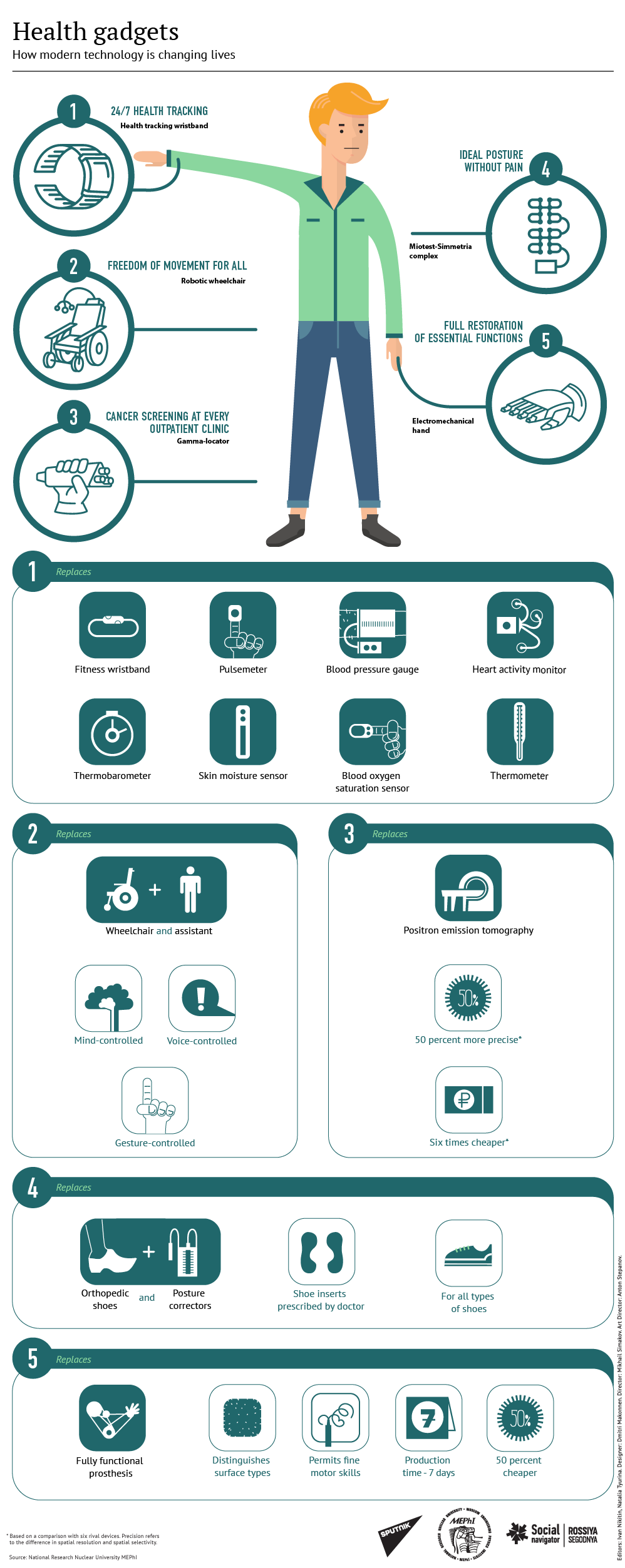
Infographics: Health Gadgets

The development of health-tracking technologies is changing the way people monitor their health and perform physical activities such as exercise, jogging, running, weight-lifting, yoga, etc.

I came cross the following cool infographics that shows how health gadgets are changing our lives:

Click to enlarge

health-gadgets

Source: Sputnik

Do Americans Get Their Money’s Worth in Health Care ?

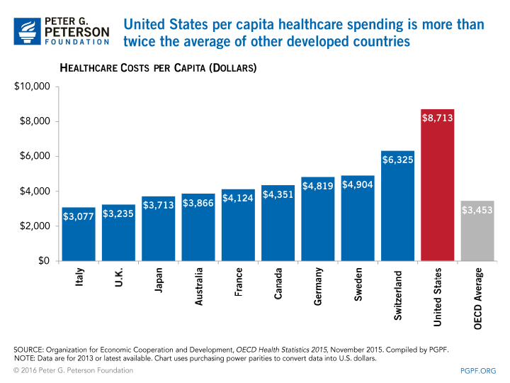
The healthcare system in the US is the costliest in the world. Accordingly the US expenditures on healthcare is the highest in the world. The total expenditure runs into Trillions and contrary to popular belief public spending accounts for more than private spending. On a per capita basis the US spending on healthcare is more than twice the average of other developed countries.

Click to enlarge

healthcare-costs-per-capita-select-countries

Source: Peter G. Peterson Foundation

The question is what do Americans get for spending so much on health care? For example, do Americans get to live up to age 150 or 100 ?. The answer is an absolute no. In fact, Americans do not get their money’s worth in the health care field. This is because much of the money spent is due to highly inflated costs, administrative paperwork, marketing,outrageous compensation, etc. So in effect most of the money spent goes not towards the well being of the patient but for everything else.

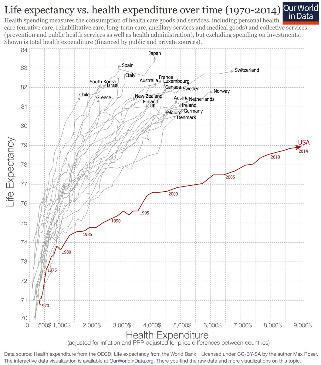
One factor which shows that the health outcome does not justify the high US expenditures is life expectancy. The US healthcare spending has been growing for many years now. But in terms of life expectancy the US ranks the lowest when compared to other developed countries as shown in the chart below.

Click to enlarge

life-expectancy-vs-health-ependture-for-select-countries

Source: twimg.com via twitter

People in other developed countries and even in an emerging country like Chile live longer with lower health expenditures.

Shenzen Subway Map

The Shenzhen Metro is one of the largest in China. Currently the system has six lines covering 140 miles with 132 stations. To put this in perspective, the world’s largest subway system, the New York Subway has 469 stations and the second largest metro in Shanghai has 364 stations.

The subway map of Shenzen Metro is shown below:

Click to enlarge

shenzhen-subway-map-2

Source: China Highlights

Earlier: Hong Kong Metro Map

Are British Stocks Cheap Now?

The FTSE 100 closed at 7,097.50 –  a new record high for this year today. Rising oil prices and a recovery in commodity producers this year has propelled the benchmark index to record levels.

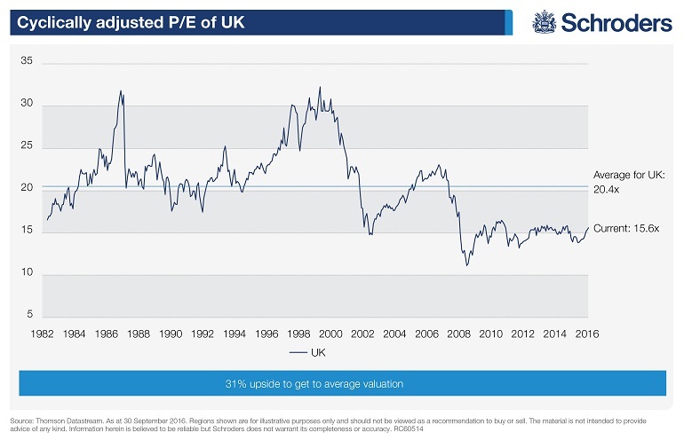
With the index at such levels, some investors may be wondering if there is any value left in UK stocks. According to a report by Schroder’s, based on the P/E ratio British stocks are valued but they are undervalued based on the cyclically-adjusted PE or CAPE ratio.

The current P/E of 22 is much higher than the long-term average of 15. But the CAP measure shows UK stocks are cheap since the ratio is 15.6 compared to the long-term average of 204.

Click to enlarge

cape-ratio-of-uk-stocks

Source:  Why is the FTSE 100 near all-time highs – and can it go higher? by David Brett, Schroder’s

Investors looking to explore British stocks trading on the US markets can check out the list here.