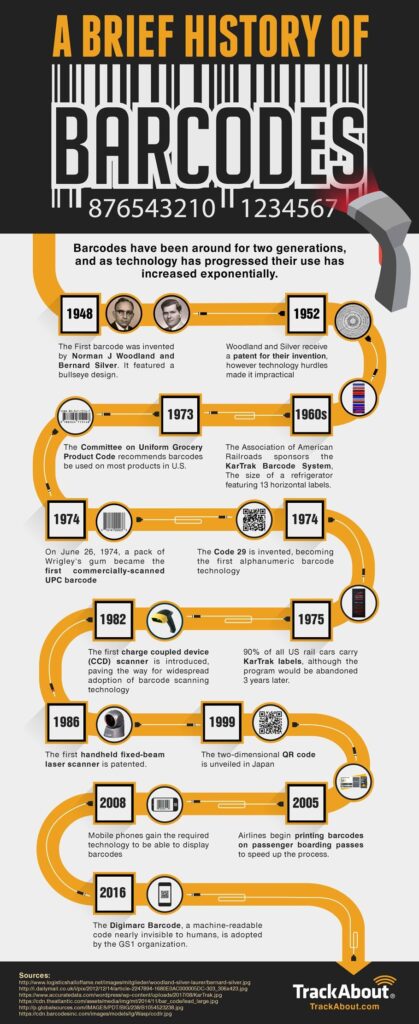
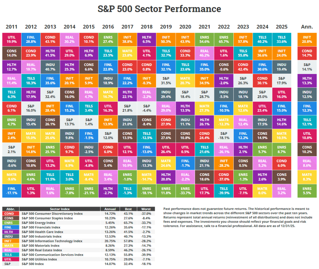
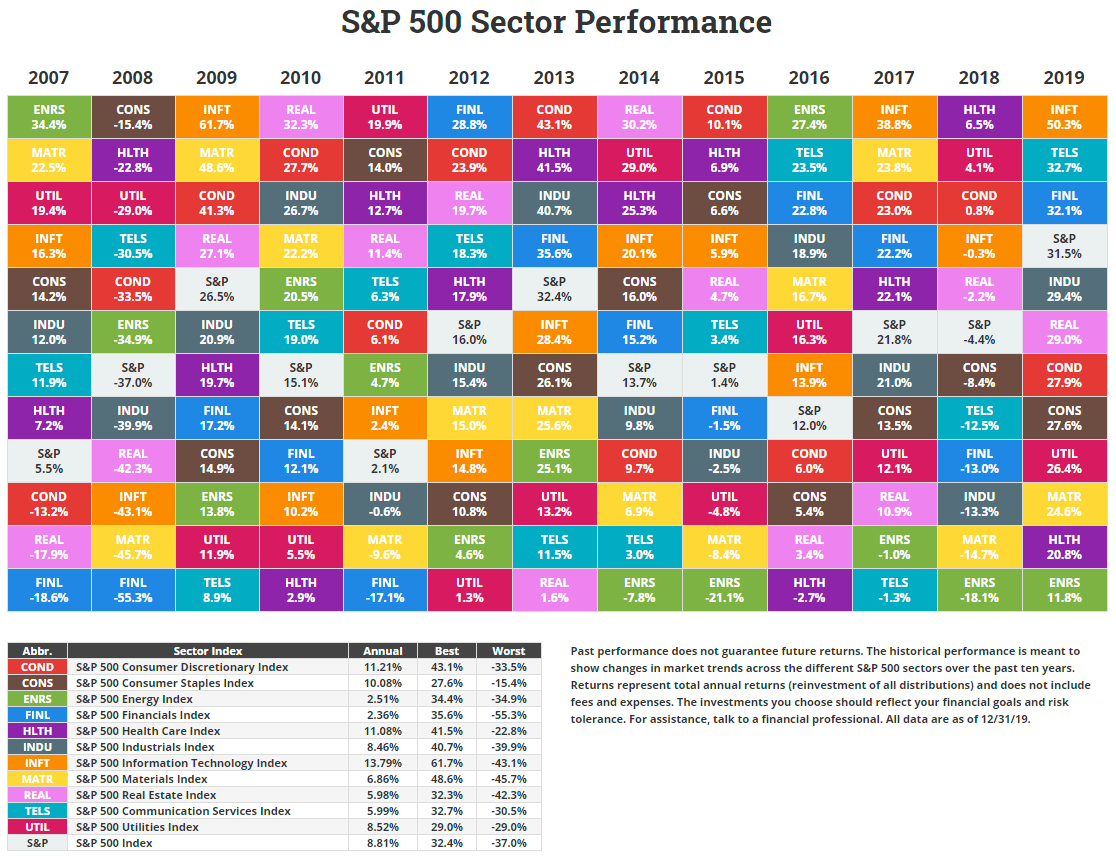
The following chart shows the sector returns for the S&P 500 from 2007 to 2019. This is the last chart in the series published by Novel Investor. Earlier I posted return charts for International Developed Markets and Emerging Markets.
Note: Click S&P 500 Sector Performance by Year From 2007 To 2021 for the latest chart.
Click to enlarge
Note: Returns shown above are Total Returns (i.e. returns including dividends reinvested)
Source: Novel Investor
In 2019, the best performer was the IT sector with an astonishing growth of over 50%. The energy sector had the worst return even as oil prices stabilized and increased.
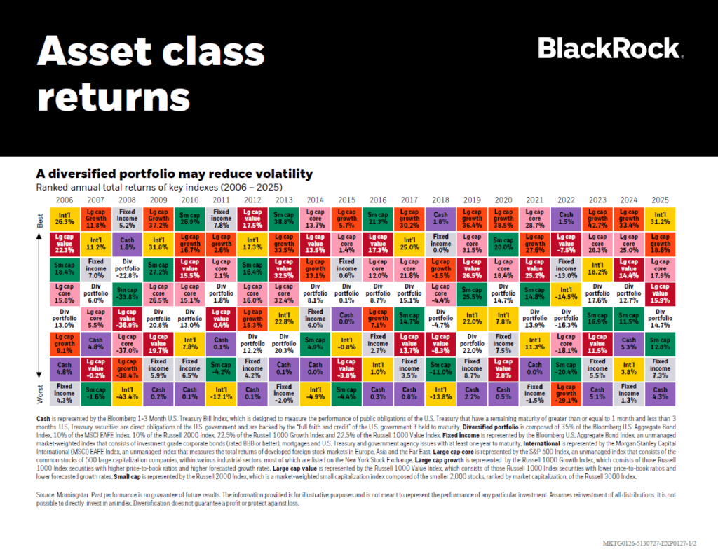
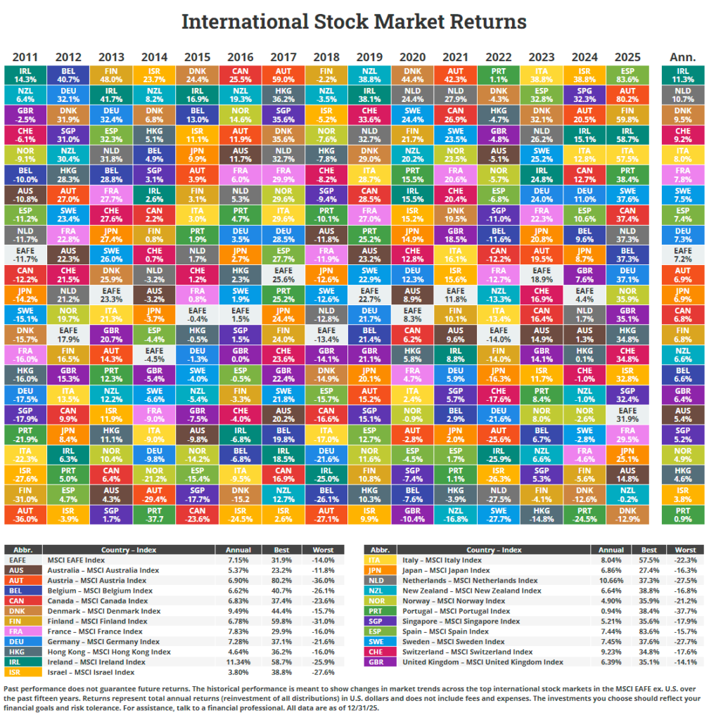
Diversification is the simplest and easiest way to reduce risk and increase a portfolio’s return. The above colorful chart vividly illustrates the point.
In addition, the chart also shows that not one sector is the consistent winner year after year.
Related ETFs:
- SPDR S&P 500 ETF (SPY)
- S&P MidCap 400 SPDR ETF (MDY)
- SPDR Consumer Discretionary Select Sector SPDR Fund (XLY)
- SPDR Consumer Staples Select Sector SPDR Fund (XLP)
- SPDR Energy Select Sector SPDR Fund (XLE)
- SPDR Financials Select Sector SPDR Fund (XLF)
Disclosure: No Positions