Annual Total Return of Key Market Indices 2012 to 2021: Chart

One of the simplest and easiest ways to reduce risk with investing in equity markets is via diversification. Instead of putting all eggs in one basket it is wise to spread the assets in a portfolio across many asset classes, types, regions, countries, sectors, etc. The following chart shows the total return of key indices from 2012 to 2021:

Click to enlarge
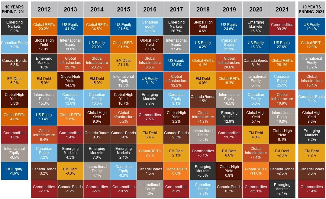
Source: Morningstar Direct, Russell Investments. Annualized return in CAD. Canadian equity=S&P/TSX Composite Index, US Equity=S&P 500 Index, International Equity=MSCI EAFE Index, Emerging Markets=MSCI Emerging Markets Index, Canada Bonds=S&P Canada Aggregate Bond Index, Emerging Markets Debt= JP Morgan Emerging Market Bond Index, Global High Yield=Bloomberg Global High Yield Index, Global Infrastructure=S&P Global Infrastructure Index, Global Real Estate Investment Trusts (REITs)=FTSE EPRA NAREIT Developed REITS Index, Commodities= S&P Goldman Sachs Commodities Index, Indexes are unmanaged and cannot be invested in directly. Past performance is not indicative of future results. Index performance does not include fees and expenses an investor would normally incur when investing in a mutual fund. Diversification and strategic asset allocation do not assure profit or protect against loss in declining markets. 

Note: The returns noted are in Canadian dollars

Source: Going Global: Finding Opportunities in a World of Uncertainty, Russell Investments
Stock Market Investing: India vs. China – Which is Better?

Higher economic growth does not necessarily lead to higher equity market returns and vice versa. I have written about this concept many times before. So it is wise not to invest in the equities of a country just because the economy is growing strongly. Over the past three decades or so, China and India have emerged as the major markets in the developing world. While India is the world’s largest democracy China is a communist state that follows “market socialism”.

China has had an astonishing economic growth in the past few decades compared to India. This tremendous growth is reflected in the GDP and GDP per capita figures. For instance, the GDP of China was nearly $18 Trillion in 2021 whereas India’s GDP was just over $3.0 Trillion. Similarly the GDP per capita of China in 2021 was $12,556 while India’s was just $2,277 according to The World Bank.

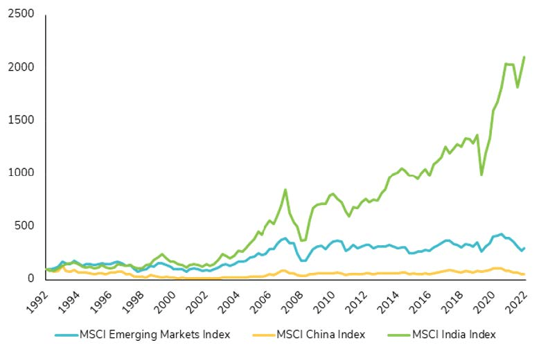
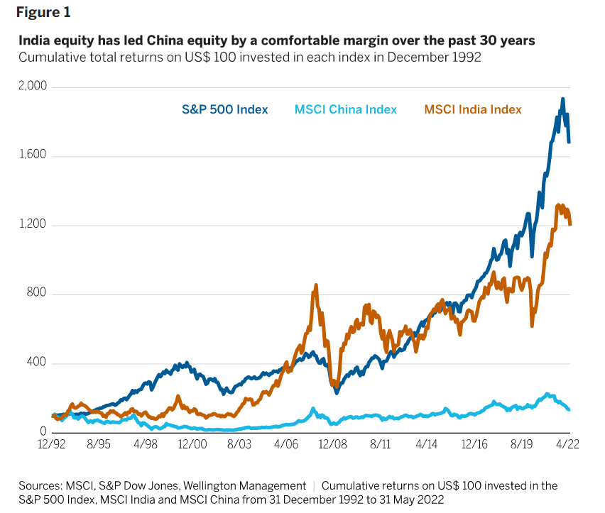
However when it comes to equity markets, Indian stocks have outperformed Chinese stocks by a huge margin in the past 30 years. From a recent article at Wellington Management:

Consider three major global equity markets: China, India, and the US. Of the three, would you believe India has been the second-best performer over the past 30 years, well ahead of China? It’s true.

Figure 1 shows the cumulative total returns posted by the S&P 500 Index, the MSCI China Index, and the MSCI India Index from 31 December 1992 through 30 April 2022. Our clients have been uniformly surprised that China’s long-term performance has been so much lower than that of the US and India, especially given all the investor focus on China in recent years. And they’ve been even more surprised that India – a market many clients have more or less ignored – has fared so well over the long run.

Click to enlarge

Source: India equity: An unsung long-term performance story, Wellington Management

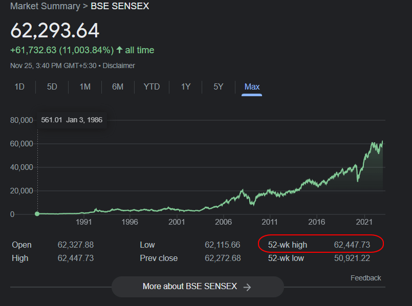
Most emerging markets are in bear markets similar to most developed markets this year. However one standout is India. India’s Sensex is up by over 5% in local currency terms and nearly 7% in US dollars YTD. The index reached an all-time high of 62,447 this year.

Click to enlarge

Source: Google Finance

Below is another chart showing how Indian equities have trounced Chinese equities over the past 30 years:

Click to enlarge

Source: The decade of Indian equities?, SYZ Group

The author of the article is bullish on Indian stocks. He concluded with the below points:

Historically, investors have underestimated Indian equities due to India’s underrepresentation in emerging market indices (11% while GDP represents 45%) and a misperception of risks such as liquidity or market concentration.

In the medium to long term, India should benefit from several favorable winds such as digitalization, the growth of direct-to-consumer trade and the geopolitical reshaping of supply chains.

The biggest risk to this market is a significant and sustained rise in commodity prices, which could negatively impact India’s current and fiscal accounts and push inflation higher.

The ongoing changes in the Indian economy are not fully reflected in the benchmarks. The best way to capture opportunities is to carefully select companies through fundamental and bottom-up research.

Update (12/10/22):

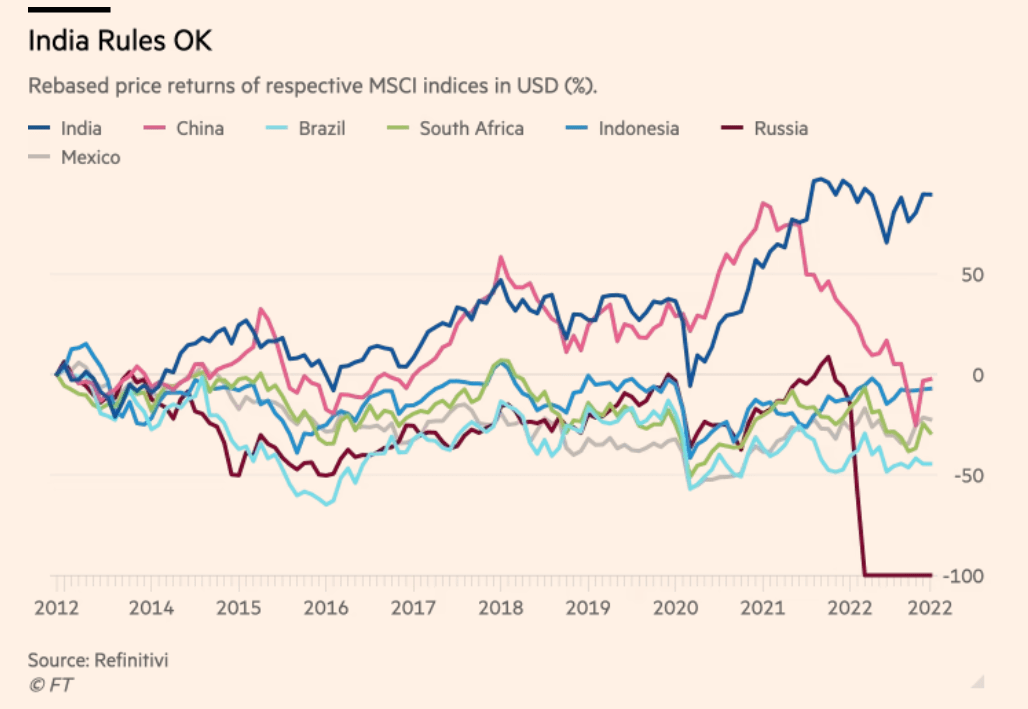
India vs. Other Emerging Markets since 2012:

Source: India takes off?, FT Alphaville

Related ETFs:

  • WisdomTree India Earnings (EPI)
  • iShares S&P India Nifty 50 Index Fund(INDY)
  • PowerShares India ETF (PIN)

Disclosure: No positions

Historical Drawdowns of 15% or more in the S&P 500 Index Since 1928: Chart

The S&P 500 is down just over 16% so far this year as of Nov 25th. The index was down much more earlier in the ongoing bear market. From June thru mid-August stocks recovered only to plunge again. So wise investors are cautiously waiting if the current rise from October will stand. Many market participants consider it as another bear market rally. Should the Fed continue to raise interest rates further at a strong clip each time, the economy could enter a recession early next year. Of course that would not be good for stocks. It is anybody’s guess on how much equities could fall in a recession.

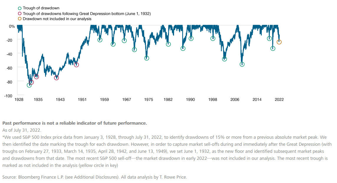
Drawdowns of 15% or more in the S&P 500 have occurred many times in the past. Some of these declines were severe. The last major drawdown occurred during the Global Financial Crisis(GFC) of 2006-08. The following chart shows the historical drawdowns in the S&P 500 since 1928:

Click to enlarge

Source: Contrarian Investing During a Sell-Off: An Update, T. Rowe Price, September 2022 via Investment Office

Related ETF:

  • SPDR S&P 500 ETF (SPY)

Disclosure: No positions

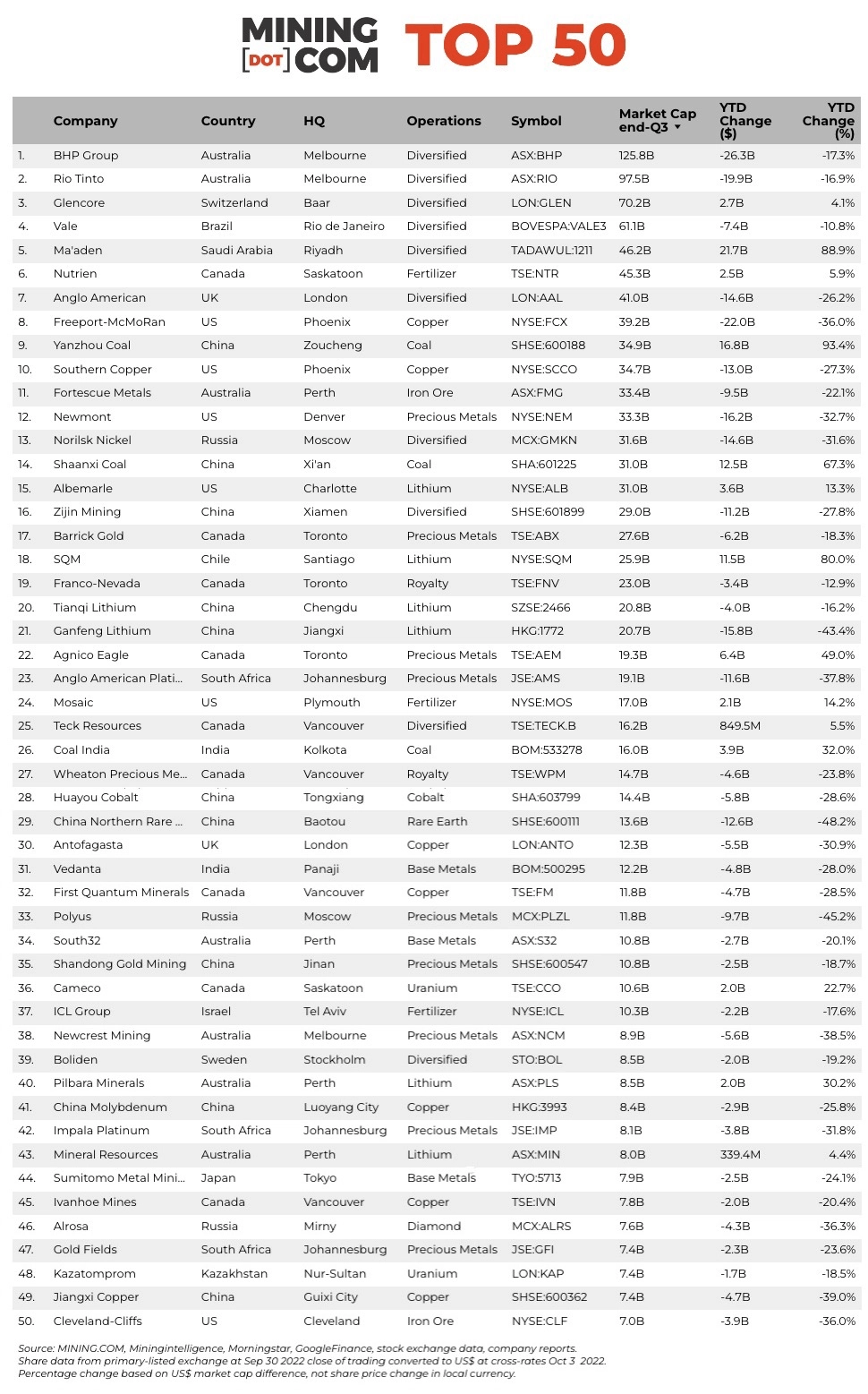
The Top 50 Global Mining Companies 2022

Global equity markets have been volatile this year with most being mostly down. In the commodity markets, its been a similar story with some shining while others falling year-to-date. For example, energy- related commodities such as crude oil, natural gas and coal have been big winners. Even Uranium had one of the best years. The Russian invasion of Ukraine lit a fire under fertilizer ingredient potash leading to a 14-year peak. Growing adoption of EV vehicles by consumers have led to soaring demand for Lithium which is used in making the batteries. By October, Lithium prices have doubled this year. Gold prices have been stagnant to down though it is considered as a safe haven asset during adverse market conditions for equities. Gold prices started the year at over $1,805 per ounce and closed at $1,751 recently.

With that brief intro, let’s take a quick look at the Top 50 biggest mining companies in the world according to a report by Mining.com:

Click to enlarge

*NOTES:

Source: MINING.COM, Miningintelligence, Morningstar, GoogleFinance, company reports. Trading data from primary-listed exchange at September 30, 2022 where applicable, currency cross-rates October 3, 2022. 

Percentage change based on US$ market cap difference, not share price change in local currency.

Market capitalization calculated at primary exchange from total shares outstanding, not only free-floating shares.

Source: The top 50 biggest mining companies in the world, Mining.com

The biggest mining company world based on market cap at the end of Q3, 2022 is BHP Group (BHP) of Australia. The ADR trading on the NYSE is up by 11% YTD. Rio Tinto (RIO) is the second biggest firm and its ADR is down by 1% so far this year.

A few other observations from the report:

  • Vanvouver, Canada- based Teck Resources Ltd (TECK) has benefitted from its exposure to Canadian oil sands and coal.
  • Coal companies like  Shaanxi Coal, Yanzhou Coal and India’s Coal India have had a great run this year.
  • Lithium producer Sociedad Quimica y Minera de Chile (SQM) has shot up over 82% YTD due to a 10-fold increase in profits and US-based Albemarle Corporation (ALB) has also increased by 15% YTD.
  • Other notable firms in the above list include Vale(VALE) of Brazil, Nutrien Ltd (NTR) of Canada, Southern Copper Corp(SCCO), Mosaic Co (MOS),  Cameco Corp (CCJ) and Cleveland-Cliffs Inc (CLF).

Disclosure: No positions

30 Years of the FTSE 250: Infographic

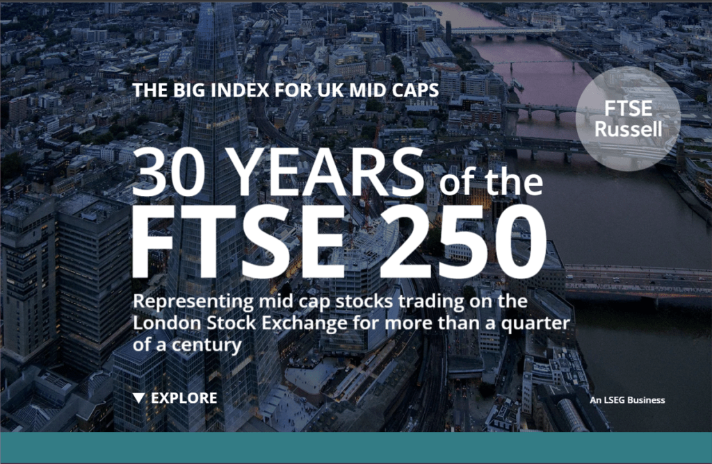
The FTSE 250 Index is the mid-cap index of the UK stock market. The index is a better representation of the British economy than the widely popular FTSE 100 which is more global-oriented. The FTSE 250 index was created 30 years ago in 1992. The following infographic shows some of the major milestones of the index:

Click the image below to go to the infographic page

Link for the Infographic:

30 YEARS of the FTSE 250

Source: FTSERussell