Once upon a time being a citizen of a country used to be a privilege and citizenships were usually not for sale. In today’s globalized world, that is not true anymore. Many countries offer passports for a price. Acquiring citizenship or residency statuses in these countries is easy as depositing a bunch of cash. Cash is king and anyone can acquire a passport as long as they have meet the minimum requirements.
The following table shows the countries that offer citizenship or residency programs for cash:
Click to enlarge
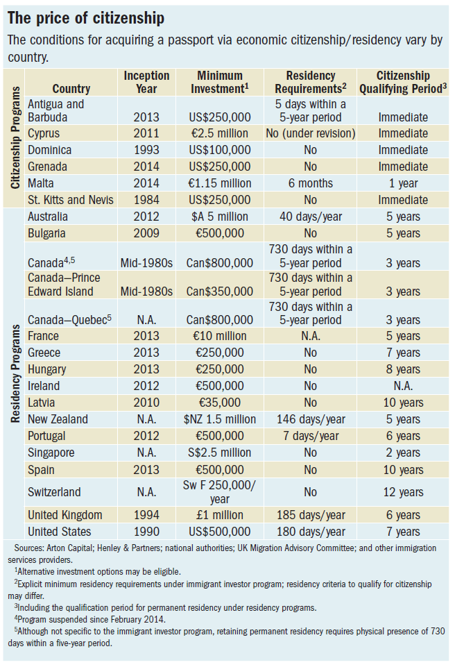
Source: A Passport of Convenience by Judith Gold and Ahmed El-Ashram, Finance & Development Magazine, IMF, December 2015
For example, a farmer in Brazil or China can get a Maltese passport if he can deposit 1.15 million Euros. Among the countries offering these types of citizenships for cash programs, Maltese and Cypriot passports are the best deal since they allow the holder to the most number of countries without a visa.