US Presidential Terms and Annual S&P 500 Returns 1926-2015

Equity investors are bombarded with a multitude of statistics on a daily basis mostly showing past data. However the past does not predict the future and for the most part past performance does not mean predict the future performance of a stock. With the US Presidential election coming up, one of the many stats that often appear in the media include how well the stock market does during the rule of various presidents. People tend to infer answers to questions such as: Are Republican Presidents really good for stock market returns? or Do stocks perform better under Democrats? An article by Ken Fisher of Fisher Investments discussed this topic. From the article:

You may have heard some people claim there’s a reliable, gameable stock market pattern in US presidential terms – that some years are better than others.

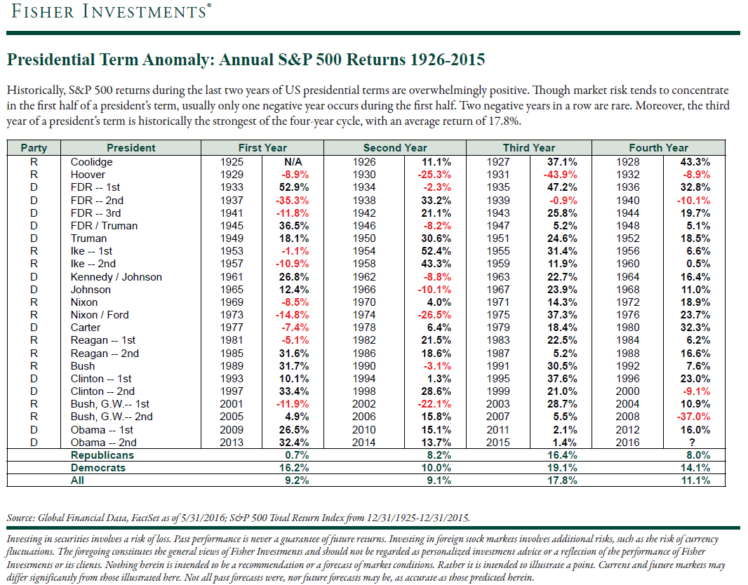
You may also have heard that since 1926, every single year ending in five (1935 1945, 1955, etc) has been positive. Every one! But, you’ve also likely been warned these are silly indicators – as good as voodoo.

The ‘year five’ quirk is just that – a statistical quirk. There have been eight occurrences out of 10 since 1926. Since stocks rise more than fall, you’d normally expect at least two-thirds of those to be positive anyway.

It’s not unreasonable to expect that, with a coin weighted to show heads two-thirds of the time, all eight tosses would be heads. It happens. But it’s still just a quirk.

The following chart shows the Presidential Terms and the Annual S&P 500 Returns since 1926:

Click to enlarge

US Presidential Terms-SP500-returns

Source: Presidential term cycles are stock market voodoo: Fisher’s financial mythbusters, Aug 15, 2016, Money Observer

The entire article is worth a read.

Global Innovation Ranking 2016: China Continues To Move Higher

China is slowly becoming a leading country in innovation. Relative to its peer countries China is far ahead in innovation and R&D spending. While a few years ago the country was known as the “shopping floor for world’s manufacturing” that is no longer the case.

Because of its one-party system and the absence of some social ills that tend to affect democratic countries such as its peers Brazil and India, China is moving up rapidly in many fields. For example, it has became a leader in developing high-speed rail networks and has the world’s longest high-speed rail network. It is also advancing in space exploration. This week’s launch of quantum hack-proof communication satellite is one example.

The following infographic shows how China is leading other countries based on select metrics:

Click to enlarge

China Innovation Ranking Infographic

Source: China Daily

Which Canadian Companies Are In The Fortune Global 500 List?

Fortune magazine recently published its famous Fortune Global 500 ranking for 2016. As usual US-based companies dominate the list. Of the thousands of Canadian companies only 12 made it to the list. The companies are selected based on revenues.

In terms of size, the top ranked Canadian firm in the list is George Weston with revenues of over $36 billion. The complete list of the 12 firms are shown below:

Click to enlarge

Fortune Global 500 Canada Companies

Source: Fortune

A few observations:

  • Of the six major banks, Bank of Novo Scotia(BNS), Royal Bank (RY) and TD Bank(TD) are in the list with RY having the highest revenue.
  • Toronto-based lie insurer(MFC) is still struggling to recover to reach its pre-global financial crisis levels. Ultra-low interest rates and lower investment returns are adversely impacting insurers. Manulife stock trades at about $13 a share. Before the crisis it traded above $46 a share.
  • Oil and gas company Enbridge Inc(ENB) currently has a market cap of about $39 billion and a dividend yield of 3.90%.
  • Auto parts maker Magna International Inc(MGA) has plenty of potential for growth since the stock price has fallen from over $53 a while ago to about $40 recently. Higher automation and on-board electronics systems in newer autos provides continued growth opportunities for auto components suppliers.

Note: Data noted above are as of Aug 12, 2016

Disclosure: Long BNS, MGA, RY and TD

Related:

German Stocks Have Entered Bull Market

German stocks as measured by the benchmark DAX Index have entered a bull market last week. In this post lets review a few points about the DAX index and German equities in general.

The year-to-date return of the DAX:

Click to enlarge

DAX YTD return chart

The 5-year return of the DAX:

DAX 5-year return chart

Note: Data shown are as of Aug 12, 2016

Source: Yahoo Finance

Key points:

  • Since the lows reached in February of this year, the DAX has soared over 20 percent as of Aug 9, the standard definition for a bull market.
  • However unlike other major indices, the DAX return includes dividends. So technically the Dax Kursindex which excludes dividends was up about 18%.
  • The P/E ratio of DAX is about 24.
  • The dividend yield of the index is 2.90%. Since this is high the overall DAX return is boosted unlike other indices.
  • According to Daniel Weston, Chief Investment Officer of Aimed Capital, the bull market in German equities is not supported by economic growth. He noted that since bond yields are negative, yield-seeking investors are chasing stocks with their juicy dividends leading to soaring prices.
  • One of the best performing stocks in Germany is the DAX component Adidas AG (ADDYY). The ADR has shot up by over 78% year-to-date as of Aug 12, 2016.
  • From a long-term investment return perspective, the DAX is a fantastic wealth creator.

Sources:

Disclosure: No Positions

Dividend Payers and Growers Outperform “the Market”

Dividend paying/growing stocks generally outperform non-dividend paying stocks. When dividends are reinvested the compounding effect gives a boost to the overall total return of an equity investment. This effect becomes especially strong over long time periods for obvious reasons. Stocks that not only pay dividends but also grow their dividends consistently year after year tend to yield the highest total return relative to just dividend payers and non-payers.

The following chart shows the dramatic difference in returns between Dividend Payers/Growers  vs.“the Market”:

Click to enlarge

Dividned Growers and Payers vs the Market Chart

Source: Investing for Dividend Growth, Touchstone Investments

From the research report:

As companies become more profitable, they may share more by increasing their dividends. The chart below illustrates a hypothetical
example of dividend payers or growers based on a simulation of the S&P 500 Index. This select group of dividend payers and growers
has outpaced the hypothetical $1,000 investment in the S&P 500 Index on a total return basis by more than a two-to-one margin over
the past 24 years. In fact, the compounded growth of reinvested dividends of this hypothetical model of the Index has exceeded the total
return of the S&P 500 Index (and far outperformed the growth of reinvested S&P 500 Index dividends).

Related ETFs:

  • iShares Dow Jones Select Dividend ETF (DVY)
  • SPDR S&P Dividend ETF (SDY)
  • Vanguard Dividend Appreciation ETF (VIG)
  • Vanguard High Dividend Yield ETF (VYM)

Disclosure: No Positions