On The Composition Of Australian S&P/ASX 200 Index

The benchmark index of the Australian equity market is the S&P/ASX 200 Index. It measures the performance of the 200 largest stocks listed on the Australian Stock Exchange (ASX) by float-adjusted market capitalization.

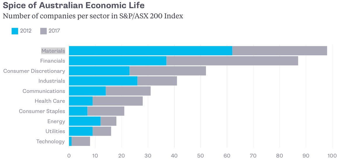
Since Australia is a commodity-based economy, resources form the largest sector in the index. After natural resources, the highest number of companies by sector in the index are financials and consumer discretionary.

The sector composition of the S&P/ASX 200 index is shown in the graphic below:

Click to enlarge


Source: ASX

Compared to the Australian market, the largest sector in the S&P 500 is IT followed by healthcare and financials.

Among the top 20 AS 200 firms are four major banks – Westpac(WBK), ANZ Banking Group Ltd (ANZBY) , National Australia Bank (NABZY) and  Commonwealth Bank (CMWAY).

Please go to this page for The Complete List of Australian ADRs trading on the US market.

Disclosure: Long WBK and NABZY.


US Equity Sector Returns By Year: 2007 To 2016

Diversification across sectors is important for well-diversified portfolio. No sector is the best performer each year. So this year’s best performing sector may turn out to the worst one next year. For example, the tech sector is the hottest one this year with soaring stock prices especially for the FANG stocks. Next year they may not be able to replicate this growth. In the graphic below, the last time the tech sector topped all the other sectors was in 2009.

The following chart shows the various sector returns for US stocks from 2007 thru 2016 full year. Since the return shown for 2017 is for Q1 only we can ignore that last column.

Click to enlarge

SourceSchwab Sector Views: From the Top Down, by Brad Sorensen, Schwab

Back in 2007, energy stocks were the rage with a nearly 35% total return. But in recent years oil prices have collapsed and accordingly in 2014 and 2016 the energy sector was the worst performing sector.But last year the rebound in oil and gas prices propelled energy stocks to the top of the chart with a 27% total return.

The key takeaway for investors is that in additional to diversification across regional, country, value, growth and mid/small.large caps, etc. sectoral diversification is also required for long-term success in equity investing.

What Happens in an Internet Minute 2017: Infographic

I came across the following cool infographic showing what happens in a internet minute in 2017. In just 60 seconds, a staggering 156 million emails are sent, 3.5 searches are made on Google(GOOG)  and 16 million text messages are sent today.

While technology has made all these possible the bigger question is this: Has the internet and social media made people smarter, knowledgeable and critical thinkers (or) is it the other way around?

Click to enlarge

Via Lelde Smits @ Twitter

Disclosure: No Positions

How Copper Shaped Chile’s Economy: Infographic

A few days ago I wrote an article about how commodity prices can strongly impact a country’s equity market performance using the example of Copper and Chile. The importance of copper prices cannot be underestimated for growth of the Chilean economy. The infographic below shows how Copper shaped the Chilean economy:

Click to enlarge

Source:How copper riches helped shape Chile’s economic story, Mining.com

Salvador Allende was the democratically-elected 30th President of Chile. He was overthrown from power in a coup in September, 1973 supported by the CIA. Once Allende was out, it became a question of economic growth via ballots (or) bullets. Chile ended up with the later choice. The Chilean military under General Augusto Pinochet ran the country from that time until 1990. Chile remained under military dictatorship until 1993. Under Pinochet’s thousands of people were killed or disappeared but the country’s economy prospered.

Related ETF:

  • iShares MSCI Chile Investable Market ETF (ECH)

Disclosure: No Positions

The Number of IKEA Stores per Capita by Country: Chart

The number of IKEA stores worldwide by country is interesting to review. However that can lead to misinterpretation since populations of countries very. So an ideal way to compare the number of IKEA stores is at a per capita level – meaning the number of stores compared to population count.

The chart below shows the number of IKEA stores per capita by country:

Click to enlarge

Source: Aaron Strandberg

Iceland has the most number of stores per capita followed by the home country of Sweden.In the US, there are only 1.4 stores per 10 million population. So compared to other countries, IKEA has plenty of potential to expand in the US market.

Also see: Chart: IKEA – Number of Stores and Top Countries for Sales, TFS, 2016

Updates – 9/3/23:

1.IKEA World Map

Source: Deep Resource

2.List of Countries with IKEA Stores

Source: Wikipedia

3.The Biggest IKEA networks in Europe

Source: Statista