The number of years stocks go up is higher than the number of year they go down over the long run. This theory is true for the US equity market also. The number of years the S&P 500 has yielded a positive return much higher than the other way around. The following chart shows the distribution of the returns for the S&P 500 from 1825 to 2020:
Click to enlarge
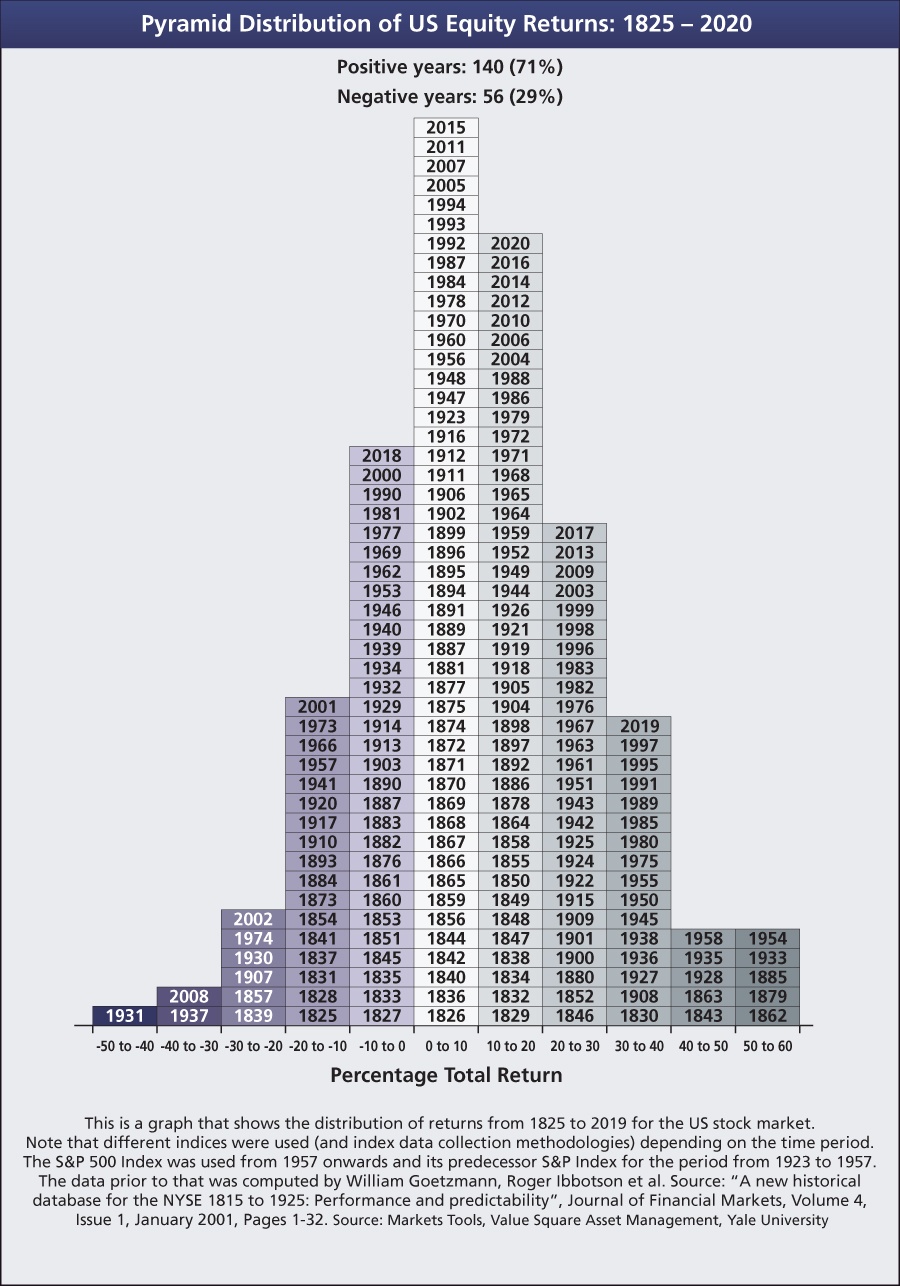
Source: Investment Office
The chart above shows the S&P 500 plunged 40 to 50% only once all the way back in 1931 at the height of the Great Depression. Similarly rise of over 40% in a year has been rare with just 10 years seeing such spectacular increases since 1825.
The key takeaway is that some years are great for stocks while others are not. So over a long period such as a decade or so it evens out leading to a decent return.
Related ETF:
- SPDR S&P 500 ETF (SPY)
Disclosure: No Positions