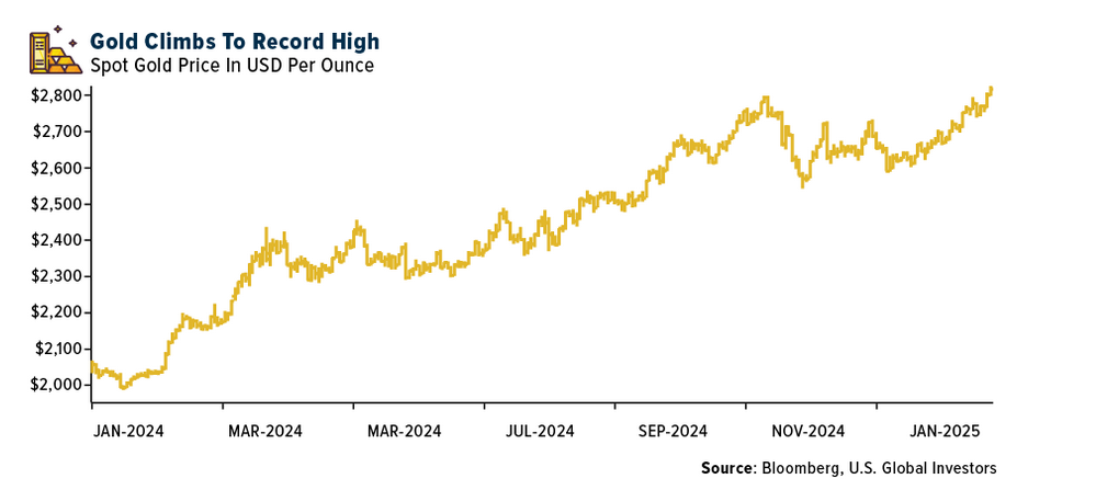
Gold is a safe heaven asset class. During adverse market conditions for stocks gold tend to perform better and vice versa. To put it another way, bear market in stocks can be bull market for gold and vice versa.
The following chart shows the long-term return of Gold vs. S&P 500:
Click to enlarge
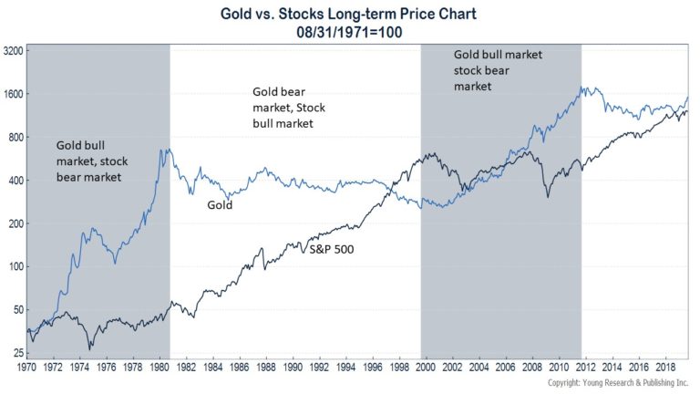
Source: Is Gold a Good Long-term Investment?, Young Research
From the above article:
Since President Nixon closed the gold window in August of 1971, the price of gold has increased more than 37-fold. From a price of $40.65 at month-end August 1971, gold has risen to $1,528 today. A $1,000 investment in gold at the end of August 1971 would be worth over $37,000 today—a compounded annual return of 7.8%.
How Does Gold’s Return Compare to Stocks and Bonds?
Gold’s 7.8% return since August of 1971 compares favorably to the 7.4% return that intermediate-term U.S. Treasury securities delivered over the same time. More surprising to some is that gold has even appreciated more than stocks over this period. From August of 1971 through today, the S&P 500 index has increased at a 7.3% average annual rate. These numbers for the S&P exclude dividends and the reinvestment of dividends, but gold’s returns relative to stocks remain impressive for an asset that many consider to be the ultimate safe-haven. (emphasis mine)
Gold’s performance is comparable to stocks as shown in the above because it does not include dividend reinvestments. The chart shows only the price return of S&P 500. If total return, which includes dividends was used the chart would have looked different.
Going back to the main theme of this post, during the 1980s and 1990s owning gold was a bad idea as stocks soared in a long and strong bull run. However during the 2000s stocks return was modest while gold performed very well.
Updated (Sept 22, 2024):
1.Gold outperforms stocks in the 21st century:
Click to enlarge
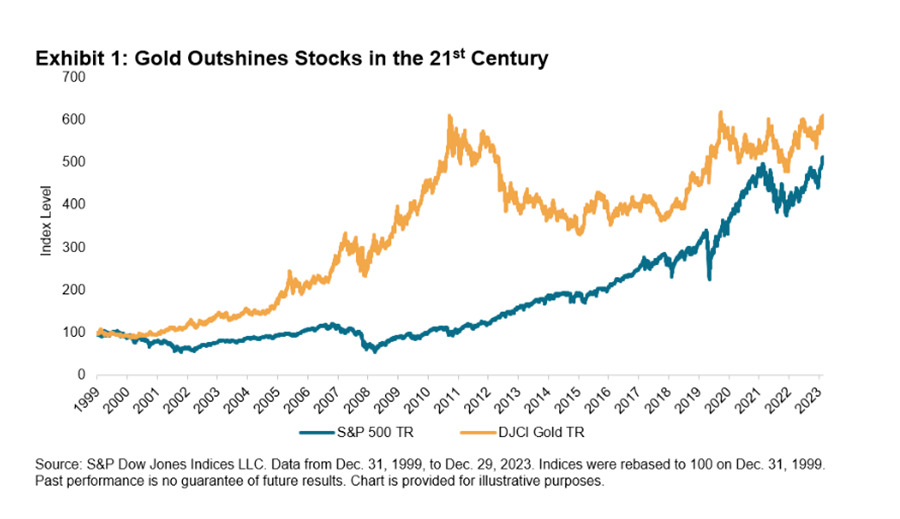
Source: Gold has outperformed the S&P 500 in the 21st century, FX Street
___________________________________________________________________________
a. SP 500 vs. Dow Jones vs Gold vs. Silver – 10 Years Return Chart (From Feb 2014 thru Feb 2024):
Click to enlarge
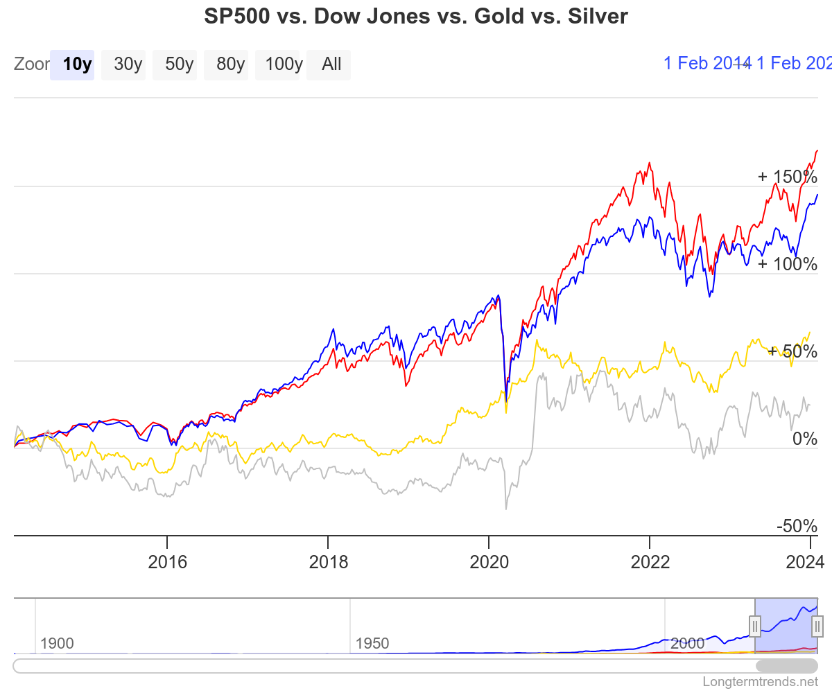
Source: LongTermTrends
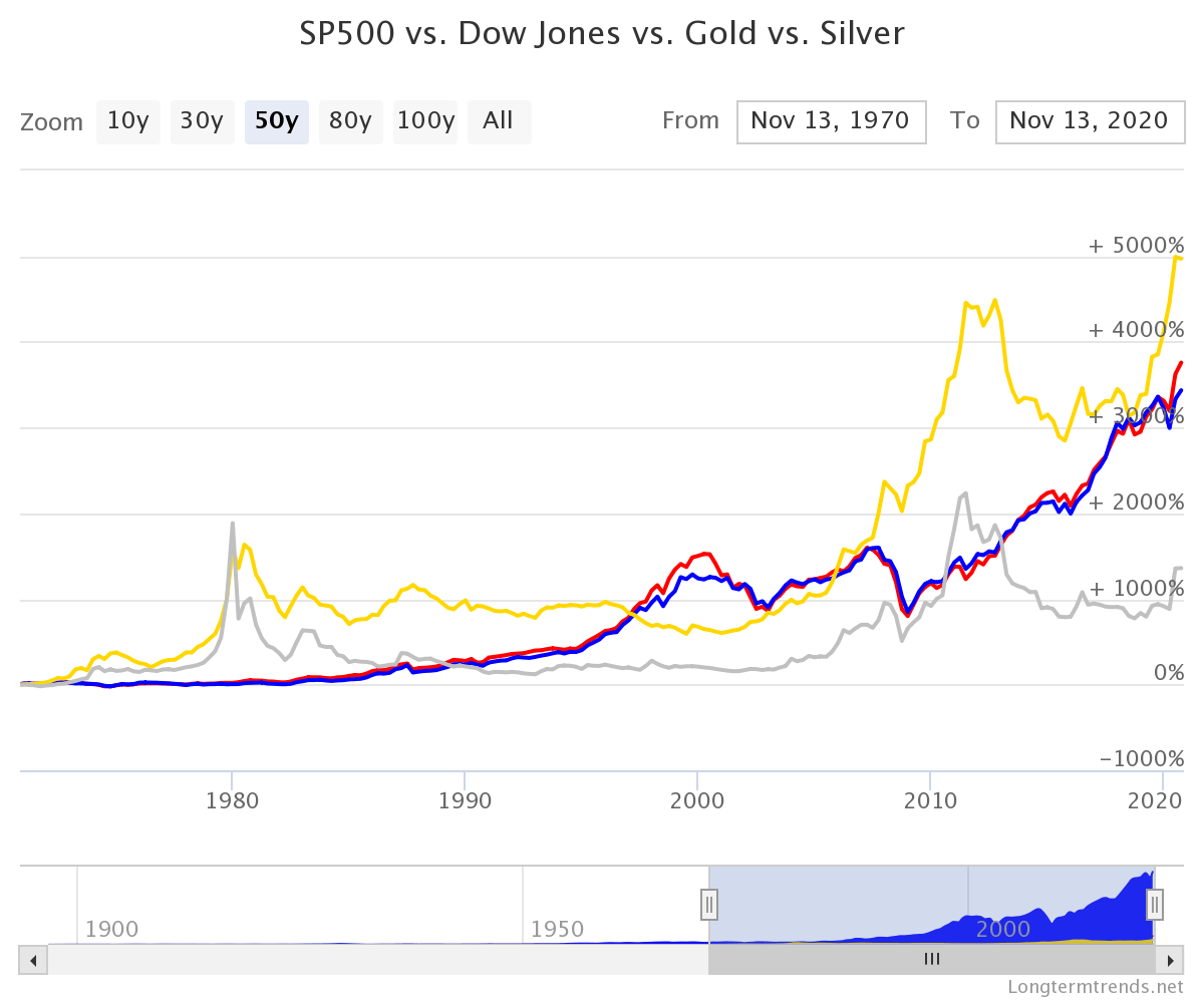
1.SP 500 vs Dow Jones vs Gold – 50 Years Return Chart:
Click to enlarge
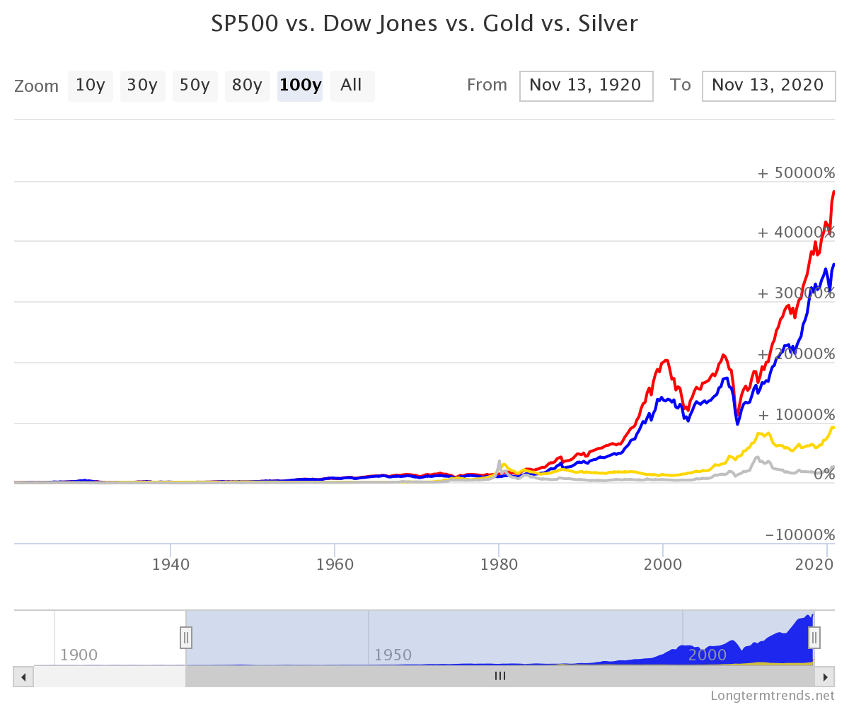
2.SP 500 vs Dow Jones vs Gold – 100 Years Return Chart:
3.SP 500 vs Dow Jones vs Gold 50 Years Total Return Chart (i.e. including Dividends Reinvested)
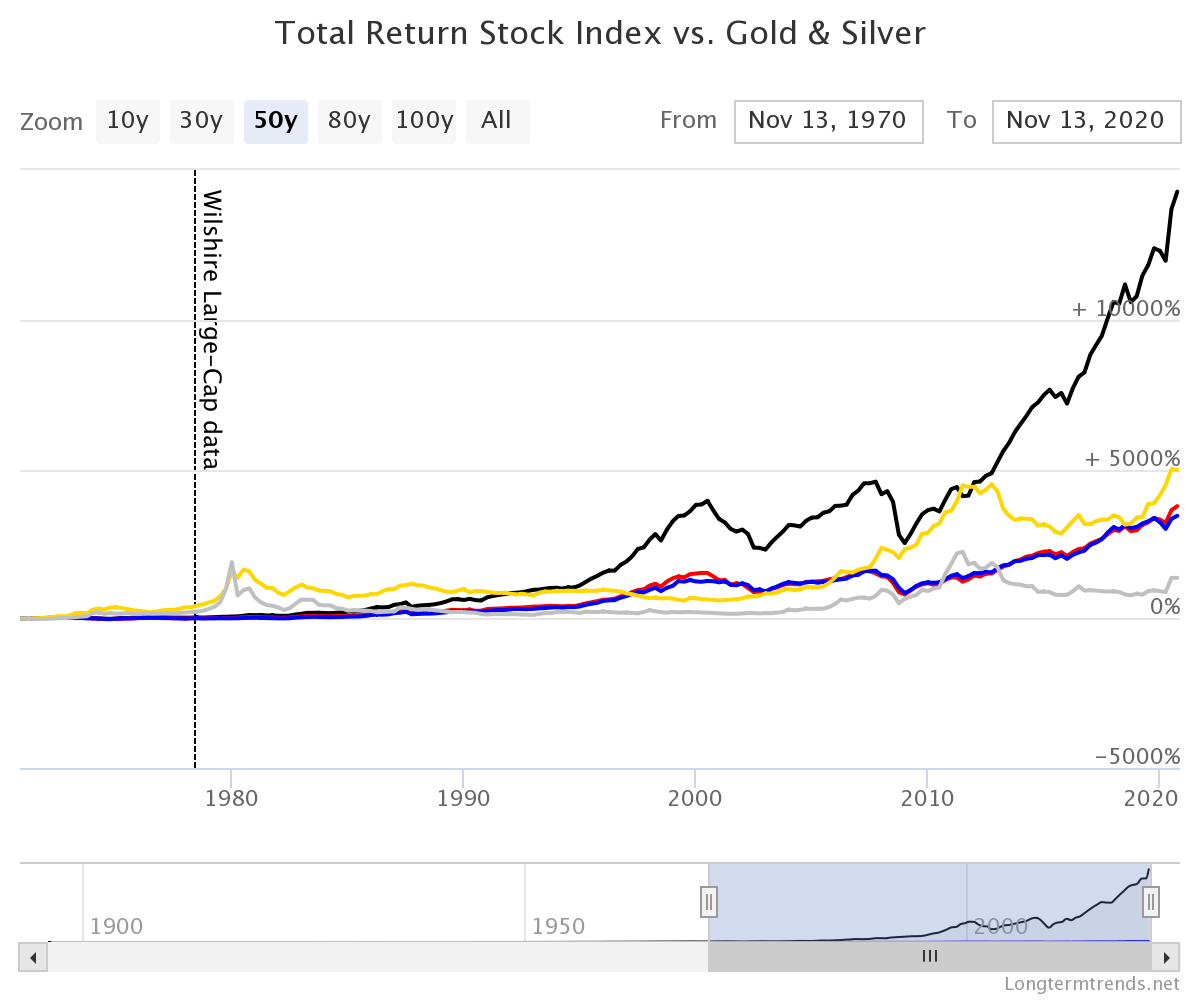
Color Legend:
- S&P 500 Price Index
- Dow Jones
- Wilshire Large-Cap
- Gold
- Silver
Source: Long Term Trends
3.Gold vs. S&P 500 Total Returns Chart From 1990 to 2017:
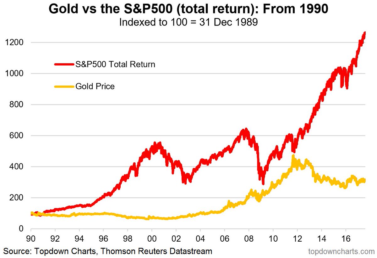
Source: Topdown charts
4.Gold vs. S&P 500 Return Chart From 2000 to 2010:
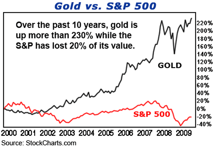
Source: Stockcharts
Related ETFs:
Disclosure: No Positions
Figures don’t lie but liars figure. That 2000 to 2009 chart is very misleading. It picks the prime period where the chart would be most favorable to Gold. Best chart? 50-year chart. Gold does not hold the same position it did historically because the value of money is based on the perception of the safety and stability of governments, not gold bars stashed away in Fort Knox. If you make a major investment in gold today as part of your portfolio, you really lose out!
Agree. That chart just cherry-picked a data period suitable to gold. I just posted it from another source.
I also believe that equities are better than gold for the long-term. Thanks for the comment.
This is excluding the fact that theres companies like Monetary Metals who actually give you a 3% yield on Gold per year. With dividends reinvested, Gold a better performing asset and its not someone else’s liability meaning if the dollar crashed the stock market goes with it but not Gold 👍🏽
Good point. I didn’t know about that. Thanks for the comment.
Investing in metals is still better than leaving money in your savings account where it is eaten away by inflation.
Good point. Thanks for the comment.
i have 40k sleeping in my account. where should i invest in 2025 ?
etf, us stock or gold ? im so confused. thanks for your help.
Hi – Unfortunately I am not able to provide investment advice since I am not a registered advisor. So please contact an advisor in your area. Or you can do your own research and decide on investment opportunities. You can use posts on this site for research as well.
With 40K you should be able to build a decent diversified portfolio with a variety of assets. Good luck !!
I wonder what the total return comparison would look like comparing a variable yield continuously reinvested ranging from 1-3% representing the interest accumulated on gold in gold from something like monetary metals vs the s&p500 with dividends reinvested.
Yeah. That’s an interesting thought for a future post.
When I come across any research on this topic I will write a post. Thanks.