I came across the below funny infographic on European stereotypes by story teller and magician Yanko Tsvetkov based Atlas of Prejudice. Southern Europe has good cuisine while places like UK is not known for any good cuisine.
Click to enlarge
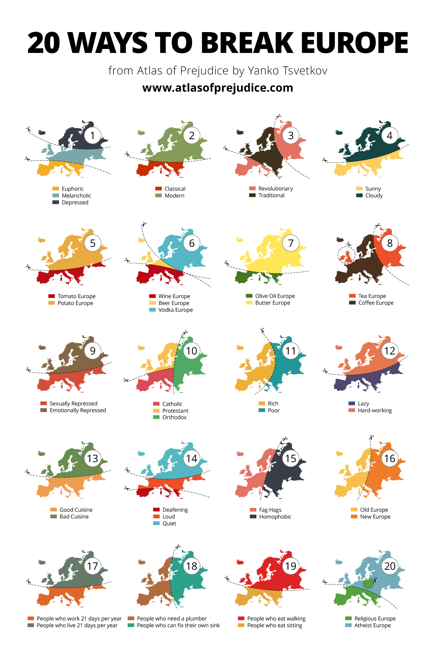
Source: Atlas of Prejudice by Yanko Tsvetkov