The latest edition of The Periodic Table of Investment Returns for the period 2002 to 2021 has been published by Callan. This popular and widely-followed chart shows the annual returns of 9 asset classes ranked from best to worst for each calendar year. In 2021, the best performing asset class was large cap US equities followed by Real Estate and small cap stocks.
Click to enlarge
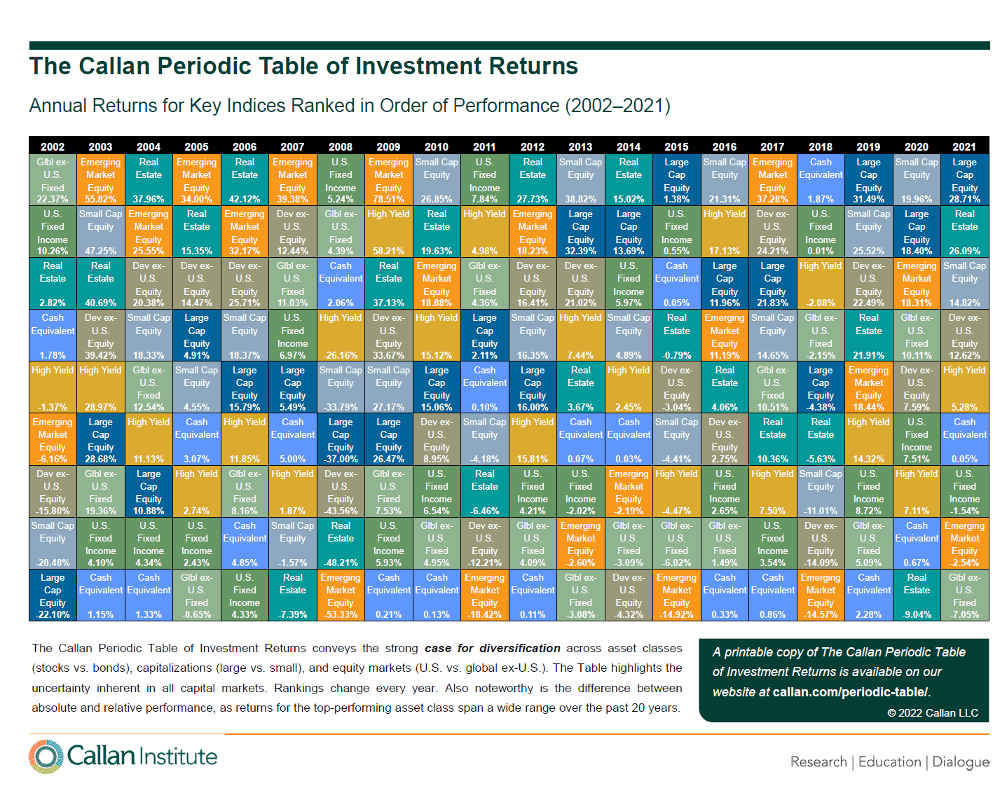
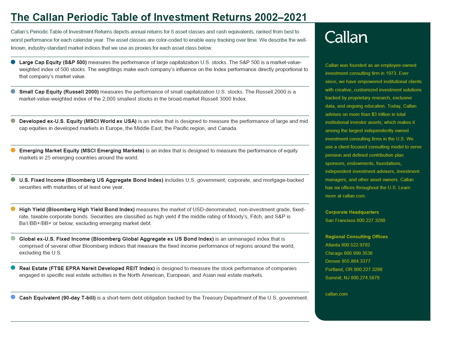
Source: Callan
Download The Callan Periodic Table of Investment Return in pdf format: