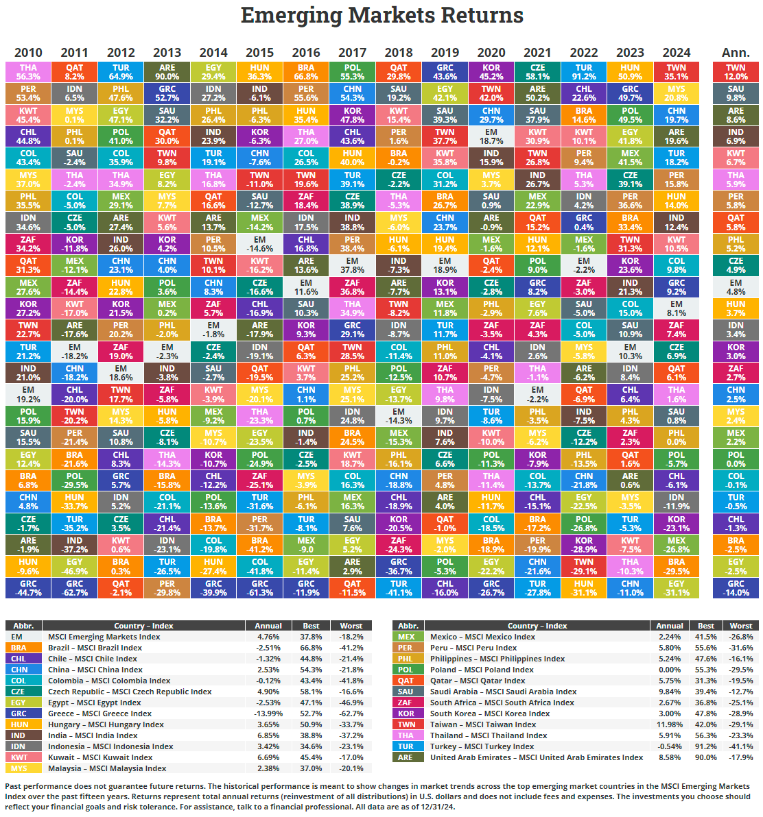
Gold prices are soaring this year. Fears of the fed failing to get inflation under control and potential trade wars with the major partners of the US due to tariffs have investors seeking haven in the yellow metal. Risky assets such as stocks are entering a period of heightened volatility. Yesterday for instance the S&P 500 ended the day with a fall of 0.50%. However the intra-day decline was over 4%. With tariffs on goods from Canada, Mexico and China becoming effective today Feb 1st, investors told equities in the afternoon.
Gold meanwhile has been a strong performer with prices closing over $2,800 this week, a record high. The following chart shows Gold’s continued rise from Jan, 2024:
Click to enlarge
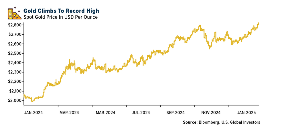
Source: China’s AI Breakthrough Sends NVIDIA Reeling and Sparks National Security Fears by Frank Holmes, U.S. Global Investors
Mish discussed Gold prices in a post yesterday. He also believes that the Fed does not have things under control. Below is a neat chart with his annotations:
Click to enlarge
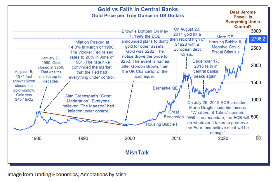
Source: Gold Hits New Record High, Dear Jerome Powell, Is Everything Under Control?, Mish Talk
The complete post in the above link is worth a read.
Lastly I came across the below chart that compares the value of gold as a percentage of global GDP. This ratio reached a record high in 2024.
Click to enlarge
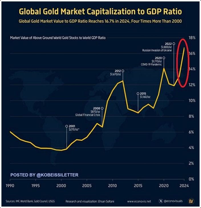
Source: The Kobeissi Letter via The Week in Seven Charts, Syz Group
From the above post:
The ratio of gold’s market capitalisation to global GDP reached a record high of 16.7% in 2024. This ratio has doubled over the past 10 years and quadrupled since 2001. The nominal value of the gold market is nearing a historic record of around $18.5 trillion.
Gold has delivered an average annualised return of +9.5% since 2000, making it one of the best-performing asset classes of this century.
In 2024, the price of gold set 41 historic records and saw its value increase by 33%.
It remains to be seen if gold can continue to maintain the momentum and beat equities this year.
Related ETFs:
Disclosure: No positions