DAX Index Returns By Year From 1955 To 2012

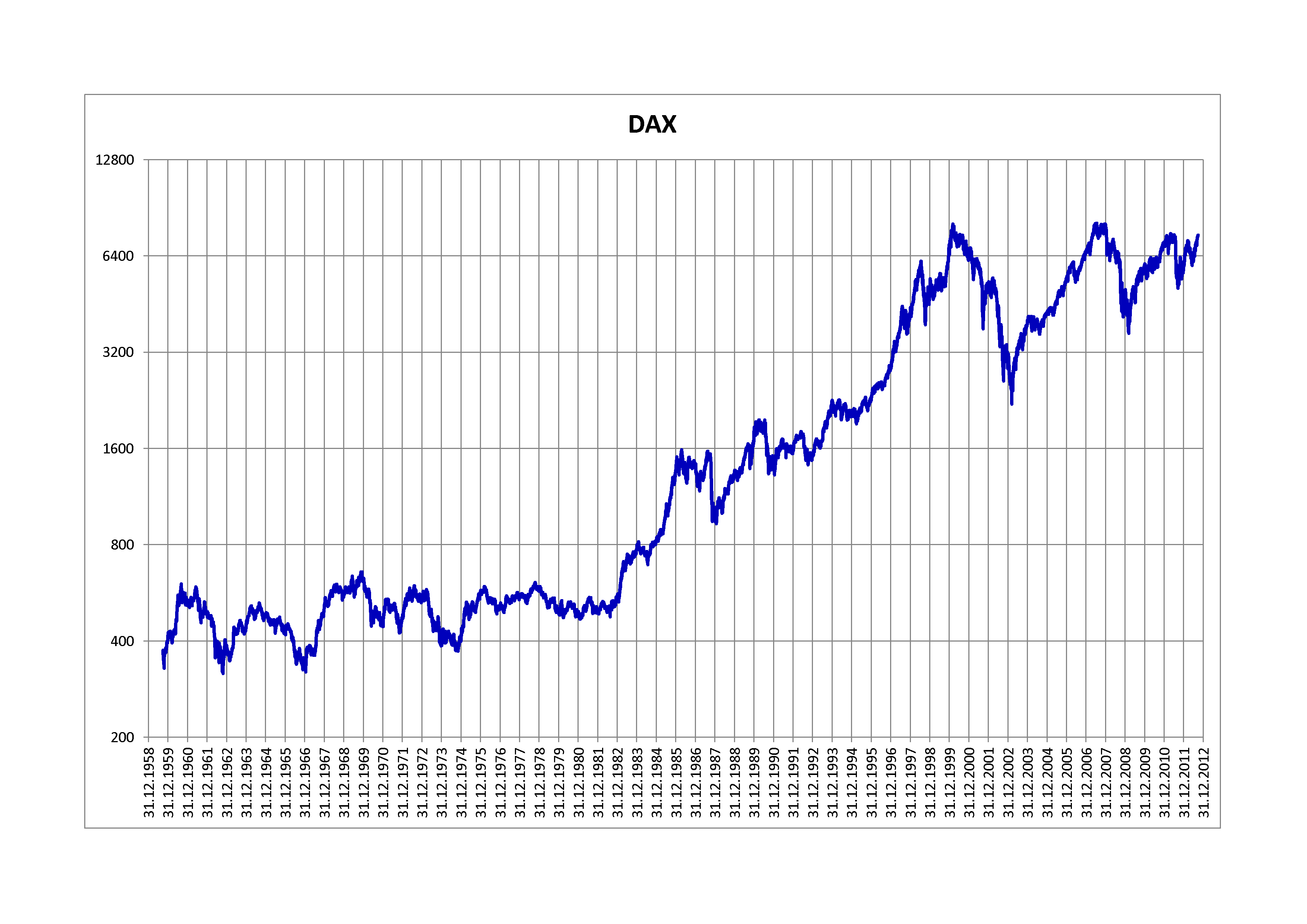
The DAX Index is the German equity market’s benchmark index. The index is similar to the Dow Jones Industrial Average in that it is comprised of 30 blue-chip companies traded on the Frankfurt Stock Exchange.

DAX had  a base value of 1,000 as of Dec 31, 1987. Yesterday it closed at 9,497.84. The chart below shows the performance of DAX since 1958:

Click to enlarge

DAX-Index-Return-since-1058

Source: Wikipedia

While the DAX mostly stayed flat up until 1983 it took off after that year.

The following chart below shows the DAX returns by year from 1955 to 2012:

DAX-Index-Return-by-year

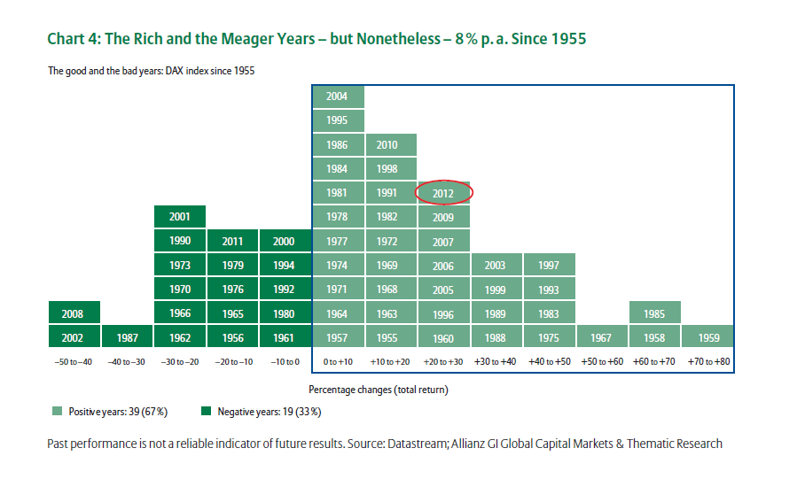
Source: 25 Years of the DAX:Wealth for Everyone, Allianz Global Investors

Writing in the above referenced research report, Hans-Jörg Naumer, Global Head of Capital Markets & Thematic Research Allianz Global Investors noted the interesting fact on the long-term performance of DAX:

In hindsight, there is no doubting that the DAX has created wealth. It has increased more than eightfold in its nearly 25 years of existence. Put another way: Someone who put 1,000 (or close to 2,000 DM) euros into the DAX back then would have around 8,500 euros at the end of May 2013. It has been,despite all the highs and lows, a good investment.It’s interesting to note: 46 % of DAX performance came from dividend distributions.

Two other points called out by Mr.Naumer are:

  • The DAX has generated 7.9% per annum in the past 25 years while German government bonds yielded 6.8% on an average.
  • Since 1955 the returns have been mostly positive in the vast majority of the years. In 39 years the returns were positive compared to 19 years in which returns were negative.

During the global financial crisis of 2008, the index fell between 40% to 50%. However since then it has generated positive total returns every year except 2011. Similar to the US equity markets the DAX also posted solid gains in the late 1990s during the high-tech boom years. For example, the index had a total return of 30 to 40% in 1999 .

Related ETF:

  • iShares MSCI Germany Index Fund (EWG)

Disclosure: No Positions

Could The U.S. Dollar Lose Its Reserve Currency Status?

The U.S. dollar has been the world’s preferred reserve currency since the end of World War I. The fact that about 60% of the world’s foreign exchange reserves are held in U.S. dollars proves that the world continues to maintain the faith in the dollar.

The U.S. is a debtor country. The government borrows heavily from both the domestic public and foreigners in order to fund its expenses.  In fact as of Jan 6, 2014 the total public debt outstanding is $17,310,216,315,568.94 with the debt held by the public at $12,333,870,746,301.06 and the rest as intragovernmental holdings according to the U.S. Department of the Treasury.

Foreigners hold about $5.6 Trillion of U.S. debt as of Oct 2013. China is the largest creditor to the U.S. holding about $1.3 Trillion of US debt.

From The Absolute Return Letter, Nov 2013 by Niels C. Jensen of Absolute Return Partners LLP:

The Americans seem to take their status for granted. Perhaps they need a reminder that reserve currency regimes come and go (chart 9). Given its status as a large debtor nation with insufficient domestic savings to finance its deficits internally, it could prove very painful, should the rest of the world decide that it is time for a change. The longer QE goes on for, the more likely that is to happen.

Click to enlarge

World-Reserve-Currency-Regimes-Since-1400

Source: Euthanasia of the economy?, The Absolute Return Letter, Nov 2013, Absolute Return Partners LLP

Despite being a large debtor country I believe it is highly unlikely that the dollar would lose its reserve currency status anytime soon. However we can think of some scenarios where the dollar could go from the world’s most preferred currency to a normal currency or even a worthless currency. Some of the scenarios which can make the U.S. dollar lose its coveted reserve currency status include the world losing faith in Uncle Sam for whatever the reason, China asking the debtor to repay its loans in full, social unrest, political chaos, etc.

South Africa’s FTSE/JSE All-Share Index Returns By Year

Page Updated: Mar 31, 2018

The FTSE/JSE All-Share Index is the leading benchmark of the South African equity market. It contains 165 companies listed on the Johannesburg Stock Exchange (JSE) based on market capitalization.  The dividend yield of the index as of Dec 31, 2013 was 2.72%.

The Top 10 Holdings and the weights in the index at the end of 2013 are shown below:

Click to enlarge

FTSE-JSE-All-Share-Index-Top-10-Components

Source: FTSE

The FTSE/JSE All-Share Index Returns By Year from 1974 thru 2017 are shown in the chart below:

Click to enlarge

The table below lists the FTSE/JSE All-Share Index Returns By Year from 1974 thru 2016:

YearJSE All Share Index Return
1974-0.8%
1975-18.9%
1976-10.9%
197720.6%
197837.2%
197994.4%
198040.9%
19810.8%
198238.4%
198314.4%
19849.4%
198542.0%
198655.9%
1987-4.3%
198814.8%
198955.7%
19905.1%
199131.1%
1992-2.0%
199354.7%
199422.7%
19958.8%
19969.4%
1997-4.5%
1998-10.0%
199961.4%
20000.0%
200129.3%
2002-8.1%
200316.1%
200425.4%
200547.3%
200641.2%
200719.2%
2008-23.2%
200932.1%
201019.0%
20112.6%
201226.7%
201321.4%
201410.9%
20155.1%
2016-0.0%
2017 21%

Source: Allan Gray 

Download Data:

Related ETF:

  • iShares MSCI South Africa Index (EZA)

Related Links:

Related:

Disclosure: No Positions

Dividend Growers Outperform Dividend Paying Stocks

Dividend-paying stocks generally beat non-dividend paying stocks in the long run. However stocks that grow their dividends outperform dividend-payers in the long-term due to the effect of compounding and rising dividends.

The graph below shows that dividend growers outperform dividend payers in terms of total returns over the long run:

Click to enlarge

Dividend-Growers-vs-payers

Source: Earning dividend income just makes sense, AGF Investments

The data shown above is for the S&P/TSX Composite Index, the benchmark index of the Canadian equity market from Dec 1986 to Dec 2012. It is not surprising to see that non-dividend payers are the worst performers. While dividend-payers yielded a total portfolio return of just over 10% dividend-growers earned even higher with returns of 12%.  Hence from an investment standpoint, investors should select dividend-growers over dividend-payers when building a portfolio for the long-term such as for retirement.

In order to identify some dividend growing stocks I referred to the S&P/TSX Dividend Aristocrats Index. The definition of this index is as follows:

S&P/TSX Canadian Dividend Aristocrats® measures the performance of companies included in the S&P Canada BMI that have followed a policy of consistently increasing dividends every year for at least five years.  Index constituents are weighted according to their indicated yield as of the last trading date in November.

Source: S&P Dow Jones Indices LLC

Ten stocks from the S&P/TSX Canadian Dividend Aristocrats index are listed below with their current dividend yield:

1.Company: Bank of Nova Scotia (BNS)
Current Dividend Yield: 3.79%
Sector: Banking

2.Company: TransCanada Corp (TRP)
Current Dividend Yield: 3.82%
Sector: Oil & Gas Transportation

3.Company: TELUS Corp (TU)
Current Dividend Yield: 4.17%
Sector: Telecom

4.Company: BCE Inc (BCE)
Current Dividend Yield: 5.11%
Sector: Telecom

5.Company: Toronto-Dominion Bank (TD)
Current Dividend Yield: 3.48%
Sector: Banking

6.Company: Suncor Energy Inc (SU)
Current Dividend Yield: 2.19%
Sector: Energy

7.Company:Rogers Communications Inc(RCI)
Current Dividend Yield: 3.68%
Sector: Wireless Telecom

8.Company:Imperial Oil Ltd (IMO)
Current Dividend Yield: 1.12%
Sector: Energy

9.Company:Canadian Pacific Railway Ltd (CP)
Current Dividend Yield: 0.88%
Sector: Railroads

10.Company: Thomson Reuters Corp(TRI)
Current Dividend Yield: 3.45%
Sector:Media

Note: Dividend yields noted above are as of Jan 6, 2014. Data is known to be accurate from sources used.Please use your own due diligence before making any investment decisions.

Disclosure: Long BNS, TD

An Introduction To Bolivian Economy

The South American country of Bolivia is bordered by Argentina, Brazil, Chile, Paraguay and Peru. The country has a population of over 10.4 million. Here is a brief overview on the economy of Bolivia from CIA’s The World Factbook site:

Bolivia is one of the poorest and least developed countries in Latin America. Following a disastrous economic crisis during the early 1980s, reforms spurred private investment, stimulated economic growth, and cut poverty rates in the 1990s. The period 2003-05 was characterized by political instability, racial tensions, and violent protests against plans – subsequently abandoned – to export Bolivia’s newly discovered natural gas reserves to large Northern Hemisphere markets. In 2005, the government passed a controversial hydrocarbons law that imposed significantly higher royalties and required foreign firms then operating under risk-sharing contracts to surrender all production to the state energy company in exchange for a predetermined service fee. The global recession slowed growth, but Bolivia recorded the highest growth rate in South America during 2009. During 2010-12 high world commodity prices sustained rapid growth and large trade surpluses. However, a lack of foreign investment in the key sectors of mining and hydrocarbons, along with growing conflict among social groups pose challenges for the Bolivian economy.

Some of the interesting facts about the Bolivian economy are listed below:

  • The GDP was over $56.0 billion in 2012 based on purchasing power parity.
  • The population below poverty line is about 50%. Poverty line is generally defined as living on less than $2 per day.
  • Bolivia’s major exports are:natural gas, soybeans and soy products, crude petroleum, zinc ore and tin. The major export partners are:  Brazil, Argentina, U.S. and Peru.
  • The major imports are: petroleum products, plastics, paper, aircraft and aircraft parts, prepared foods, automobiles and insecticides. The top import partners are: Chile, Brazil, Argentina, U.S., China, Peru and Venezuela.

Source:  The World Factbook, CIA

A few other facts about Bolivia from Deutsche Bank’s Frontier Country Report are listed below:

  • Real GDP is projected to grow by 5% in 2014.
  • Most of the FDI inflows are into the existing gas-producing companies.
  • Gross public debt stood at 31% of the GDP.
  • Bolivia is net creditor country with persistent current account surpluses.
  • Some of the top weaknesses of Bolivia are: Poor business environment, corruption, nationalization of private firms, high political risk and frequent social unrest discourage private investment. Bolivia depends heavily on commodity exports especially hydrocarbons as shown in the chart below:

Click to enlarge

Bolivia-Exports-Composition

Source: Bolivia, Frontier Country Report, Dec 20, 2013, Deutsche Bank Research

  • Revenue from hydrocarbon exports accounted for about 45% of total public revenue. Bolivia’s natural gas is shipped exclusively to neighboring Brazil and Argentina. The high dependence on commodities exposes Bolivia’s economy to the volatile fluctuations of global commodity prices.

From an investment perspective, none of the companies from Bolivia are listed on the NASDAQ or NYSE. In addition, no country-specific ETF currently exists for Bolivia.