One of the important factors that investors should have for success in stock investing is keeping control of one’s emotions. Though things like fundamental data, macro economic indicators, charts, etc. are also important to review and analyze before making an investment decision, not falling for emotional volatility is also important. This means having a strong stomach when markets experience extreme volatility.
I came across the following The Sentiment Cycle chart published by Schroders Investment Management of UK:
Click to enlarge
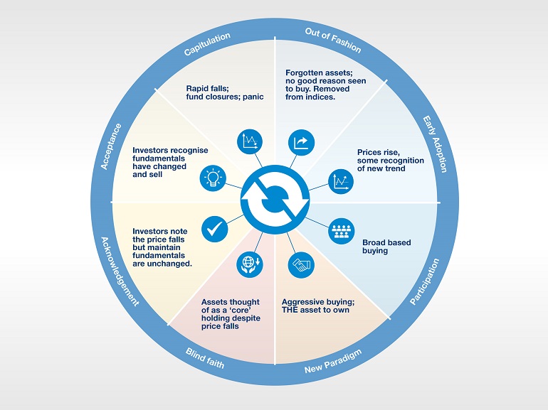
Source: Schroders
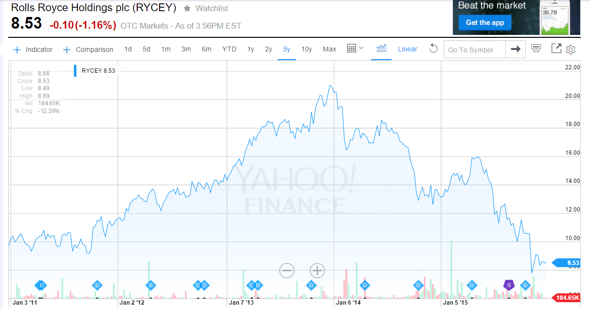
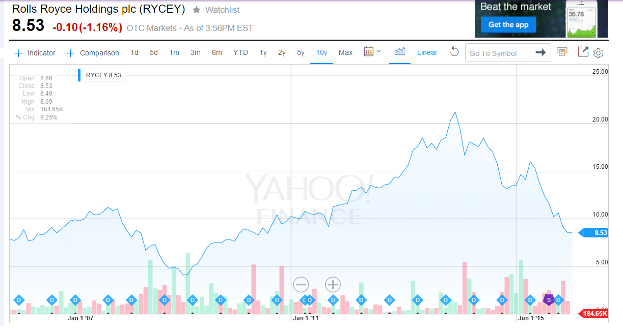
This cool chart is self-explanatory. In the New paradigm phase, investors pile on an asset and prices continue to accelerate. The asset becomes THE asset town. In the current environment FANG stocks come to mind. Facebook(FB), Amazon(AMZN), Neflix(NFLX) and Google(GOOG) have become the darlings of investors this year due to substantial gains and the belief that the future belongs to these firms. However all these companies are in the tech field and it is not impossible for some company to dislodge their leadership positions. During the dot con boom, Yahoo(YHOO) seemed to be the must-hold stock due to its strong position in the search/directory field. Then venture capitalists started favoring Google over Yahoo because Google was better and ever since Yahoo has become useless for most internet users.
Apple(AAPL) is one stock that is in the Blind Faith and Acknowledgement Phase. A few years ago Apple become the must own stock and is now a core holding of many funds and individual investors alike. However nobody knows for sure if the company can continue to bring interesting products to the market and more importantly will consumers will be willing to pay their over-priced products. The failure of Apple watch is one example where consumers did not want pay a few hundred dollars for a glorified digital watch despite all the media hype. So 10 year or even 25 years from now what will happen to Apple the company and Apple stock is anybody’s guess. However the current assumption of investors is that the fundamentals of the company has not changed and it is better to keep holding the stock despite slight declines this year.
Disclosure: No Positions