S&P 500 Index Annual Returns From 1926 To 2020: Chart

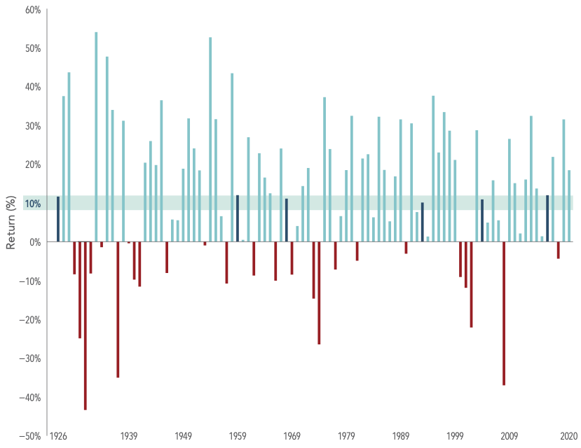
Stocks generally tend to perform well over the long-term. However in the short-term stocks can be volatile and extreme crashes are also possible. Since it is impossible to predict when the equity market soar or decline it is wise to be patient and hold investments over many years. The US equity market has had many up years than down years since 1926 as shown in the chart below:

Click to enlarge
Past performance is no guarantee of future results. Actual returns may be lower. Investing risks include loss of principal and fluctuating value. There is no guarantee an investment strategy will be successful. Indices are not available for direct investment. Index returns are not representative of actual portfolios and do not reflect costs and fees associated with an actual investment. In US dollars. S&P data © 2021 S&P Dow Jones Indices LLC, a division of S&P Global. All rights reserved. Dimensional Fund Advisors LP is an investment advisor registered with the Securities and Exchange Commission.

Source: The Bumpy Road to the Market’s Long-Term Average, Madden Funds

From 1926 to 2020, in just six years the average annual return came close the long-term average of 10%. Yearly returns have reached as high as 54% while yearly declines have been as low as 43%. So markets tend to go the extreme on either direction.

As mentioned earlier, the good news is the market has been up 70 times and down only 25 times since 1926.

The key takeaway is investors should not worry about one day or one week or one year declines. Instead they should keep their focus on achieving the long-term goal of earning a better return with equities than other investment options.

Related ETF:

  • SPDR S&P 500 ETF (SPY)

Disclosure: No positions
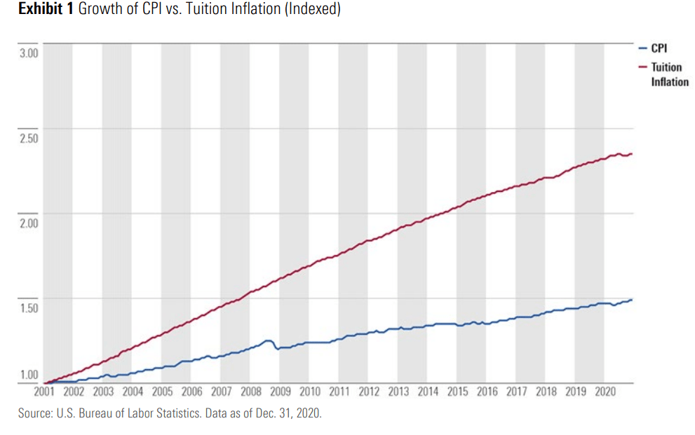
Growth of Consumer Price Index (CPI) vs. Tuition Inflation: Chart

College tuition in the U.S. has increased consistently for many years now. I have written a few articles on this topic some of which can be found here and here and here. The following chart shows college tuition has more than double since 2001 relative to Consumer Price Index (CPI):

Click to enlarge

Source: Your Personal CFO – Bourbon Financial Management

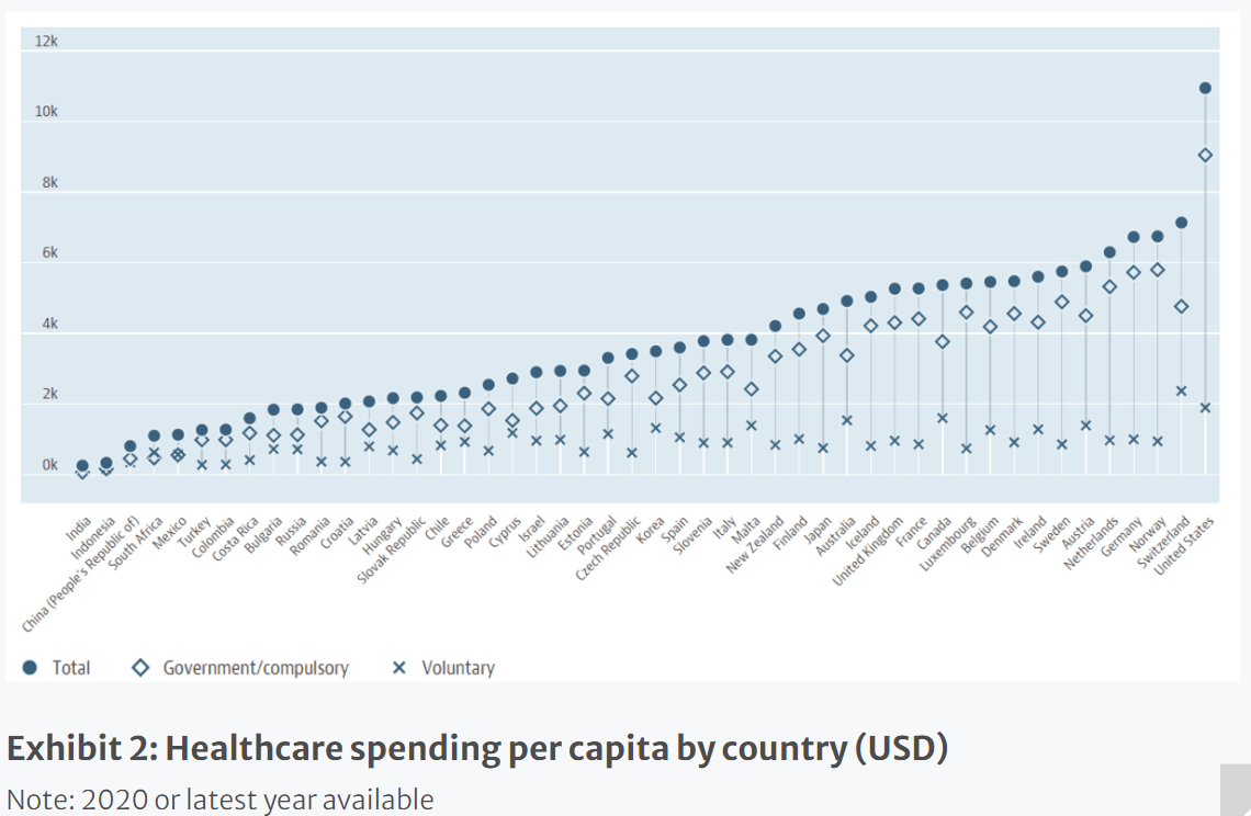
Healthcare Spending per Capita by Country 2020: Chart

Healthcare spending varies across OECD countries. The average OECD country spends about 10% of its GDP on healthcare. However the US is an outlier and spends more than 17% of its GDP on healthcare.

The following chart shows healthcare spending per capita in OECD countries in US dollars. This chart does not show the figures as a percentage of GDP though.

Click to enlarge

Chart Source: OECD

Source: The Healthcare (R)evolution by Niels Clemen Jensen, Absolute Return Partners LLP

According to Mr.Jensen, despite spending the highest on healthcare Americans have one of the lowest life expectancies in the OECD.

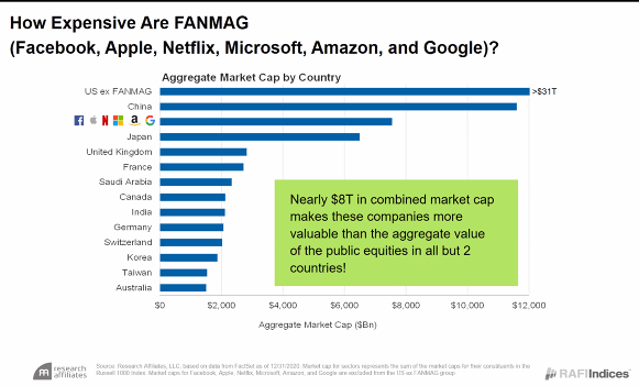
How Expensive Are FANMAG: Chart

The combined market caps of the six tech giants – Facebook(FB), Aaple(AAPL), Netflix(NFLX), Microsoft(MSFT), Amazon(AMZN) and Alphabet(GOOG) – are bigger than the equity market caps of many countries. In fact, according to a chart published by RAFI Indices last month, only two countries have market caps that are higher than that of the FANMAG’s market caps. These countries are the US excluding FANMAG and China.

It is indeed shocking that equity markets of countries like Germany, the UK, Canada, etc. are lower in value than these US tech champions. Germany for example is an engineering powerhouse with world-class companies including auto giants like BMW, Benz, Porsche, etc. and chemical leaders like Bayer and BASF. But the market values all these companies and others in the entire country lower than FANMAGs.

To put the numbers in perspective, at the end of August the total market cap of all German companies listed on the Frankfurt Stock Exchange was 2.23 Trillion Euros. As of market close on Friday Apple’s market cap was $2.4 Trillion.

Click to enlarge

Source: RAFI Indices via BFM

Disclosure: No Positions

Bulls, Bears And The Benefits of Long-Term Stock Investing: Chart

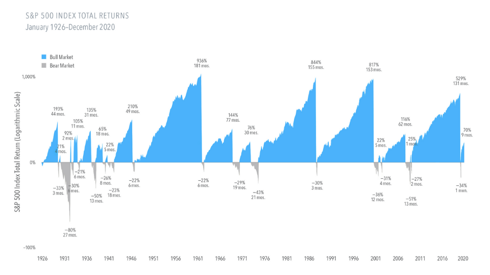
Investing for the long-term is the best investment strategy as the stock market traditionally goes higher over the long-term but tends to be volatile in the short-term. Over the many decades from 1926 thru 2020, S&P 500 has had many bull markets than bear markets. In fact, many bull markets were longer than bear markets. So an investor that held stocks patiently over both the bull and bear markets was rewarded well.

Click to enlarge

Source: Bulls, Bears, and Long-Term Benefits of Stock Investing by Ginnie Baker, Beaird Harris

From the above article:

From 1926 through 2020, the S&P 500 Index experienced 17 bear markets, or a fall of at least 20% from a previous peak. The declines ranged from —21% to —80% across an average length of around 10 months.

On the upside, there were 18 bull markets, or gains of at least 20% from a previous trough. They averaged 54 months in length, and advances ranged from 21% to 936%.

Related ETF:

  • SPDR S&P 500 ETF (SPY)

Disclosure: No positions