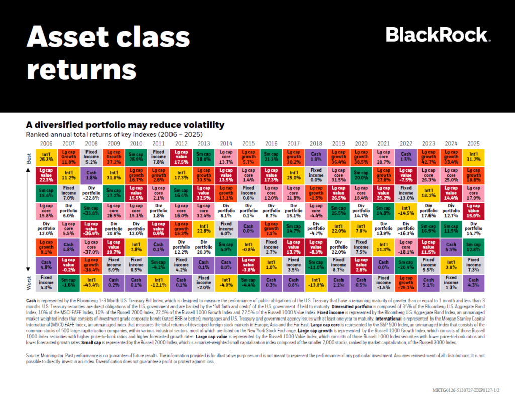
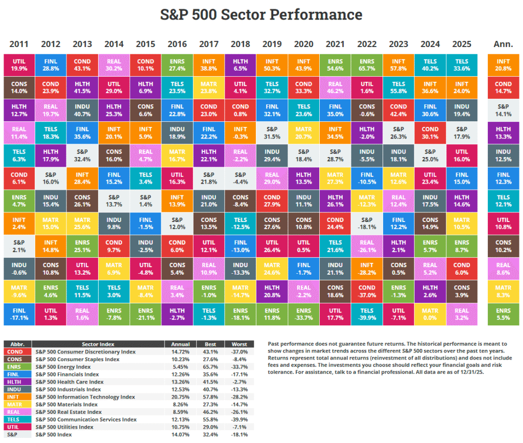
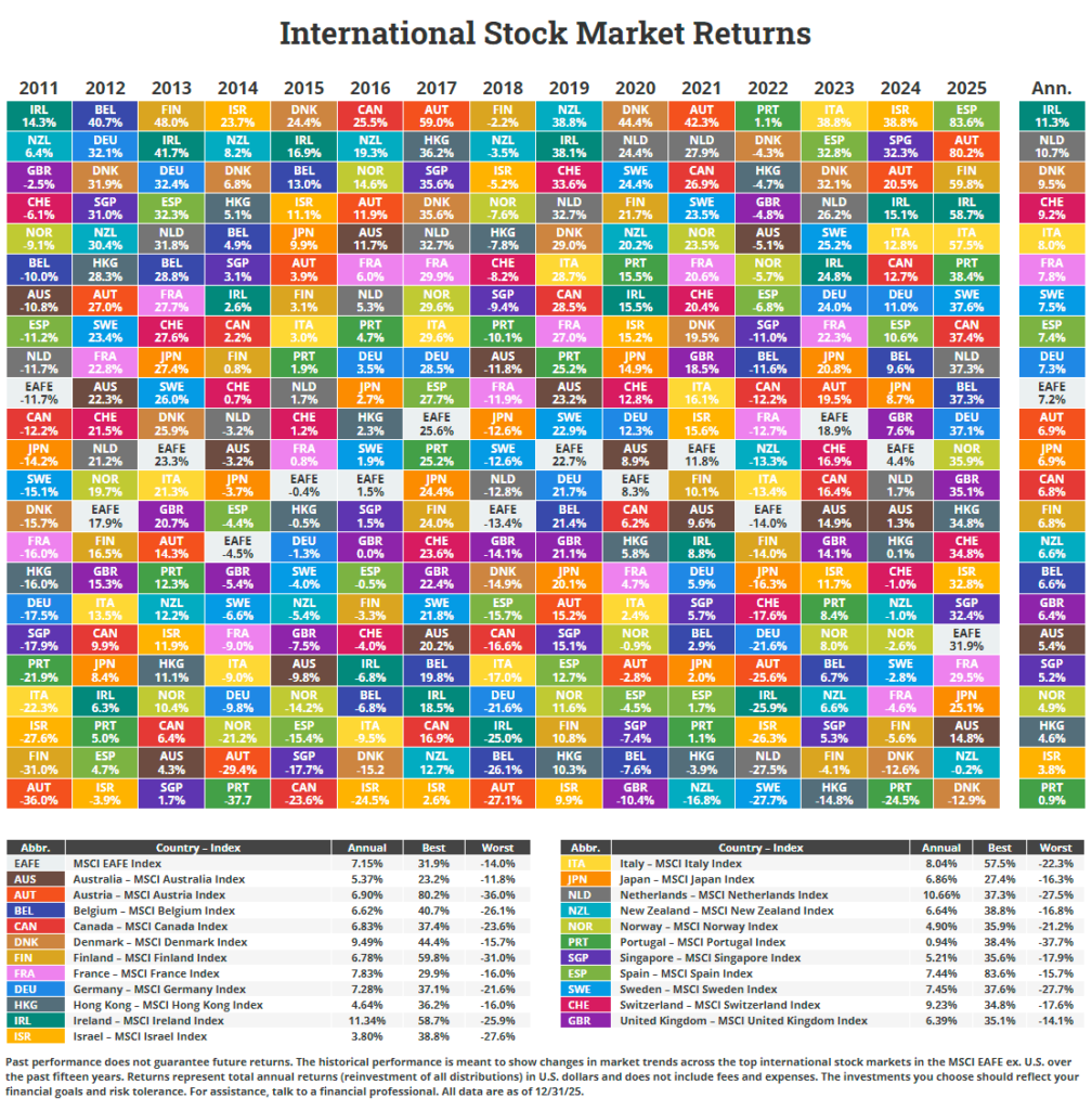
One of the strategies for success with investing in stocks is diversification. It is probably the easiest way to reduce risk while allowing room to capture any profit potential. The most popular chart that visually demonstrates the importance of diversification is The Callan Periodic Table of Investment Returns. Similar to the performance variance of sectors year over year, the returns of country indices also vary. A country’s equity market may be the top performer in one year while becoming the worst next year. No country consistently remains as the best market every year.
The following chart shows the annual returns of 22 developed markets from 2002 to 2021:
Click to enlarge
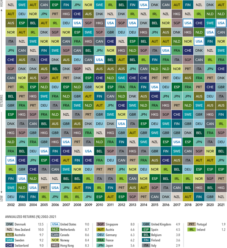
Past performance is no guarantee of results. In USD. MSCI country indices (net dividends) for each country listed. Does not include Israel, which MSCI classified as an emerging market prior to May 2010. MSCI data © MSCI 2021, all rights reserved.
Source: Which Country Will Outperform? Here’s Why It Shouldn’t Matter, Wealthscape