A while ago I book marked a fascinating article on stock market history with interesting stats and charts at Albright Capital. One of the charts that caught my eye is the histogram chart showing the Annual Total Returns of the Dow Jones Index from 1936 to 2021. Since 1983 the US market has been up 83% of the time. It gets even better with the market up 12 years and down just 1 year since 2009.
Click to enlarge
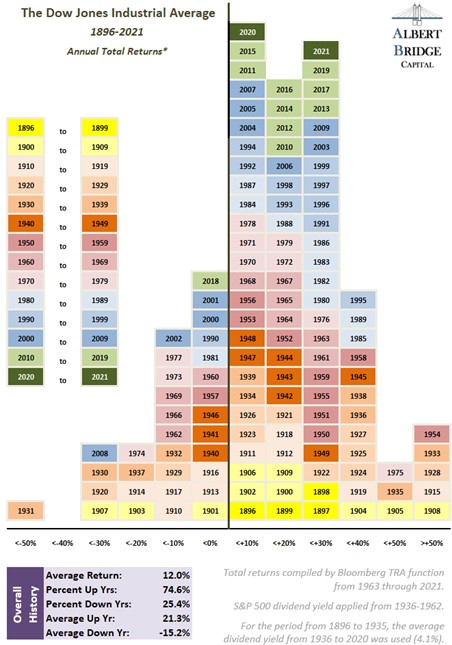
Source: Stock Market History, Illuminated, Albright Capital
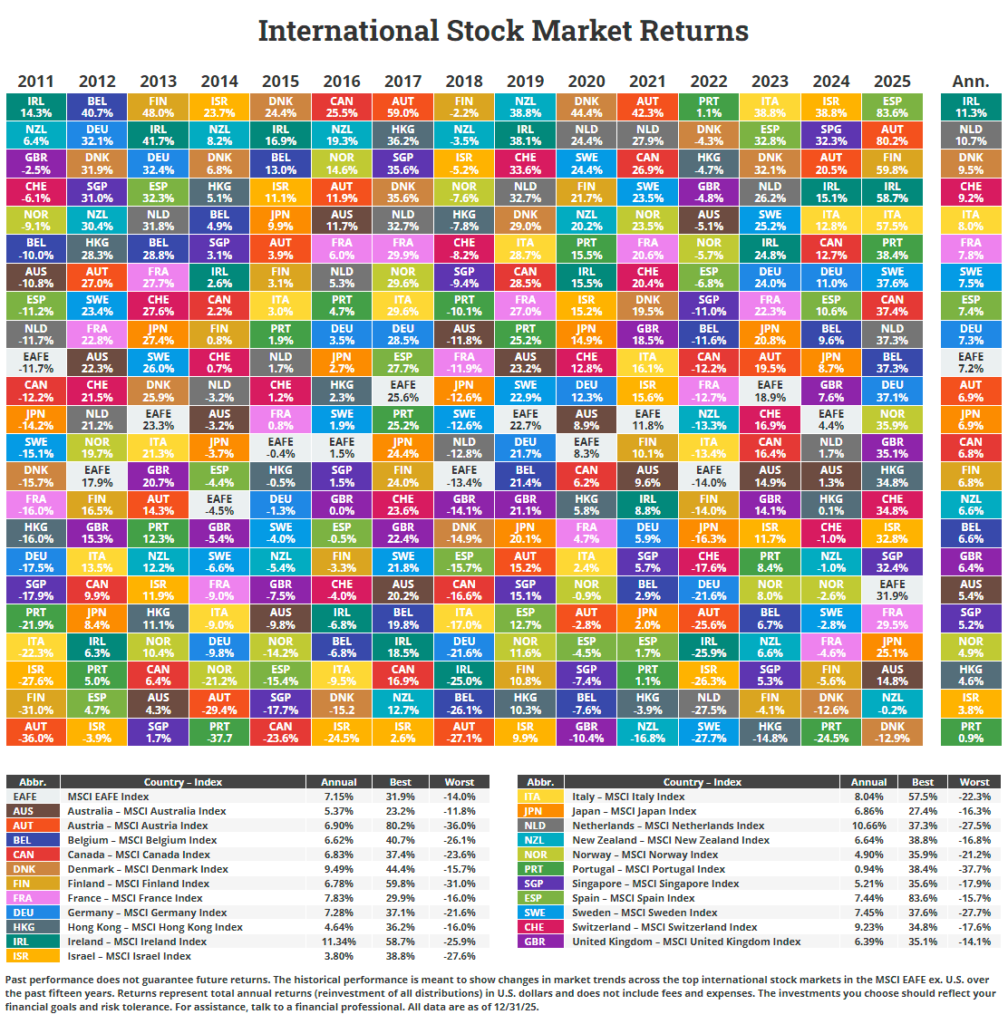
From 2010 to 2021 US markets have crushed other major markets as shown in the table below:
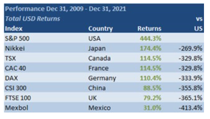
Source: Stock Market History, Illuminated, Albright Capital
For more interesting stats check out the above linked article.
Related ETFs:
- SPDR S&P 500 ETF (SPY)
- iShares MSCI Germany Index Fund (EWG)
- iShares MSCI Canada Index Fund (EWC)
- iShares MSCI United Kingdom Index (EWU)
Disclosure: No positions