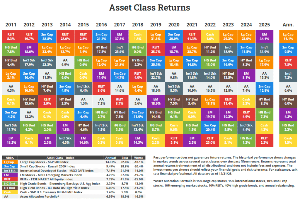
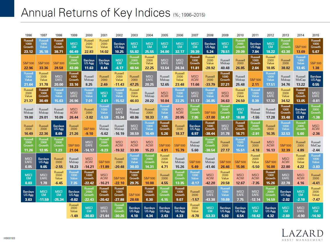
The following chart shows the returns of various indices from 1996 thru 2015. Emerging markets were hot from 2003 until 2007. After a huge jump in 2009 their returns have been average to worse since then.
Click to enlarge
Source: Lazard Asset Management
Download: Annual Returns of Key Indices Chart 1996-2015 (in pdf)
The above chart visually demonstrates the need for diversification.