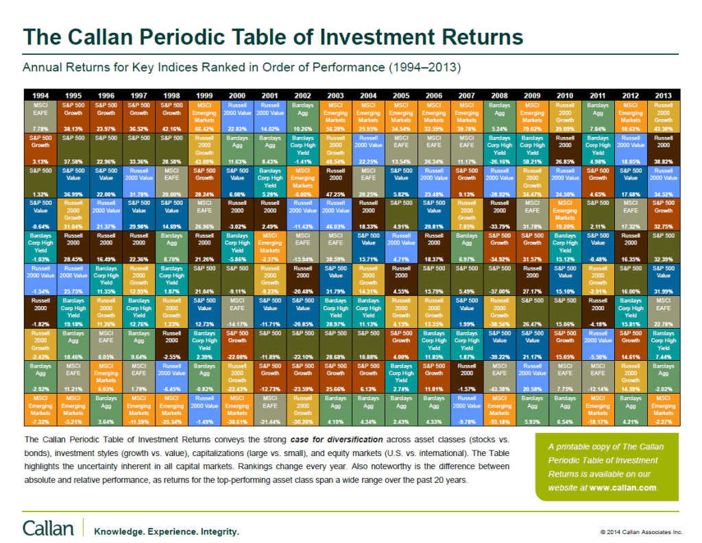
Every year Callan Associates publishes their famous The Callan Periodic Table of Investment Returns. Recently they updated the table with data for 2013.
The Callan Periodic Table of Investment Returns for 2013 is shown below:
Click to enlarge
Source: Callan Associates
As always this chart makes it clear that diversification among asset classes is important. For example emerging markets as a whole lost over 2% last year as measured by the MSCI index while the S&P 500 yielded a total return 32.39%. The difference in returns between these markets is incredible. So anyone who was overweight in emerging markets last year may have not had the best returns possible. Another point to note is that investing in emerging markets than developed markets since they can turn almost overnight for a variety of reasons. Emerging markets were hot a few years ago(2003 to 2007 and 2009, 2012) but that’s not the case nowadays as their performance was poor last year. These markets are still continuing their downward trend this year.
Small caps performed better that large caps with the Russell 2000 growth stocks soaring over 43% relative to S&P 500’s 32%.
Related ETFs:
- iShares Dow Jones Select Dividend ETF (DVY)
- SPDR S&P Dividend ETF (SDY)
- Vanguard Dividend Appreciation ETF (VIG)
- SPDR S&P 400 Mid Cap Growth ETF (MDYG)
- iShares Russell Midcap Index Fund (IWR)
- iShares MSCI Emerging Markets Indx (EEM)
- Vanguard Emerging Markets ETF (VWO)
- SPDR S&P 500 ETF (SPY)
- SPDR STOXX Europe 50 ETF (FEU)
Disclosure: No Positions
You may also want to checkout the Callan Table for 2012, 2011 and 2010.
Download: The Callan Periodic Table of Investment Returns 1994-2013 (in pdf)
Download: The Callan Periodic Table of Investment Returns 1985-2004 (in pdf)
Related: The Callan Periodic Table of Investment Returns 2016: A Review

