The Federal Reserve has provided an ocean of liquidity since the great recession that followed the global financial crisis through the QE1, QE2 and QE3 programs. In fact, the Fed’s balance sheet has grown significantly due to these programs. Total assets have soared from just $869.0 billion in August 2007 to well over $3.0 Trillion as of February 20, 2013.
Click to enlarge
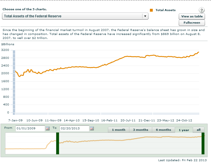
Source: The Federal Reserve
Equity prices have increased strongly in line with rising liquidity. The following chart shows the correlation between Fed’s growing balance sheet and the S&P 500:
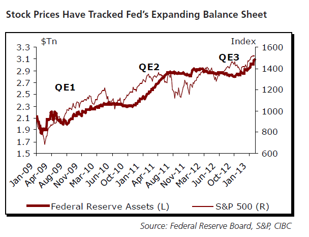
Source: The Week Ahead, February 25 – March 1, 2013, CIBC World Markets
Related ETF:
SPDR S&P 500 ETF (SPY)
Disclosure: No Positions

Sir:
I was not aware of this. My suspicion index was raised, however with the major differency in the size of the “X” and “Y” axis in the first graph, and the much better arrangement in the second graph. If there is a problem with data manipulation, the fist item I look at is how the graphs are presented.
Tom
Thanks for the comment.
I understand your point. However the source of the charts as I have noted.
So I did not personally create the charts.
-David