On the Gap Between Investor Returns and Fund Returns

Investors in funds such as mutual funds and ETFs tend to earn lower returns than the funds they own over a time period. Many studies in the past have proven this theory. The gap in return between investors and funds is due to a variety of factors such as timing the market, lack of patience, poor decisions on the part of investors, etc. It is not uncommon for investors to chase a hot fund for example based on past returns only to stampede out of it when the market turns volatile. A research study by MorningStar in August this year also shows that fund investors fared poorly in returns when compared to the total returns of the funds. The study found fund investors earned 1.7% less than the total return of funds over the 10-year period ending in December, 2020.

From the research study:

Our annual study of dollar-weighted returns (also known as investor returns) finds investors earned about 7.7% per year on the average dollar they invested in mutual funds and ETFs over the 10 years ended Dec. 31, 2020. This is about 1.7 percentage points less than the total returns their fund investments generated over the same period. This shortfall, or gap, stems from inopportunely timed purchases and sales of fund shares, which cost investors nearly one sixth the return they would have earned if they had simply bought and held.

That investor-return gap is more or less in line with the gaps we found for the four previous rolling 10-year periods. The persistent gap between the returns investors actually experience and reported total returns makes cash flow timing one of the most significant factors—along with investment costs and tax efficiency—that can influence an investor’s end results.

Our research imparts a few lessons on how investors can avoid these gaps and capture more of their fund investments’ total returns. Investors can improve their results by holding a small number of widely diversified funds, automating mundane tasks like rebalancing, avoiding narrower or highly volatile funds, and embracing techniques that put investing on autopilot, such as dollar-cost averaging.

The following chart shows the difference between investor returns and fund returns for various fund types:

Click to enlarge

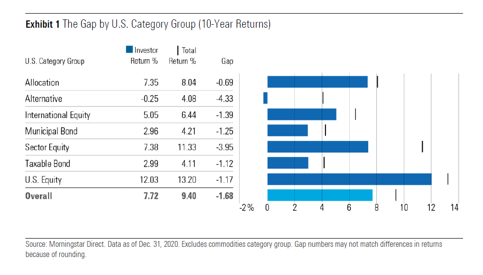
Source: Mind the Gap 2021 – A report on investor returns in the United States, MorningStar

The worst gap is for alternative funds and the next worst was for sector equity funds.

Some of the ways investors can generate a better return include:

  • Trying to time the market – that is getting out and in of funds at the wrong times
  • Avoiding high cost funds
  • Automatic reinvestment of fund distributions
  • Investing on a regular basis such as bi-weekly, monthly, etc.
  • Increasing contributions during market downturns, if possible.

Related ETFs:

  • SPDR S&P 500 ETF (SPY)
  • S&P MidCap 400 SPDR ETF (MDY)
  • SPDR Consumer Discretionary Select Sector SPDR Fund (XLY)
  • SPDR Consumer Staples Select Sector SPDR Fund (XLP)
  • SPDR Energy Select Sector SPDR Fund (XLE)
  • SPDR Financials Select Sector SPDR Fund (XLF)
  • iShares Dow Jones Select Dividend ETF (DVY)
  • SPDR S&P Dividend ETF (SDY)
  • Vanguard Dividend Appreciation ETF (VIG)

Disclosure: No Positions

National Oil Companies List by Country

In the oil and natural gas industry, there is a group of companies called the National Oil Companies (NOCs). Unlike the private oil companies like Exxon(XOM), BP(BP), etc. the NOCs are majority or fully owned by the government of the country where they are located. For example, Pemex, the largest oil company of Mexico is owned by the state. Most of the NOCs are in emerging markets. In the developed world, a few NOCs exist such as Equinor(EQNR) of Norway.

While private oil majors may have bigger market capitalization NOCs own the most of the known oil reserves and have great influence in the domestic market and beyond.

The following charts and lists show all the NOCs of the world:

National Oil Companies (NOCs) by Country in Map:

Names of National Oil Companies (NOCs) by Country:

Source: The National Oil Company Database, National Resource Governance Institute

Disclosure: No positions

Cognitive Bias Codex: Chart

Behavioral finance is an important subject that all investors need to educate themselves. As humans all our investment decisions are driven not always by facts and rational reasons. Emotions play a big part whether we are buying or selling a stock or any other asset. We also suffer from all types of bias from information bias to recency bias. To date, over 180 cognitive biases have been discovered as shown in the following chart:

Click to enlarge


Source: Personal finance is 80% personal and 20% finance, FirstLinks

China’s Energy Composition 2011 To 2020: Chart

Coal is still one of the major sources of energy for many countries despite the growth of renewable energy sources. For example, China and India are to of the largest consumers of coal. Rising coal prices in the global market could negatively impact China’s economic growth. Though the country is the world’s largest coal producer, China depends on coal imports to help meet its energy needs according to an article at Deutsche Welle. Currently coal accounts for about 60% of China’s energy consumption. The Top 10 countries with the most coal-fired plants are shown in the chart below. After China, the US has the send highest number of coal plants at 286 followed by India.

Source: Coal crunch: Asia faces winter of discontent, DW

Though coal is the major source of energy in China, the renewable sources for energy is also increasing year after year. Non-fossil fuel energy has increased to 15.9% of installed capacity in 2020, up 8.5% form 2005 according to a white paper titled “Responding to Climate Change: China’s Policy and Actions” published by the State Council Information Office.

China’s Energy Mix 2011 to 2020:

Click to enlarge

China’s Non-fossil energy power generation composition:

Source: Graphic: China’s efforts in fighting climate change, China Daily

Related:

Some Fun Facts About Canada: Infographic

Canada is one the largest countries in the world. But did you know that Canada is actually the second largest country in the world based on land area? Recently I came the following infographic about some fun facts about Canada. Though this is a bit dated still it is useful to learn some fun facts about the great white north. From an economy standpoint, the Canadian economy is about one-tenth the size of the US economy. Generally the saying goes the US is an elephant while Canada is an ant.

Click to enlarge

Source: BIV