S&P 500 vs. NASDAQ vs. Dow Jones Returns: Chart

Equity markets are performing very well so far this year. After a dramatic selloff in July and early August, markets have recovered and continue to reach record highs. Some of the individual stocks have soared much more than than the S&P 500’s 21.0% YTD. With that said, I wanted to see how the three major indices of the US markets have grown this year and the past five years. While the main benchmark of the market is the S&P 500, the NASDAQ and Dow have also had double-digit returns this year.

The following chart shows the price returns of S&P 500 vs. NASDAQ Composite vs. Dow Jones Indices YTD:

Click to enlarge

Source: Google Finance

The chart below the 5-year returns for the above three indices:

Click to enlarge

Source: Google Finance

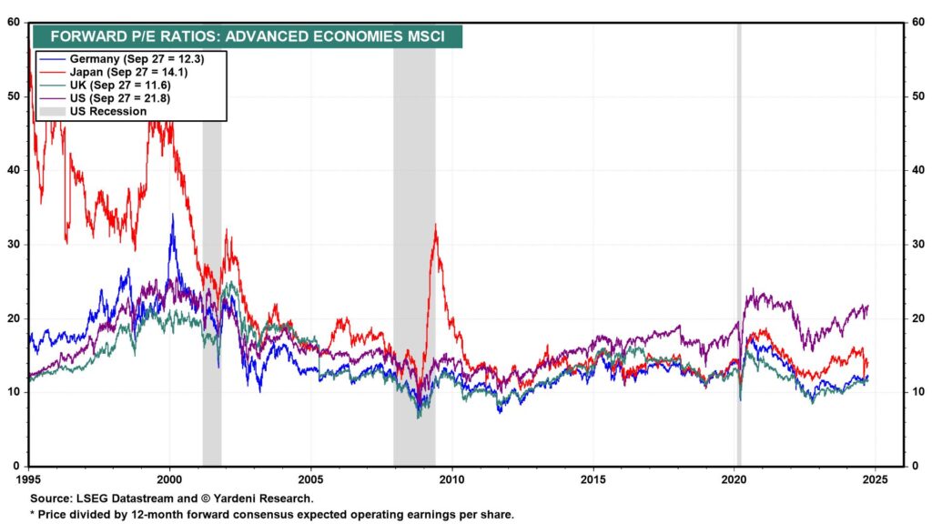
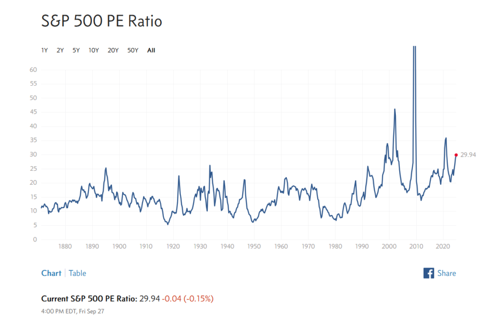
It remains to be seen if the markets would continue to move higher through the last quarter or remain at current levels. With interest rates starting to go down and chances of recession remaining unlikely it may not be a bad idea to nibble at quality names especially when there is any major declines. Valuations no doubt are at stretched for most stocks. So despite consistent high earnings investors may not be willing to bid up stocks even more from current prices.

Related ETFs:

  • SPDR S&P 500 ETF (SPY)
  • Vanguard S&P 500 ETF (VOO)
  • Invesco QQQ Trust ETF (QQQ)
  • SPDR Dow Jones Industrial Average ETF Trust (DIA)

Disclosure: No positions

Australian Stocks – Nominal Total Returns from 1900 to 2023: Chart

I have written about historical annual returns of the Australian equity markets a few times before. Recently I came across a chart showing the nominal total returns of Australian stocks from 1900 to 2023. According to this chart, the Arithmetic Mean Nominal Total Return was 11.7% per year which is very good. In the past 124 years, Aussie stocks have yielded a positive return 78% of the time. The worst year in terms of decline was in 2008 during the GFC when they crashed by over 40% as shown in the chart below:

Click to enlarge

Source: Owen Analytics via Morningstar, Australia

Related ETF:

  • iShares MSCI Australia ETF (EWA)

Disclosure: No Positions

Defense Stocks Outperform The Market in the Long Run

The defense sector has been one of the big growth sectors for many years now and continues to grow further. The ongoing Russia-Ukraine war, middle-east conflicts and other geo-political risks around the world keep defense companies busy. I came across an article by Arian Neiron at VanEck in which he discussed the benefits of investing in defense stocks.

In the long-term, defense stocks have outperformed the broader market as shown in the chart below:

Click to enlarge

Source: A megatrend hiding in plain sight: defence by Arian Neiron, VanEck

He identified the following three reasons for owning stocks from the industry as part of a well-diversified portfolio:

  • Spending by governments toward the sector is increasing.
  • Demand for the sector’s products and services has not historically correlated to the economic cycle.
  • The defence industry has historically been at the forefront of technological development and advancement.

Defense stocks are having another great run so far this year.For instance, American defense giant Lockheed Martin Corporation (LMT) has soared by 27% YTD.

The following are some of the top defense stocks that investors can consider for further research:

  • General Dynamics (GD)
  • Northrop Grumman (NOC)
  • L3Harris Technologies, Inc. (LHX)
  • RTX Corporation (RTX)
  • BAE Systems PLC (BAESY)
  • Ingersoll Rand Inc (IR)

Disclosure: No positions