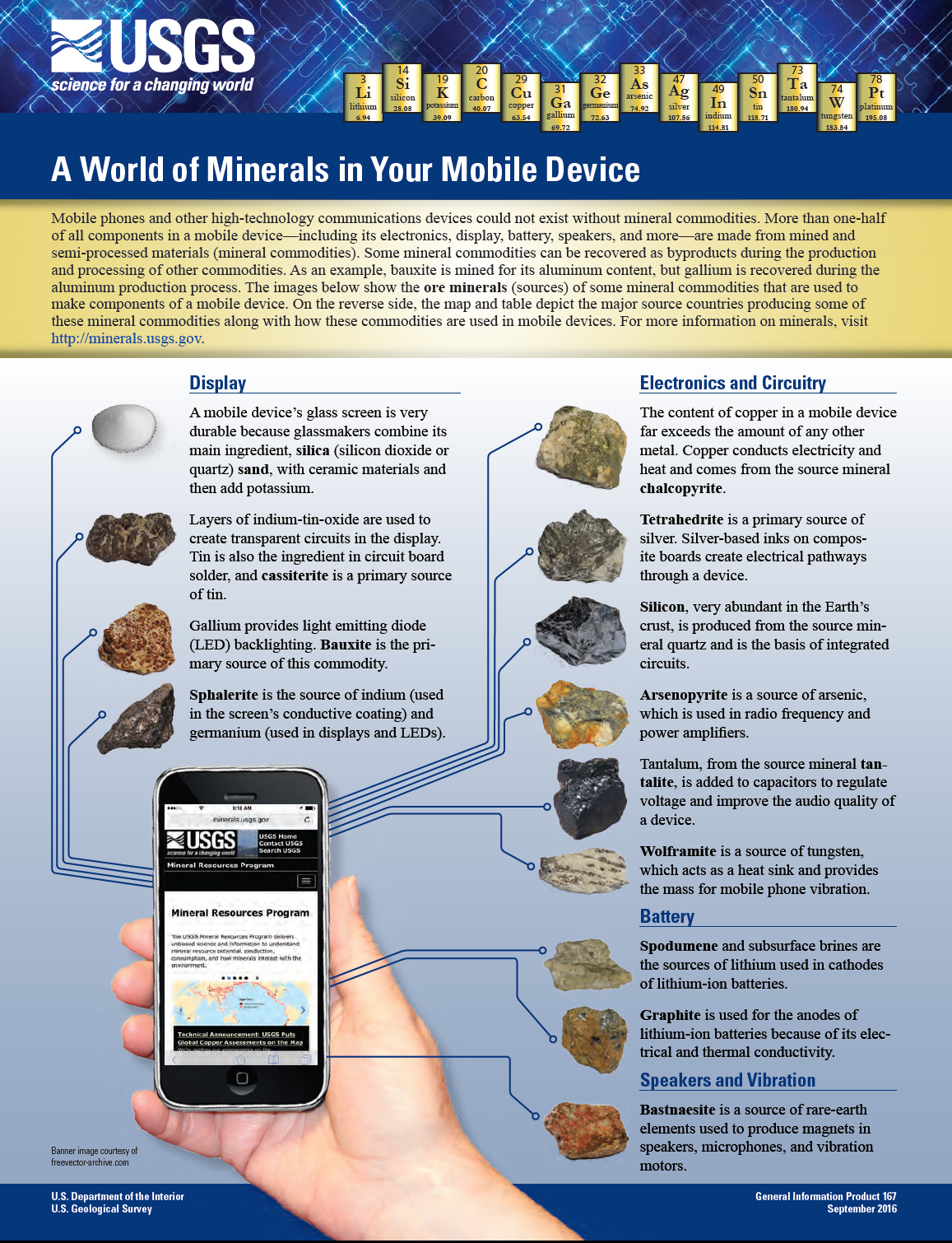
Russian energy giant Lukoil(LUKOY) has announced plans to terminate its ADR program. In addition, the firm will also cancel its listing on the London Stock Exchange as well effective June 6, 2022. This is a big blow for American and foreign investors in Lukoil. However this is not a surprise since Russian passed a law in April, 2022 which banned the trading of domestic companies shares on foreign markets.
Below is the press release from the company site:
ON DEPOSITARY RECEIPT FACILITIES OF PJSC LUKOIL
Thursday, May 5, 2022PJSC «LUKOIL» (hereinafter, the “Company”) announces that the recently enacted Russian Federation law (Federal Law No. 114-FZ of April 16, 2022 (the “Law”)), prohibits circulation outside of Russia of depositary receipts representing shares of Russian issuers, effective April 27, 2022. The Law requires Russian issuers to initiate termination of their depositary receipt facilities.
In accordance with the Law and the terms and conditions of the Company’s American Depositary Receipt (hereinafter, “ADR”) facilities, the Company advised Citibank N.A. of its intent to terminate its Level 1 ADR facility and Rule 144A ADR facility, effective December 30, 2022.
The Company also notified the FCA and the London Stock Exchange of its intent to cancel the listing and admission to trading of the ADRs (ISIN US69343P1057 and ISIN US69343P2048) and ordinary shares of PJSC LUKOIL (ISIN RU0009024277), effective June 6, 2022.
ADR holders may convert their ADRs into ordinary shares of PJSC «LUKOIL» by December 30, 2022. Only persons who held ADRs as of April 27, 2022, are eligible for conversion of their ADRs into ordinary shares of PJSC «LUKOIL».
Source: Lukoil
Here is an article from Interfax:
MOSCOW. May 5 (Interfax) – Lukoil has sent notices to request terminating the listing of its ADR programs and the listing of the company’s shares on the London Stock Exchange, the Russian oil company said in a statement.
Lukoil said that, in accordance with the recently enacted Russian law prohibiting circulation outside of Russia of depositary receipts representing shares of Russian issuers, it had advised Citibank N.A. of its intent to terminate its Level 1 ADR facility and Rule 144A ADR facility, effective December 30, 2022.
The company also notified the FCA and the London Stock Exchange of its intent to cancel the listing and admission to trading of the ADRs and ordinary shares of Lukoil, effective June 6, 2022.
ADR holders may convert their ADRs into ordinary shares of Lukoil by December 30, 2022. Only persons who held ADRs as of April 27, 2022, are eligible for conversion of their ADRs into ordinary shares of Lukoil.
ADR were traded for 30.6% of Lukoil’s shares as of the end of May 2021, when data were last disclosed. The depositary receipts are listed on the LSE and trade on the Frankfurt, Munich and Stuttgart stock exchanges as well as the U.S. OTC market.
Source: Interfax
Since February Russian stocks trading on the London Stock Exchange and US markets have been halted due to Russia’s invasion of Ukraine. Now with trading on foreign markets banned by Russia, Lukoil is one of the first firms to terminate its depository programs. Other Russian companies will follow soon.
For American investors holding Lukoil, now is the time to make a decision on what to do with their ADRs.
Related Posts:
- Some Russian ADRs Can Be Converted To Ordinary Shares Now
- Trading of Russian Companies on US Stock Exchanges Halted
- An Update on Russian ADRs
Disclosure: No positions