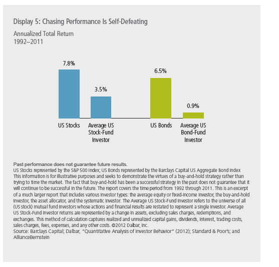
Consumer staples stocks traditionally have paid moderate dividends and offered slow and steady growth. Utility stocks on the other hand, have high dividend yields and are considered to have higher growth rates.
When it comes to choosing a sector for investment investors are faced with this question: Should I go with consumer staples which pay moderate dividends or should I go with utilities which pay high dividends?. In the long-term the low-dividend yield consumer staples have easily outperformed utilities. Though utilities have high dividends their dividend growth rate tend to be lower. Hence investors looking to invest for the long-term should invest some potion of their portfolio in consumer staple stocks.
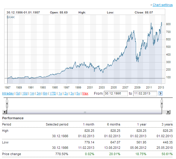
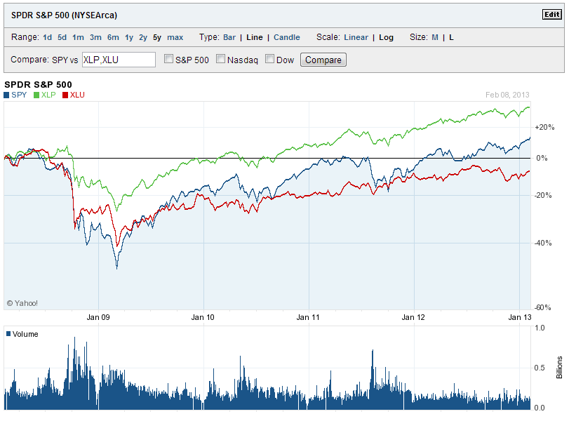
In order to confirm the above theory I used two ETFs for the sectors – Select Sector SPDR-Consumer Staples ETF (XLP) and Utilities Select Sector SPDR ETF (XLU) to measure against the S&P 500 ETF (SPY). In both the 5-year and long-term returns XLP outperformed XLU as shown in the charts below.
5-Year Return Comparison:
Click to enlarge
Long-Term Return Comparison:
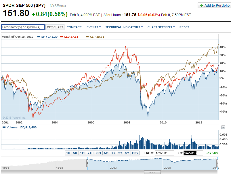
Source: Yahoo Finance
According to Standard & Poor’s data, the 5-year annualized price return for consumer staples and utilities are 6.09% and -1.54%. The difference in returns is not surprising. In the 3-year and 1-year categories also consumer staples beat utilities.
Note: Chart data shown as of Feb 8, 2013
Disclosure: No Positions