Canada and Australia are two of the commodity-based developed economies. Canada depends heavily on the U.S., its top trading partner while the Australian economy is more tied to Asia especially resource-hungry China. Hence the economic growth of these two countries depend on the U.S. and China respectively. In terms of equity returns, how did Canadian equities perform relative to their Australian peers?
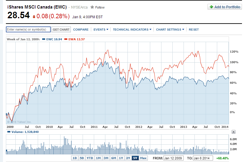
The following chart shows the performance of the iShares Canada ETF against the Australia ETF over the past 5 years:
Click to enlarge
The following chart shows the performance of the iShares Canada ETF against the Australia ETF over the long-term:
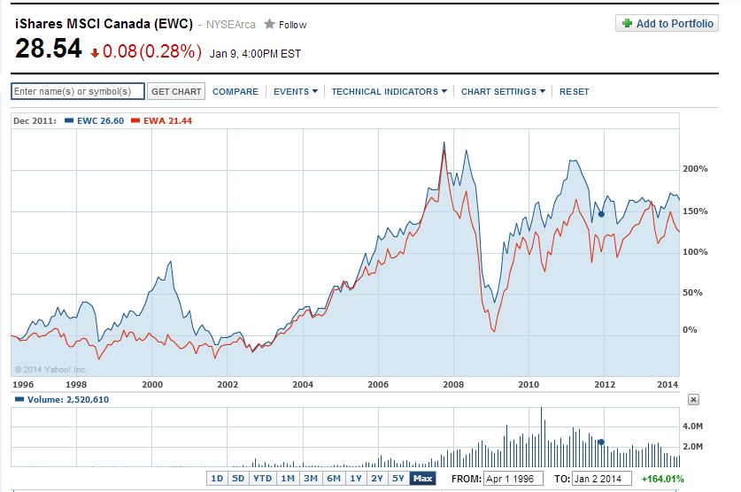
Source: Yahoo Finance
In 5 years Australia has outperformed Canada (EWC).But in the long-term Canada beat Australia (EWA). It is interesting to note that Canadian and Australian stocks followed almost followed each other for the most part.
Related ETFs:
Disclosure: No Positions