Came across this interesting infographic showing some common words in British and American English.
Click to enlarge
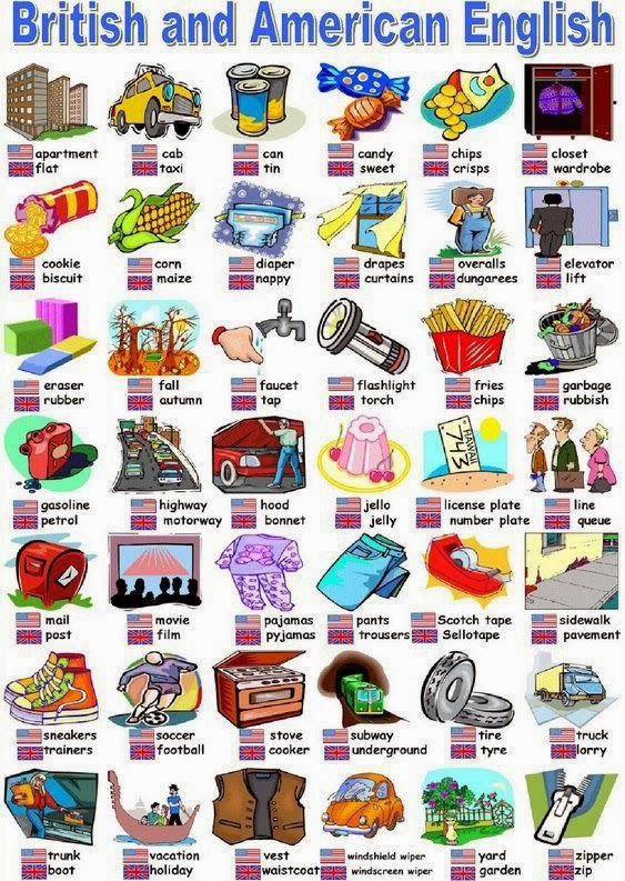
Source: Malaysia-Finance Blogspot
Came across this interesting infographic showing some common words in British and American English.
Click to enlarge
Source: Malaysia-Finance Blogspot
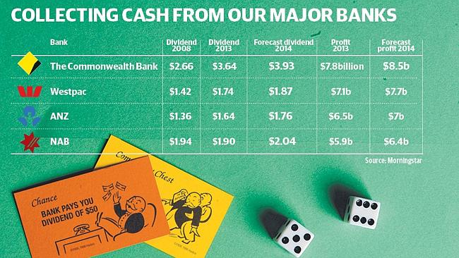
Commonwealth Bank, one of Australia’s four major banks announced better-than expected earnings for the half-year to December 31 last month. As a result the bank may increase dividend payments this year to A$3.93 per share according to a news report. Trading updates from National Australia Bank Limited and Australia & New Zealand Banking Group Limited have signaled that dividends could increase by 10% this year.
However it should be noted that economic issues such as high unemployment, prolonged bear market in commodities, collapse of the housing market, etc. could impact Australian banks. From the news report:
Rivkin Securities director of local investments Shannon Rivkin says the recent results suggest the sharemarket has “underestimated the sweet spot the big banks are in at the moment”.
He says the better-than-expected bad debt environment suggest there is the potential for more dividend increases in the coming years.
“Unless we see a big fall in the housing market, which I don’t suspect, I think the banks will likely adopt a progressive dividend policy going forward, and any cuts to the dividends are unlikely.”
Rivkin says the dividends offer a fantastic yield, plus the potential for capital growth, for self-managed super fund investors, particularly those who have retired because the dividends also come with tasty tax benefits.
Source: Big banks dividends on a roll, Feb 23, 2014, News Corp Australia
The 5-year return of three of the banks are listed below:
Click to enlarge
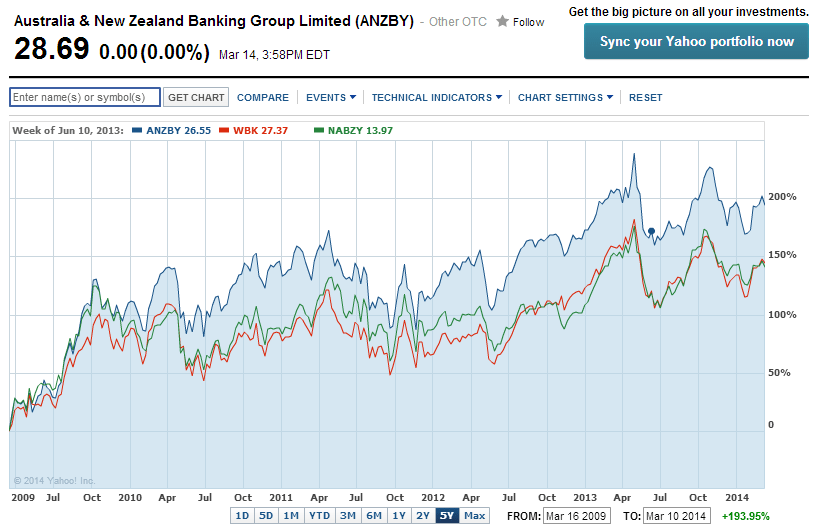
Note: Commonwealth Bank is excluded from the above chart since five year data does not exist.
Source: Yahoo Finance:
All the four banks currently pay dividends of over 5%. Investors looking to add Australian banks can consider adding them in phases.
The current dividend yields of the banks are listed below with their tickers on the US markets:
1.Company: Australia & New Zealand Banking Group Limited (ANZBY)
Current Dividend Yield: 5.15%
2.Company: Commonwealth Bank of Australia (CMWAY)
Current Dividend Yield: 5.22%
3.Company: National Australia Bank Limited (NABZY)
Current Dividend Yield: 5.55%
NABZY had a 2:1 split in January, 2014.
4.Company: Westpac Banking Corp (WBK)
Current Dividend Yield: 5.46%
Note: Dividend yields noted above are as of Mar 14, 2014. Data is known to be accurate from sources used.Please use your own due diligence before making any investment decisions.
Disclosure: No Positions
The S&P 500 index is down 0.40% year-to-date in price terms. Brazil’s Bovespa and Mexico’s IPC Index are down 12.7% and 11.2% YTD respectively.
Commodity-based Brazilian economy is suffering from slowdown in China. Chinese demand for many types of commodities such as iron, copper, etc. have fallen drastically in recent months leading to depressed prices of those commodities. Unlike Brazil, the Mexican economy is not driven by commodities though the country is one of the major producers of crude oil. The country’s economy is highly dependent on the U.S. economy with most of the exports going to the U.S. Mexico is also one of the top trade partners of the U.S. Hence the fortune of Mexican economy is closed tied to the U.S. rather than China or other countries. Though Mexican stocks are off similar to Brazilian stocks so far this year, the 5-year return shows that Mexican stocks have held up pretty well compared to Brazilian stocks.
The chart below shows the performance of Brazil, Mexico against the S&P 500 via ETFs:
Click to enlarge
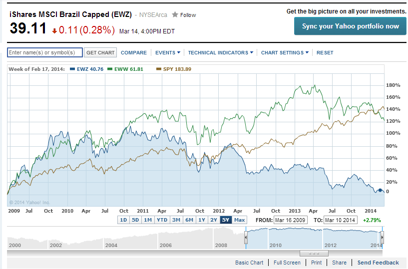
Source: Yahoo Finance
The iShares MSCI Brazil Capped ETF (EWZ) is mostly flat with a return of 2.79% in the past 5 years whereas the Shares MSCI Mexico Capped ETF (EWW) is up over 121%. The Mexican ETF has followed the performance of the S&P 500 ETF SPDR S&P 500 (SPY) which is up by over 140% during the same period.
From an investment perspective, Mexican stocks offer better growth potential now than Brazilian stocks.
Disclosure: No Positions
South Africa has a population of about 48 million. After years of apartheid rule the country held multi-racial elections in 1994 leading to the rule by the African National Congress (ANC). Since that time the country’s economy has grown although modestly. While blacks led by the late Nelson Mandela were able to gain political power from the minority whites, infighting and other issues have continued to adversely impact economic growth and preventing the country from realizing its full potential.
The South African economy is the largest in Africa with a GDP of about $353.9 billion in 2013. The GDP is projected to grow by 2.7% according to The World Bank.
The following is a brief overview of the South African economy from CIA’s The World Factbook site:
South Africa is a middle-income, emerging market with an abundant supply of natural resources; well-developed financial, legal, communications, energy, and transport sectors and a stock exchange that is the 15th largest in the world. Even though the country possesses modern infrastructure that support a relatively efficient distribution of goods to major urban centers throughout the region, unstable electricity supplies retard growth. The global financial crisis reduced commodity prices and world demand. GDP fell nearly 2% in 2009 but has recovered since then. Unemployment, poverty, and inequality remain a challenge, with official unemployment at nearly 25% of the work force. Eskom, the state-run power company, has built two new power stations and installed new power demand management programs to improve power grid reliability. South Africa’s economic policy has focused on controlling inflation, however, the country has had significant budget deficits that restrict its ability to deal with pressing economic problems. The current government faces growing pressure from special interest groups to use state-owned enterprises to deliver basic services to low-income areas and to increase job growth.
Source: The World Factbook, CIA
South Africa’s major exports are gold, diamonds, platinum, other metals and minerals, machinery and equipment and major imports are machinery and equipment, chemicals, petroleum products, scientific instruments, foodstuffs. Its major trading partners are China, India, Germany, Saudi Arabia, the US and Japan.
The benchmark stock index of South Africa is the FTSE/JSE Africa All Share Index. The index is a market capitalization weighted index and represents 99% of the full market capital value of all all the listed companies on the Johannesburg Stock Exchange. There are 165 constituents in the index and the top 10 holdings account for about 60% of the total. Nearly one-fourth of the index is comprised of firms in the basic resources sector.
The following chart shows the performance of the index from 2008 thru 2013 in local currency:
Click to enlarge
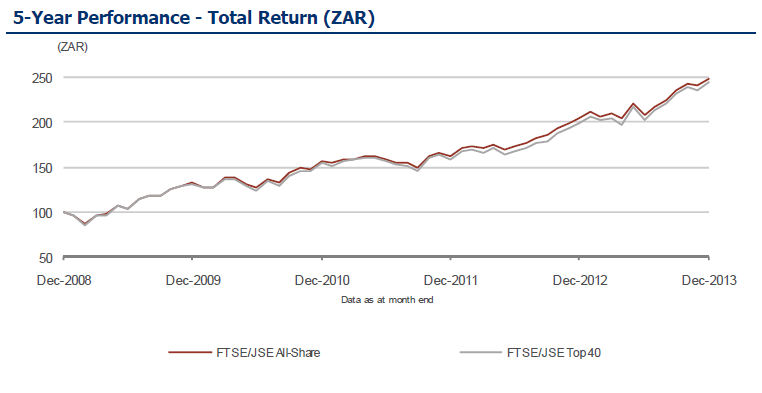
Source: FTSE
The historical returns by year for this index can be found here and the total returns can be found here.
The top holdings in the FTSE/JSE All-Share Index are listed below with the ADR tickers and current dividend yields:
1.Company: BHP Billiton (BBL)
Current Dividend Yield: 3.68%
Sector: Mining
2.Company: Compagnie Financiere Richemont AG
Sector: Personal Goods
3.Company: SABMiller PLC (SBMRY)
Current Dividend Yield: 1.04%
Sector: Beverages
4.Company: Naspers (NPSNY)
Current Dividend Yield: 0.32%
Sector: Media
5.Company: MTN Group (MTNOY)
Current Dividend Yield: 8.01%
Sector: Mobile Telecom
6.Company: Anglo American PLC (AAUKY)
Current Dividend Yield: 3.46%
Sector: Mining
7.Company: Sasol (SSL)
Current Dividend Yield: 3.63%
Sector: Oil & Gas Producers
8.Company: British American Tobacco PLC (BTI)
Current Dividend Yield: 4.26%
Sector: Tobacco
9.Company: Standard Bank Group (SGBLY)
Current Dividend Yield: 4.20%
Sector: Banking
10.Company: Old Mutual Plc (ODMTY)
Current Dividend Yield: 3.40%
Sector: Life Insurance
Note: Dividend yields noted above are as of Mar 7, 2014. Data is known to be accurate from sources used.Please use your own due diligence before making any investment decisions.
Related ETF:
Disclosure: No Positions
Also see:
Here are some links to past articles on Russia from this site:
Market Vector Russia ETF (RSX) – 5 Year Return:
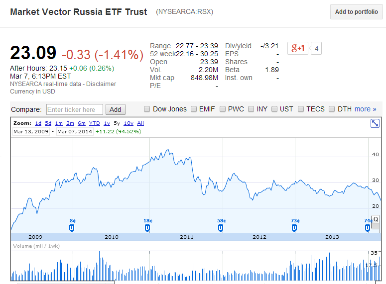
Source: Google Finance
Also checkout:
The Full List of Russian ADRs trading on the US markets.
Disclosure: No Positions