The US Economy Has Regained All the Jobs Lost in the Past 14 Years. Fact Or Fiction?

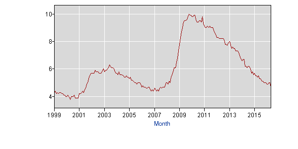
The Unemployment Rate in the US stood at 4.7% according to the BLS. The long-term term in unemployment since 1999 is shown in the chart below:

Click to enlarge

US Unemployment Rate since 1999

Source: BLS

Since the peak of the Global Financial Crisis unemployment level has slowly declined to reach almost closer to the 1999 levels. However most workers don’t feel like it is 1999 and competition is still fierce for any job open.

According to one expert at Blackrock, most people have missed one great statistic on the US economy. From an article published in April by Rick Rieder:

Many commentators seem to be pessimistically focused on the U.S. economy’s weak wage growth and manufacturing sector trouble. They don’t appear to be paying attention to the signs that the U.S. economy has actually been operating at a very high level in recent years, including one statistic that shows the economy’s true strength.

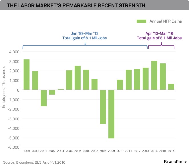
This statistic, which may surprise you: In aggregate, the hiring of 8.1 million people over the past three years is equal to all the U.S. job creation accomplished in the 14 years prior, according to a BlackRock analysis of jobs data following the March employment situation report. See the chart below.

US Labor Market Strength

In recent years, the U.S. economy has operated at much better levels than many market watchers gave it credit for. It has displayed quite remarkable labor market strength considering the secular headwinds to growth, such as an aging demographic, and it has been growing much faster than traditional metrics depict. This is because, as I’ve noted before, new technologies provide services at a much lower cost, and deliver efficiencies and productivity enhancements that are not captured in traditional economic data.

Source: A statistic about the U.S. economy that may surprise you, Blackrock Blog, April 7, 2016

So based on the charts above one can argue that all the jobs lost in the past 14 years have been recreated. But that does not tell the whole story. Millions of Americans are still looking for jobs that they lost during the great recession. Some factors that are not shown in cool looking charts like the above are things like the quality of jobs created, full-time or part-time, jobs with benefits paid or no benefits, etc. For instance, someone losing a well-paid job in a stable industry and getting a job as a hourly sales person at a department store or flipping burgers at a fast-food place for minimum wage is not the same thing.While it is true the person is employed and working, it is the quality of job that matters.

Many Americans including Presidential contender Donald Trump consider the real unemployment rate is much higher. His success in winning many state primaries confirms that many do not believe it is 1999 and everything is great. In fact, his campaign slogan is “Make America Great Again”which implies that that is average or not great now.

Here is an excerpt from an article by Barry, a fellow blogger and a Wall Street veteran on this topic:

By now, we have become almost used to a steady stream of inaccurate statements from the presumptive Republican presidential nominee. Most are not worth correcting. However, Donald Trump’s recent comments on the federal government’s unemployment data, so reminiscent of those made a few years ago by former General Electric chief Jack Welch, deserve a rejoinder. (He called today’s report that employers added just 38,000 jobs “terrible” — but only if you ignore the 35,000 striking Verizon workers. Still, 73,000 new jobs is pretty meh.)

The New York Post’s John Crudele last week interviewed Trump, who said he thinks the jobless rate is close to 20 percent and not the roughly 5 percent reported by the Labor Department. And, of course, Crudele reported, anyone who buys the 5 percent figure is a “dummy,” according to Trump.

This, in a nutshell, is typical of the usual economic conspiracy theories we have discussed in the past; it is obvious political bias corrupting economic analysis. It plays upon people’s recent post-traumatic stress from the financial crisis first and exploits their anxiety about the future. It also reveals deep ignorance about how employment data is assembled.

Source: Trump Finds Cooking in the Unemployment Numbers, Barry Ritholtz, June 2, 2016, Bloomberg

In summary, if one believes the official figures then probably so many millions of jobs have been created in recent years. Otherwise it is a fiction.

US Consumers: In Debt We Trust

The Global Financial Crisis (GFC) occurred just a few years ago. One of the reasons for that crisis was American consumers piling up excessive debt. For a short time after the crisis, the personal savings ratio started rising. However Americans are back to old habits again as they gorge on debt like there is no tomorrow. As the US is a consumption-based economy when consumers tighten their wallets the economy suffers. Much of the current rising consumption is fueled by debt as opposed to funded with income. With lending standards loosened again US consumers are willing taking on more debt even while their wages have stagnated for years. For most workers, real wages have been stagnant for years especially since the dot-com crash of 2000. But functional illiteracy with financial matters and high-octane gimmicks by marketers have made workers accumulate additional debt considering stagnant wages, pathetic quality of jobs being created, destroyed retirement savings, soaring taxes, etc.

From an article in the journal article discussing rising debt levels:

If current trends persist through the end of the year, U.S. households will owe as much as they did at the peak of borrowing in 2008.

Global debt has already topped 2008 levels and keeps rising. That’s pretty astonishing so soon after debt-driven crises in the U.S. and Europe and endless worries about too much borrowing in Japan, China and emerging markets.

Total Debt Balance

But for all the hand-wringing, a near-term debt crisis is unlikely. Lower interest rates mean debt payments are far lower than they were before the crisis. In the U.S., household debt compared with the overall economy is way down. And overseas, loans can easily be rolled over.

Yet even with low rates, the cycle of borrowing and rolling over loans has a cost. People, governments and businesses spend now instead of later, likely reducing future growth. The cycle also allows borrowing to go on for years, which can be good—allowing reform to take hold—or not, allowing bad policies go on almost indefinitely.

U.S. households owed $12.25 trillion at the end of the first quarter, up 1.1% from the end of 2015, according to the Federal Reserve Bank of New York’s Quarterly Report on Household Debt and Credit, released Tuesday. If the first quarter repeats itself through the end of the year, U.S. household debt will approach its peak of $12.68 trillion, which it hit in the third quarter of 2008.

Source: Trillions in Debt—but for Now, No Reason to Worry, WSJ, May 25, 2016

One of the major source of the debt binge by Americans is the small plastic card called as the credit card  or more correctly the debt card. Here is a chart shows the growing debt mountain in this category of debt:

Click to enlarge

Credit Card Debt

Source: Balance Due: Credit-Card Debt Nears $1 Trillion as Banks Push Plastic, WSJ, May 20, 2016

According to the above article, the total outstanding balances in credit card debt is poised to hit $1.0 Trillion this year. That would be close enough to the $1.02 Trillion reached before the GFC in 2008.

The soaring debt levels at the consumer level is not good for the economy as a while. Since wages are not rising and expenses are increasing exponentially for middle class and poor Americans, another crisis can be expect to occur in the future unless changes happen that can support the current high standard of living in this country.

The World’s 20 Biggest Dividend Payers

The Henderson Global Dividend Index from Henderson Global Investors is a long-term study of global dividend trends. The report contains fascinating facts on dividends paid out by firms based on various regions and countries. The latest edition released last month lists the top dividend payers in the world.

The World’s 20 Biggest Dividend Payers are listed in the table below:

Click to enlarge

World Top Dividend Payers-2016-Q1

Source: The Henderson Global Dividend Index, Edition 10, May 2016, Henderson Global Investors

A few observations:

  • Almost all of the dividend payers listed above are American or European firms.
  • Energy, pharma, banking and consumer staples dominate the ranking.
  • Between them these 20 firms paid out an astonishing $39.13 billion in dividends in the first quarter.
  • Many of these firms appear in this list year after year. So they can trusted for consistent income.

Investors looking for dividend stocks can use this list to research further and add select stocks in a phased manner. These 20 stocks are listed below with their tickers on the US market and the current dividend yield:

1.Company: Novartis AG (NVS)
Current Dividend Yield: 3.36%
Sector: Pharmaceuticals
Country: Switzerland

2.Company: Royal Dutch Shell PLC (RDS.A)
Current Dividend Yield: 7.60%
Sector: Oil, Gas & Consumable Fuels
Country: UK

3.Company: BP PLC (BP)
Current Dividend Yield: 7.53%
Sector: Oil, Gas & Consumable Fuels
Country: UK

4.Company: AT&T Inc (T)
Current Dividend Yield: 4.90%
Sector: Telecom
Country: USA

5.Company: AstraZeneca PLC (AZN)
Current Dividend Yield: 4.71%
Sector: Pharmaceuticals
Country: UK

6.Company: Vodafone Group PLC (VOD)
Current Dividend Yield: 6.17%
Sector: Wireless Telecom
Country: UK

7.Company: Telstra Corp Ltd (TLSYY)
Current Dividend Yield: 5.50%
Sector:Telecom
Country:  Australia

8.Company: Siemens AG (SIEGY)
Current Dividend Yield: 3.46%
Sector:Industrial Conglomerates
Country: Germany

9.Company: Bhp Billiton Limited (BHP)
Current Dividend Yield: 5.61%
Sector: Metals & Mining
Country: Australia

10.Company: Exxon Mobil Corp (XOM)
Current Dividend Yield: 3.39%
Sector: Oil, Gas & Consumable Fuels
Country: USA

11.Company: Pfizer Inc (PFE)
Current Dividend Yield: 3.46%
Sector: Pharmaceuticals
Country: USA

12.Company: HSBC Holdings PLC  (HSBC)
Current Dividend Yield: 7.84%
Sector: Banking
Country: UK

13.Company: PepsiCo (PEP)
Current Dividend Yield: 2.94%
Sector: Beverages
Country: USA

14.Company: Banco Santander SA (SAN)
Current Dividend Yield: 4.81%
Sector: Banking
Country: Spain

15.Company: Chevron Corp (CVX)
Current Dividend Yield: 4.25%
Sector: Oil, Gas & Consumable Fuels
Country: USA

16.Company: Johnson & Johnson (JNJ)
Current Dividend Yield: 2.79%
Sector: Pharmaceuticals
Country: USA

17.Company: GlaxoSmithKline (GSK)
Current Dividend Yield: 6.45%
Sector: Pharmaceuticals
Country: UK

18.Company:Procter & Gamble Co (PG)
Current Dividend Yield: 3.25%
Sector: Household Products
Country: USA

19.Company: Microsoft (MSFT)
Current Dividend Yield: 2.78%
Sector: Software
Country: USA

20.Company: Philip Morris International Inc (PM)
Current Dividend Yield: 4.03%
Sector: Tobacco
Country: USA

Note: Dividend yields noted above are as of June 3, 2016. Data is known to be accurate from sources used.Please use your own due diligence before making any investment decisions.

Disclosure: Long SAN

The FP500: Canada’s Most Profitable Companies

FP magazine recently published its ranking of top 500 Canadian companies based on revenue. The #1 rank went to George Weston Ltd. with 2015 revenues of over $46 billion followed by Royal Bank of Canada(RY) and auto parts maker Magna International Inc (MGA).

The following graphic shows the top five most profitable companies and other lists:

Click to enlarge

Top profotable firms-canada

The graphic below shows the most indebted firms:

Canada Most Indebted frims


Source: THE FP500 – The premier ranking of Corporate Canada, Financial Post

Four of the top five profit making firms are banking institutions.

The complete list of the FP 500 firms and other fascinating details can be found here.

Disclosure: Long RY, MGA

On The Difference In Returns Between S&P 500 Price and Total Return Index

The S&P 500 Index that is benchmark of US equities is a price index – meaning dividends are not included in the return calculations. Since this index is the most popular and reported by the media all the time, investors may use this index to compare their portfolio performance. This is not the correct way to benchmark one’s portfolio return against an index. Assuming an investor reinvests dividends the better way to measure the performance of US stocks is to use the S&P 500 Total Return Index which includes dividends reinvested.

Of the 500 companies in the index, 425 paid dividends at the end of 2015, So when these dividends are reinvested the return will be higher over the long-term due to the effect of compounding. The difference between the S&P 500 Price Index and Total Return can be substantial over many years such as 5 years as shown in the chart below:

Click to enlarge

SP 500 Price vs Total Returns


In the past 5 years, the price index returned 65% compared to the total return index return of about 84%. That is a gap of 19%.

Over 10 years the difference in returns is even higher.

SP 500 Price vs Total Returns-10 years

Source: Yahoo Finance

Here is another chart showing the returns from 1988 thru mid 2013:

SP 500 Price vs Total Returns Long-Term

Source: Inside the S&P 500: Dividends Reinvested, S&P Indexology Blog

Related ETF:

  • SPDR S&P 500 ETF (SPY)

Unfortunately there is no ETF that tracks the S&P 500 Total Return Index.

Disclosure: No Positions