Dr. Shane Oliver: Why Australian Immigration Should be Lower

The housing market in Australia is one of the most expensive in the world. High prices never seem to slow down or decline. Though the country is large much of the population is concentrated on a few coastal cities. One of the factors that was always suspected but hardly discussed in the media is the role of immigration. The question that should be answered is how much immigration affect housing shortages and prices. Canada is another resource-based economy that faces a similar problem as well. The majority of the population are crammed into a few big cities and most live closer to the US border. Despite being one of the largest countries in the world in terms of land, housing prices in cities like Toronto and Vancouver are a joke. In these cities a million dollars will get one an average house or in some extreme cases a small shack.

With that said, Dr.Shane Oliver at AMP capital argues that Australian immigration must be lowered significantly in order to reduce supply shortfalls and meet industry capacity. From the article:

Australia’s surging population

March quarter data showed that Australia’s population rose by 563,000 or 2.2% over 12 months, with 454,000 of that coming from immigration. Permanent and long-term arrival data up to July suggest that the surge in immigration is continuing and we are on track for net immigration of 500,000 or more in the last financial year.
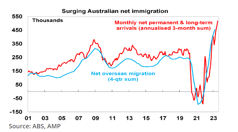
Mr.Oliver further discussed the housing affordability or lack there off, housing supply and of course the role of immigration. He concludes by stating the number of immigrants allowed in must be cut by about 50%. A brief excerpt from the piece:

Immigration levels need to be lower

There are a lot of things that need to be done to improve housing affordability: making it easier to build more homes but in a way that does not lead to ever worsening urban congestion and compromise the very things that make Australia great (yes like many Australians I admit to being a NIMBY); encouraging greater decentralisation to regional Australia to take pressure off cities; and tax reform in terms of replacing stamp duty with land tax and reducing the capital gains tax discount. But it’s impossible to escape the conclusion that immigration levels need to be calibrated to the ability of the home building industry to supply housing. This is critical. Current immigration levels are running well in excess of the ability of the housing industry to supply enough homes exacerbating an acute housing shortage and poor housing affordability.

Our rough estimate is that if home building supply capacity is 200,000 dwellings a year (as we managed in the five years to 2022) then immigration levels need to be cut back to 260,000 from around 500,000 now. But if capacity is just 180,000 dwellings pa or we want to reduce the accumulated supply shortfall by say 20,000 dwellings a year then immigration should be cut back to near 200,000 people a year.

Source: Oliver’s insights – immigration and housing affordability, Dr.Shane Oliver, AMP Capital

The residential real estate market in the US is another bubble as well. I haven’t seen any article from economists on the impact of immigration- both legal and illegal – on the housing market.
Fed Funds Rate vs. Money Market Assets: Chart

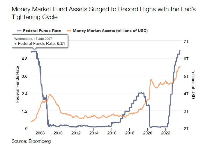
The Federal Funds Rate has increased sharply since the spring of 2022. After slashing interest rates to almost zero during the Covid pandemic the Federal Reserve embarked on a relentless process to raise interest rates to current target levels of 5.25% to 5.50%. Accordingly rates on Money Market Funds have rise to over 5%. No wonder assets in these funds have soared since last year and are headed towards the $7.0 Trillion mark. The following chart shows the correlation between fed funds rate and money market assets:

Click to enlarge

Source: Is Cash Really King? Why Bonds Should Reign, Thornburg

Related funds:

  • Vanguard Federal Money Market Fund (VMFXX)
  • Vanguard Treasury Money Market Fund (VUSXX)
  • Schwab Value Advantage Money Fund – Investor Shares (SWVXX)
  • Schwab Treasury Obligations Money Fund – Investor Shares (SNOXX)
  • Fidelity Money Market Fund (SPRXX)
  • Fidelity Government Money Market Fund (SPAXX)

Disclosure: Long SWXXX

Australian Bank Stocks Offer Potential Investment Opportunities

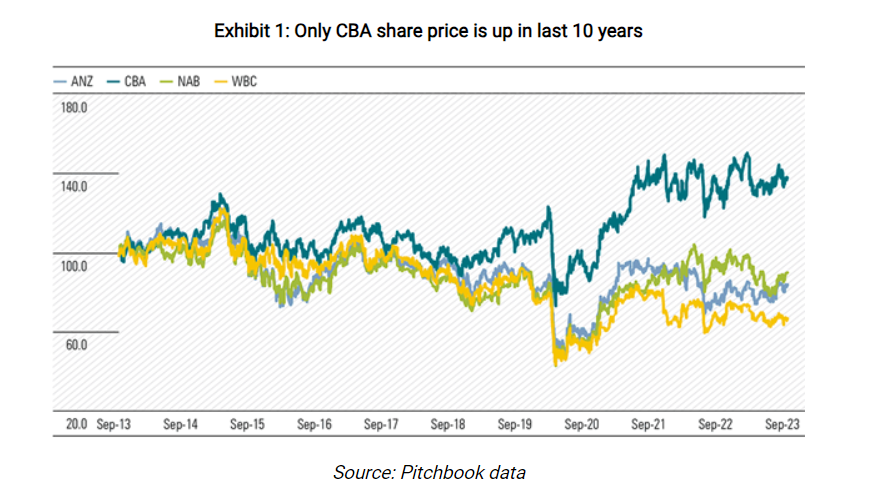
Australian banks have been one of the poor performers among the developed world’s banks for many years. In fact, the stock prices of the major banks except Commonwealth Bank are below where they were 10 years based on prices in the domestic market. The banks have gone nowhere per most investors. The following chart shows the performance of the banks in the past 10 years on the Australian market:

Click to enlarge

Source: Can Aussie banks rediscover their glory days?, FirstLinks

However the saying that bank stocks have gone nowhere is only partially true. Because if we include dividends in the return calculation then their returns are not bad. From the above article:

Shares have gone nowhere, why invest?

Westpac and ANZ shares are down 33% and 17% respectively, in the last 10 years. With dividends, the returns are more respectable but still not great. Since August 2013, Westpac has paid fully franked dividends totaling $15.49 per share, ANZ not far behind at $15.19. This lifts 10-year total shareholder CAGR to 1.4% for Westpac and 3.6% for ANZ. National Australia Bank has done a little better with total shareholder CAGR of 4.3%. The S&P/ASX 200 total return index has returned around 8% per year for the period.

We forecast Westpac’s ROE to be 9.5% in FY24, down from 15% ten years ago. The financial services royal commission, anti-money-laundering breaches, asset divestments, and lower interest rates have driven the earnings decline. Net interest margins, or NIM, has weakened, asset divestments have halved non-interest income, and operating expenses have risen on risk, compliance and technology spend. Meanwhile, Westpac now holds an additional $24 billion in shareholder equity, a more than 50% increase. Not a pretty story and explains the share price weakness.

But we think the next five years will look different. Margins are recovering from FY22 lows and smaller banks and nonbank lenders are struggling to compete as funding costs rise. Cost savings look achievable given the bloated cost base while recent changes make it unlikely APRA will again lift capital requirements. 

Market expectations are now low, which we think is an opportunity. At the current share price, the FY24 PE of 11x and price/book of 1.0x seem to imply no operational and profit improvement. By contrast, Westpac traded on a P/E of 13x and price/book value of 2.2x in 2012 and an average price/book of 1.6x for the 10 years to 2022.

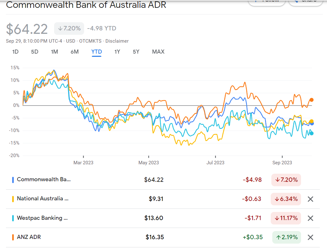
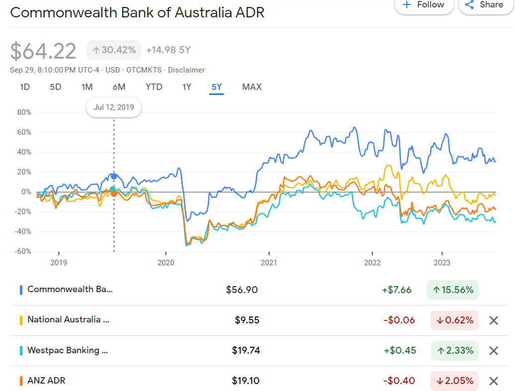
The chart below shows the year-to-date return of Aussie bank stocks available on the US markets:

Click to enlarge

5-Year returns:

Source: Google Finance

The worst performer in the past years is Westpac(WEBNF). The author of the above article projects a 30% upside for Westpac from current levels. Commonwealth bank is expensive.

So investors looking to earn a high income in the form of dividends and any potential upside in prices in the next few years can consider all banks except Commonwealth.

Referenced Stocks:

  • Westpac Banking Corp (WEBNF)
  • Australia and New Zealand Banking Group Ltd (ANZGY)
  • National Australia Bank Ltd (NABZY)
  • Commonwealth Bank of Australia (CMWAY)

Disclosure: Long NAZBY and WEBNF

The World’s Largest Uranium Producers

Countries are embracing nuclear power again after the 2011 Fukushima accident. With many reactors restarted in recent years the demand for Uranium has soared this year. According to a journal article earlier in September benchmark prices have jumped 30% to about $62 a pound. From the article:

The World Nuclear Association, an industry group, said in a report this month that generation capacity is on track to expand by three quarters by 2040. It takes between eight and 15 years for a miner to produce uranium after discovering it.

“Things are tightening up,” Jeanne Tortorelli, who manages nuclear-fuel supplies for Maryland-based Constellation Energy’s 21 reactors, told an industry event this month.

China has 24 reactors under construction to add to its fleet of 55. India plans to expand its fleet and several countries hope to install their first reactors. 

Even in Japan, where the Fukushima disaster sparked massive rallies against atomic energy, reactors that went offline until they could pass stricter safety standards are resuming operations. One-third of the country’s 33 operable reactors have restarted. Approvals are being lined up for another 16, one of which is due to resume operations this month, according to the WNA.

Source: Nukes Are Back, but Uranium Is in Short Supply, WSJ

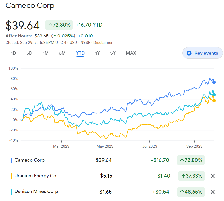
The following chart shows the price returns of Uranium producers trading on the US markets:

Source: Google Finance

Canada-based Cameco (CCJ) is up an astonishing 73% while Uranium Energy (UEC) and Denison Mines(DNN) have increased by 37% and 49% respectively as of September close this year.

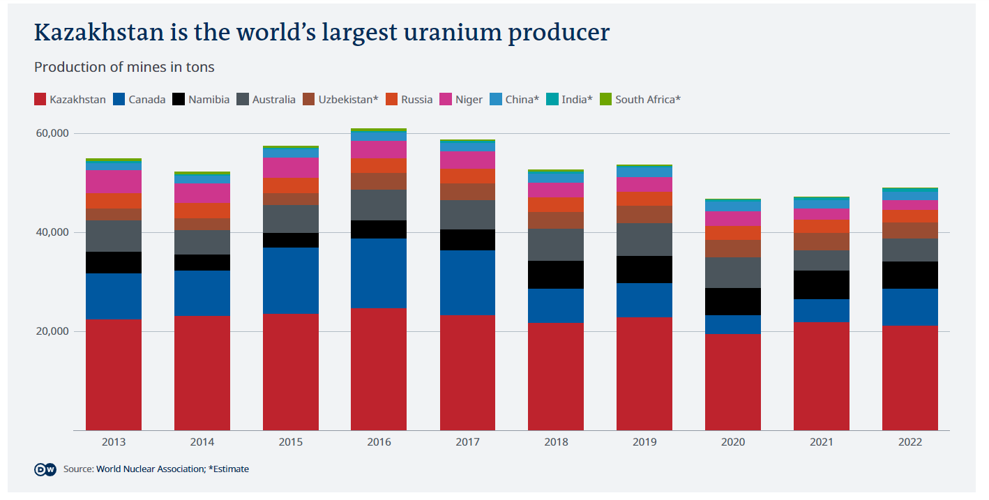
According to the World Nuclear Association, Kazakhstan is the world’s supplier of Uranium followed by Canada and other countries. Niger provides 5% of the global and is a major supplier for France, the developed world’s largest producer of nuclear energy. The following chart shows the world’s top producers of Uranium:

Source: Are Niger’s uranium supplies to France under scrutiny?, Deutsche Welle

Disclosure: No positions

How Do Assets Perform 1 Year After CD Rates Peak?

Interest rates on Certificate of Deposits(CDs) in banks have soared this year. From virtually paying nothing a few years ago CDs have become the asset to own by any investor in this high interest rate times. For instance, the rate on 1-year CDs have jumped to as high as 5.67% according to Bankrate data. With such high rates it almost sounds foolish to invest in the stock market. Growth stocks are going to get hurt by lack of access to cheap capital. Investing in other stocks are risky as well due to multiple factors from a potential government shutdown to a recession and everything in between. No wonder the equity market is in the doldrums for the past few months.

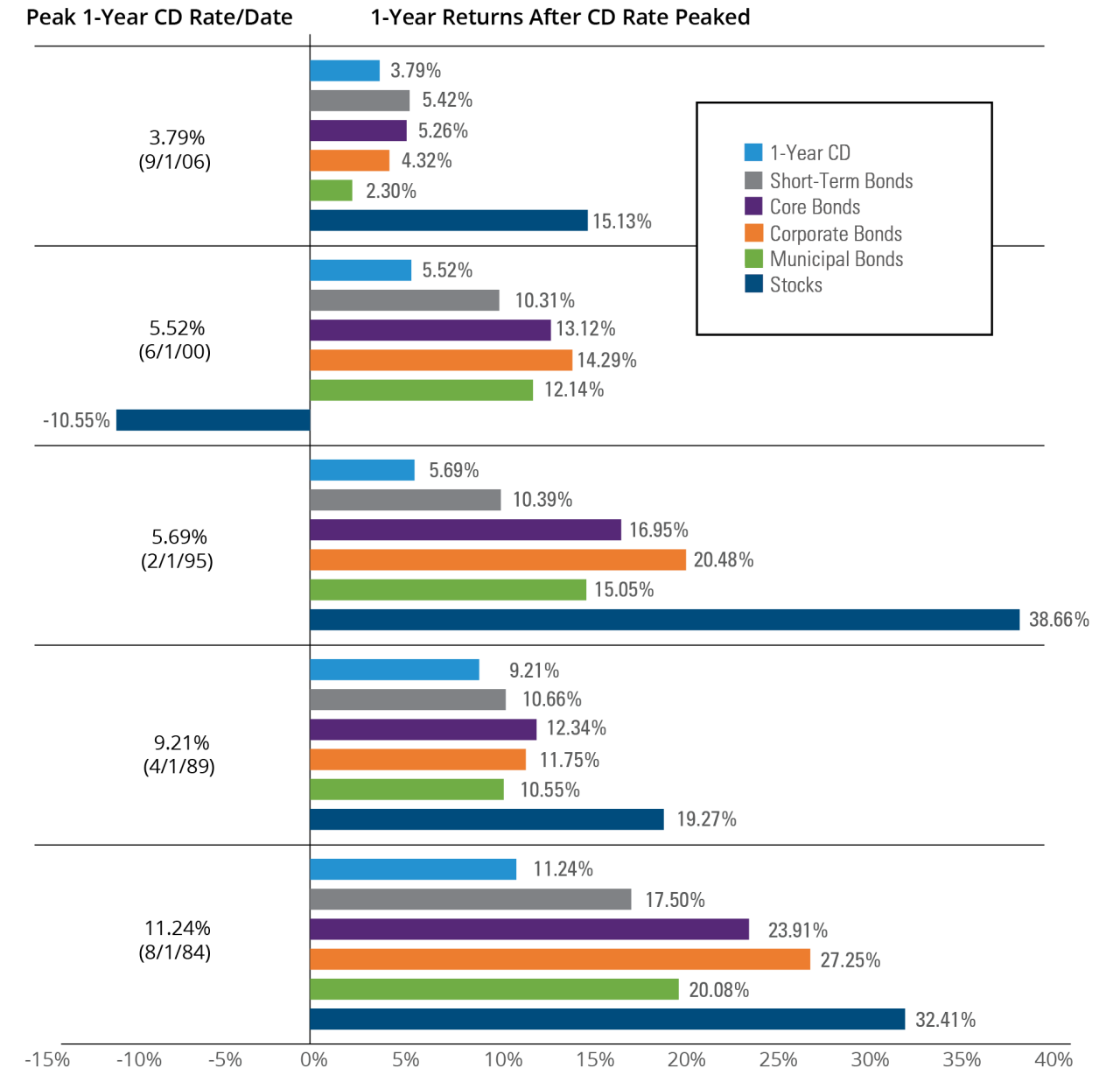
I recently came across an article at Hartford Funds which discussed on the performance of other assets 1 year after the return on 1-year CDs peaked. According to their research, the return on other assets outperformed CD returns one year after CD rates peaked. The following chart shows the performance of other assets over CDs from a select few periods in the past:

Click to enlarge

Note: The above returns do NOT include the impact of inflation and taxes which would reduce returns

Source: Is a Good CD Rate Too Good to Be True?, Hartford Funds

Related ETFs:

  • SPDR S&P 500 ETF (SPY)
  • iShares TIPS Bond ETF (TIP)
  • iShares iBoxx $ Investment Grade Corporate Bond ETF (LQD)
  • Vanguard Total Bond Market ETF (BND)

Disclosure: No positions