The Callan Periodic Table of Investment Returns 2016: A Review

Update: The Callan Periodic Table of Investment Returns 1998-2017

Callan Associates has published their “The Periodic Table of Investment Returns for 2016”. This fascinating chart shows the returns of various of classes such as stocks, bonds, US and foreign stocks, etc. The importance of diversification among asset classes is vividly illustrated by the Callan chart each year.

The Callan Periodic Table of Investment Returns for 2016 is shown below:

Click to enlarge

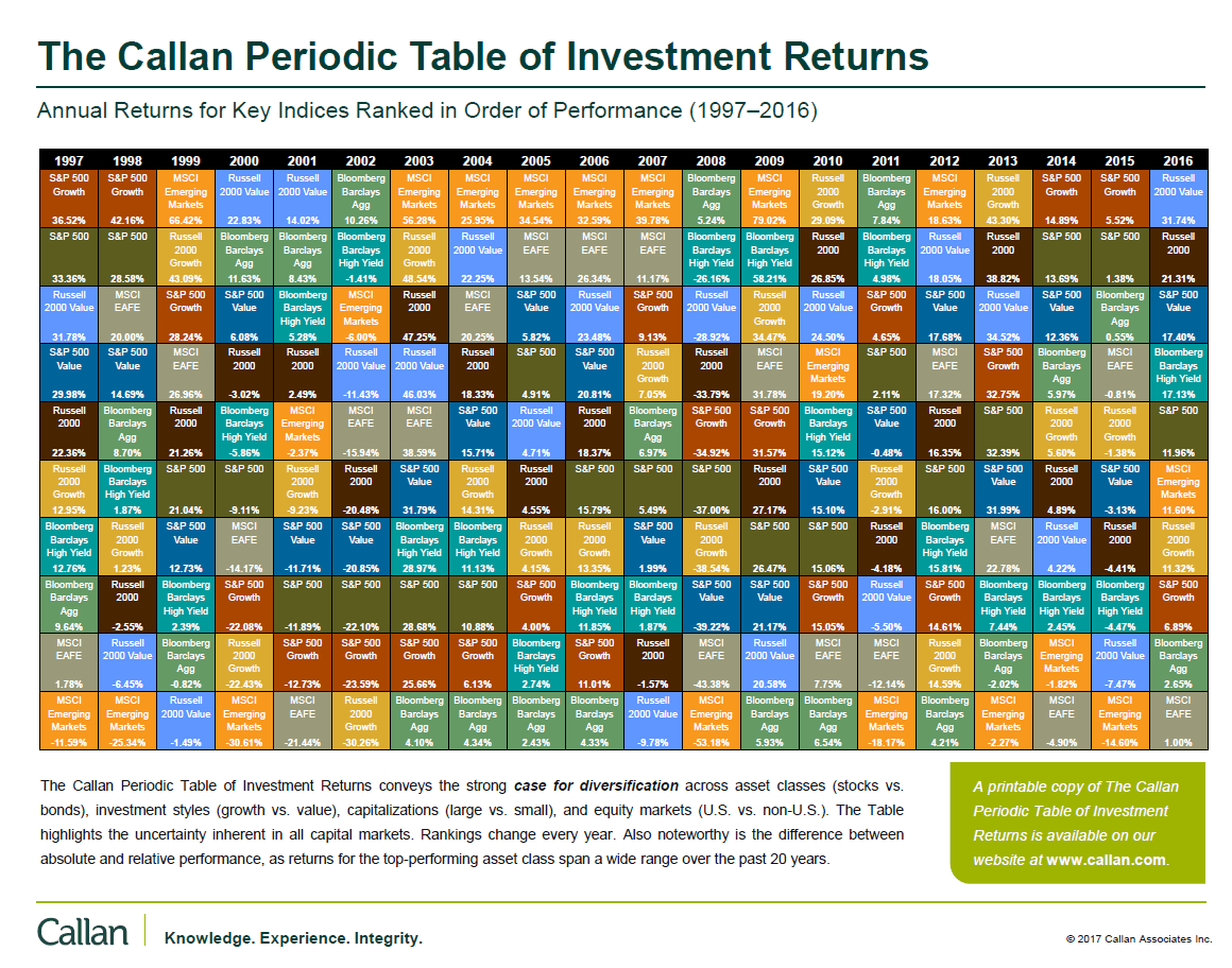
Source: Callan Associates

Download: The Callan Periodic Table of Investment Returns 1997-2016 (in pdf format)

In 2016, the S&P 500 had a total return of 11.96%. While this is a good return, the small caps as represented by the Russell 2000 earned even higher with a return of over 21%. Emerging markets also performed well last year. But European stocks were the worst performers as the MSCI EAFE Index had a return of just 1%.

For the Year 2017 version of Callan Chart go here.

Previous Year Callan Charts:

Related ETFs:

  • iShares Dow Jones Select Dividend ETF (DVY)
  • SPDR S&P Dividend ETF (SDY)
  • Vanguard Dividend Appreciation ETF (VIG)
  • SPDR S&P 400 Mid Cap Growth ETF (MDYG)
  • iShares Russell Midcap Index Fund (IWR)
  • iShares MSCI Emerging Markets Indx (EEM)
  • SPDR S&P 500 ETF (SPY)
  • SPDR STOXX Europe 50 ETF (FEU)

Disclosure: No Positions

Why Cutting Severe Losses Is Important

In the world of stock market investing, cutting losses is more important than holding on to gains. The courage to cut and protect remaining capital is especially critical when a stock plunges heavily leading to sever losses in portfolio. It is much easier for anybody to hold on to stocks that continue to go higher. Even one has to sell a gainer one can easily feel satisfied making a decent profit of say 25% or 505 or even 200%. However when a stock falls from say $10 to $5 or even $2 it is extremely difficult for anyone to sell out and move on. This is because we tend to hang on to hope even if that is misplaced that the stock would somehow recover. In other times, we are unwilling to accept the fact that we made a big mistake on that failed investment.

The following diagram shows why it is difficult to recoup sever losses:

Click to enlarge

Source: Allianz

A 10% loss requires a gain of 11% to break even. Similarly an 80% loss requires a gain of 400% to recoup original investment. For example, if a $10 stock declines to $2 for a loss of 80%, then it has to soar by 400% to get back to $10 – that is has to increase by 4 times. Simply increasing by 100% or doubling from $2 would only take it to just $4.

From an article by Jason Zweig at WSJ in 2011:

Research published in 1998 by behavioral-finance professor Terrance Odean of the University of California, Berkeley, showed that individual investors are 50% more likely to sell a winning stock than a loser—even though, on average, the stocks these investors sell go on to outperform while those they hold onto underperform.

Why the reluctance to bail? Selling an underwater asset, says Mr. Odean, “isn’t primarily about economic loss, it’s about emotional loss.” Once you sell below your purchase price, he believes, you can no longer tell yourself, “I still made a good choice, and it’ll come back.”

Individual investors aren’t the only ones who can’t make peace with their losses, according to numerous academic studies. Mutual-fund managers who cling to losing stocks underperform, by roughly four percentage points annually, the managers who cut their losses.

On average, professional futures traders and stock traders hurt their returns by clinging to their losers. Real-estate investment trusts hang onto properties that are losing money longer than they keep those that are in the black.

Unpublished research presented at the annual meeting of the Society for Neuroeconomics earlier this month sheds new light on this old problem. Neuroeconomics is an emerging field that combines the techniques of neuroscience with theories from psychology and economics to study financial behavior.

In one study, led by Gregory Berns of Emory University, people lay inside a brain scanner while deciding to hold or sell an investment; the price of the asset changed randomly up or down. The researchers focused on the ventral striatum, a region of the brain that has been shown to respond to rewards, particularly when they are unexpected.

That suggests that many investors who are losing money may automatically assume—rightly or wrongly—that their position is bound to recover.

Source: Why We Can’t Let Go of Our Losers, Jason Zweig, WSJ, October 15, 2011

So the key takeaway here is that when there is a severe loss on a stock, it is important to analyze why the loss occurred and if it makes sense to hold on or simply cut the losses and move on to something else. Though it is emotionally draining to lose money, in the end it is only necessary to earn overall higher positive returns from a equity portfolio.

In a real life example, last year I sold out French bank Societe Generale SA (SCGLY) in an account with a huge loss. Luckily I was able to reinvest the remaining capital into Bancolombia SA (CIB), a Colombian bank in the low $20s and was able to recoup a substantial portion of the loss. Of course this is only an example where it worked out. In some instances, it may take years to recoup thousands of losses. The key factor in the SocGen saga was the willingness to cut losses and move on.While selling out a stock with a huge loss was painful, recovering the loss with a replacement stock is much more satisfying.

Disclosure: Long SCGLY, CIB

Dividend Yield by Country January 2017: Chart

The chart below shows the latest dividend yield for select countries.:

Click to enlarge

Note: The values shown above are trailing 12- month yields.

Source: Star Capital

Among the developed countries, New Zealand and Australia have the highest yields at over 4%. That figure is double that of the yield for US. Among emerging markets, India has the worst dividend yield followed by South Korea. These two countries are not known for their dividend culture.

US Minimum Wage Adjusted For Productivity

The minimum wage increased in 19 US states from the beginning of this year. For example, in California the minimum wage increased by 50 cents to $10.50 an hour. In the state of Massachusetts, it increased y $1 to $11 an hour. The chart below shows the rate increases by state:

Click to enlarge

Source: Minimum Wages Set to Increase in Many States in 2017, WSJ, Dec 30, 2016

Despite these raises, the US minimum wage is still low according to one report by EPI. Productivity has soared for many years due to advancement in technology and automation. However much of the gains have been extracted and accumulated by the upper class. Hence if US minimum wage had kept up with productivity it would be much higher today. In 2016, adjusted for productivity the rate would have $18.85 per hour.

Click to enlarge

Source: The top charts of 2016, EPI

From a global perspective also, the US rate is lower than other developed countries. In fact, an OECD report placed the US at number 11 with Australia ranking the top.

Source: OECD

Some of the reasons for the depressed wages for American workers especially the lowest skilled workers are: excess supply of labor due to natural population growth, legal and illegal immigration, automation that wiped out many low-paying jobs, extreme pressure on corporations that employ minimum wage workers to increase profits, etc.

Periodic Table of Investment Returns: Emerging Markets 2002 Thru 2016

The following chart is the Periodic Table of Investment Returns for select Emerging Markets from 2002 thru 2016. This is a followup post to the developed markets chart I posted earlier.

Click to enlarge

Source: Novel Investor

For an interactive version of the above chart please go here.

Related: Review: The Callan Periodic Table of Investment Returns 2015