Germany’s DAX Index Returns Triangle 1953 to 2021: Chart

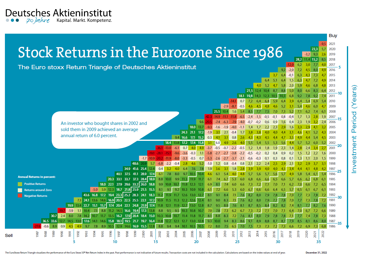
The German Stock Institute published their updated version of the DAX Index Annual Returns Triangle Chart for the years from 1953 to 2021. According to this chart, the average annual return on the DAX return over the past 70 years thru 2021 was 8.9%. For the most chart the chart shows positive returns in any given period.

Click to enlarge

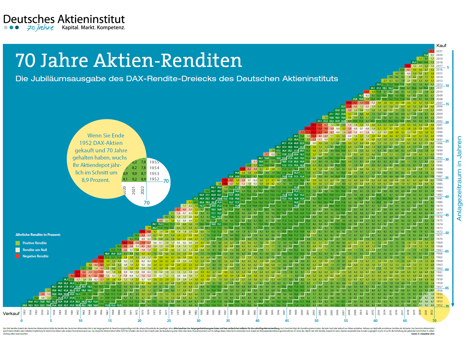
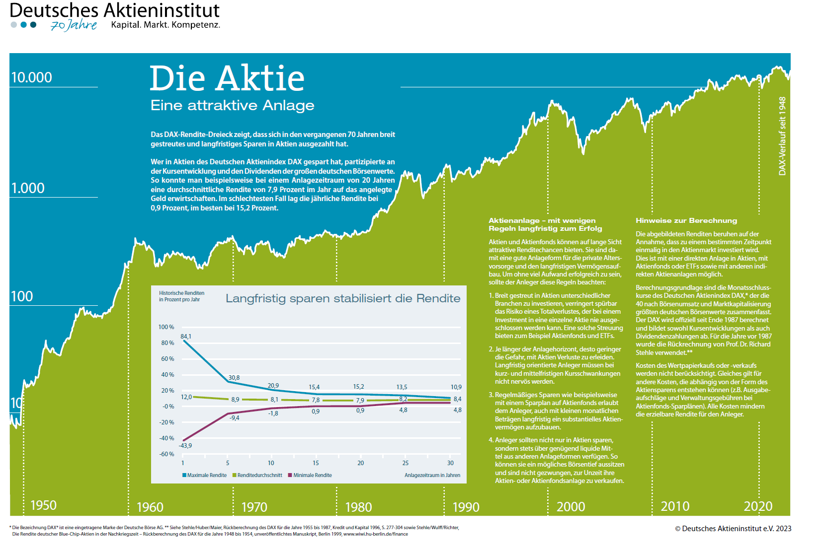
Note: Use Google Translate since the text in the chart above is in German

Source: German Equity Institute 

Related ETF:

  • iShares MSCI Germany Index Fund (EWG)

Disclosure: No Positions

Always Focus on the Market’s Long-Term Performance: S&P 500 Example

Equity markets always go through periods of booms and busts. During bull markets, stocks can earn astonishing returns and of course when markets turn the other way losses can be shocking. Sometimes the volatility on both ways can be gut wrenching. For stock investors the key attribute for success is to side out the volatility and focus on the long term goal. Simply getting worried about day-to-day movements of the market is not useful.

With that said, the following charts the performance of four investments over the long term from 1926 to 2022:

Click to enlarge

Source: It’s Easy to Forget the Market’s Good Years, Hartford Funds

The chart shows the stocks earned the best returns and cash was the worst performer. Bonds also fared poorly relative to stocks.

Another important point to remember is that over many years the number years with positive returns are higher than the number of years with negative returns. So by holding stocks for the long run, investors can generate a decent return.

Click to enlarge

Source: It’s Easy to Forget the Market’s Good Years, Hartford Funds

Related ETFs:

  • SPDR S&P 500 ETF (SPY)
  • Vanguard S&P 500 ETF (VOO)

Disclosure: No positions

The Top 20 Host Economies of FDI Inflows in 2022: Chart

The Top 20 Host Economies of FDI Inflows in 2022 is shown in the chart below. The US was again the world’s top country for Foreign Direct Investment with an inflow if $285 billion. This was 26% less than the figure in 2021. The next top destinations for FDI were China, Singapore, Hong Kong and Brazil. Though Mexico is considered as a rising competitor to China, the FDI inflow is nowhere near China’s. Mexico received just $35 billion in inflows compared to China’s $189 billion in 2022.

Click to enlarge

Source: World Investment Report 2023, UNCTAD

Warren Buffet’s Berkshire Hathaway Has Underperformed in Recent Decades

Warren Buffet is celebrated as one of the greatest investors of all time. His company Berkshire Hathaway’s stock has earned investors astronomical returns over the years. However I always thought that investors’ and media’s obsession with his greatness is overblown. A recent article I came across confirms my belief. According to the piece, Warren Buffet is no longer a genius and is just like so many other active managers out there whose glory days from initial few years of awesome performance are long gone.

Berkshire Hathaway has never paid a dividend and its Class A stock closed at $525,425 yesterday. The YTD return is about 12%. From the article:

Berkshire Hathaway has not added any value against the S&P500 index since 2002. Its out-performance fade curve is the same as other value-adding share funds in Australia and other markets.

Tracking performance decay over time

Here is my chart for Berkshire Hathaway since May 1965 when Buffett took control.

Click to enlarge

The red line is the Berkshire’s share price. Since 1965, the company has paid no dividends and has reinvested all earnings, so the share price is essentially the ‘Total Return’ series. The shares have not split over the period and the price of BRK Class A shares has grown from $12.37 to $546,725 per share at the end of August 2023.

The blue line is the S&P500 total return index. This is the most appropriate benchmark because Berkshire’s investments have always been US companies (listed and unlisted), with few exceptions (notably Chinese car maker BYD).

The black line shows annualised rolling 10-year excess returns above the benchmark. This is our main historical measure for long-term investors.

The orange dotted line is the annualised rolling 3-year excess returns above the benchmark. This is a good way to see performance through different cycles and market conditions.

The author went on to show that Berkshire’s performance has been poor in the past two decades. The stock has earned average or no excess returns over the S&P Total Returns in that time period. Another excerpt from the piece:

We see a clearer picture of performance by looking at returns per decade:

In the 1990s, it added almost no value as Buffett lagged the market by deliberately avoiding the crazy ‘dot-com’ boom. This earned him a lot of derision at the time but he was vindicated when he added value in the 2000s by avoiding the ‘tech wreck’. However, virtually no value was added in the 2010s and 2020s.

Source: Even Warren Buffett lost his edge 20 years ago by Ashley Owen at OwenAnalytics via FirstLinks

The entire article is worth a read.

Disclosure: No Positions