On Friday Brent Crude reached the $60 per barrel mark for the first time since July, 2015. Global oil prices have been slowly recovering after years after of declines that followed prices reaching nearly $150 many years ago. Though oil majors are reporting strong earnings recently their stock prices are not yet getting investors’ love fo far.
Of all the major oil companies in the world. PetroChina has plunged the most in terms of stock price return since reaching the peak in 2007. According to a Bloomberg article PetroChina(PTR) was the first company in the world to cross a market capitalization of over $1.0 Trillion. Since the peal PetroChina has wiped out over $800 billion in market capitalization. The chart below shows the dramatic decline in PTR share prices:
Click to enlarge
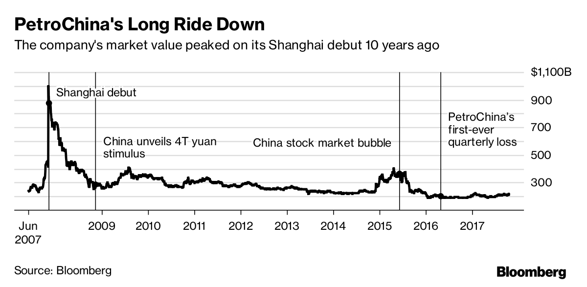
Source: The Biggest Stock Collapse in World History Has No End in Sight, Bloomberg, Oct 29, 2017
The following chart shows the performance of PetroChina against the oil supermajors – : Royal Dutch Shell PLC (RDS.A), Royal Dutch Shell PLC *(RDS.B), Chevron Corp (CVX), Exxon Mobil Corp (XOM), BP PLC (BP), Total SA (TOT) and Eni SpA (E) in the past 10 years:
Click to enlarge
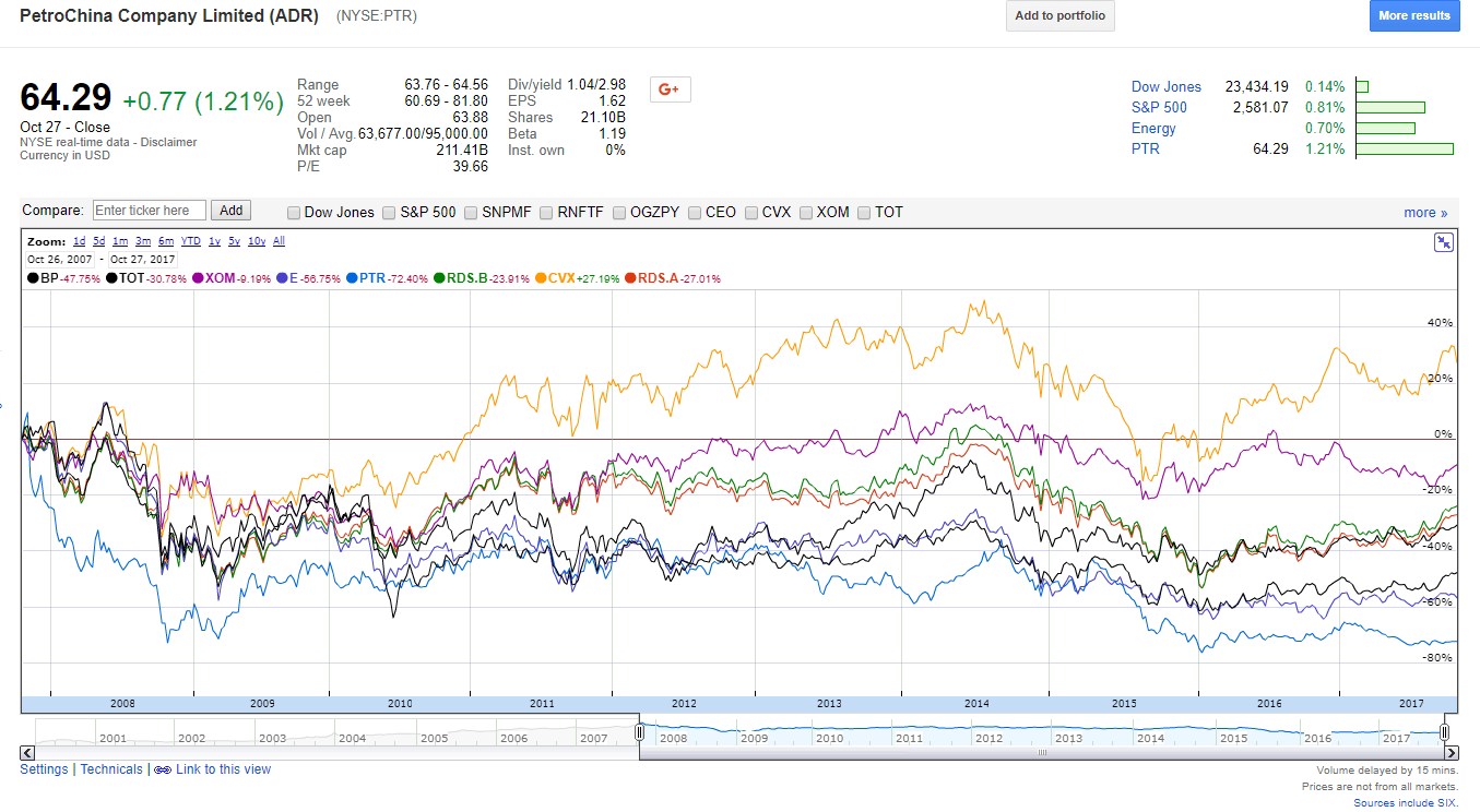
Source: Google Finance
The full Bloomberg article is worth a read. The key takeaway is that even if the state is the largest shareholder a company’s stock can decline by astronomical levels wiping out shareholder’s wealth in the billions.
Disclosure: No Positions