The Callan Periodic Table of Investment Returns for monthly returns thru September 2018 of various asset classes is shown in the chart below:
Click to enlarge
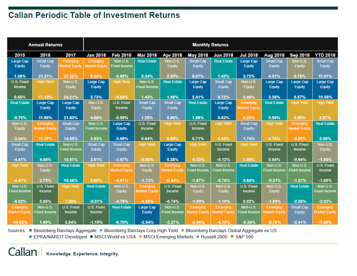
Source: Callan
Thru September, Small Caps are the biggest winners while emerging market equities have been the worst.