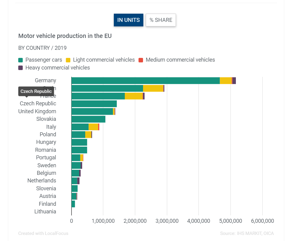
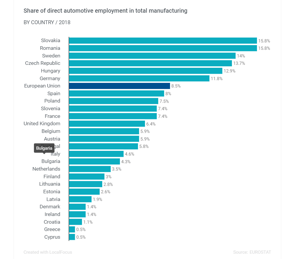
The automobile industry accounted for about 2.7 million jobs in the EU in 2018. This amounted to 8.7% of the total manufacturing employment. The chart below shows the share of direct automotive employment in total manufacturing by member states of the EU and the UK. The industry accounts for the highest percentage of manufacturing jobs in some of the East European countries such as Czech Republic, Slovakia, Romania and Hungary.
Click to enlarge
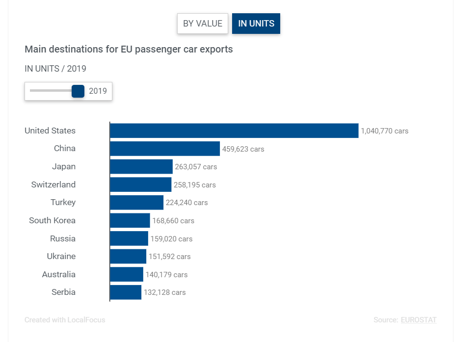
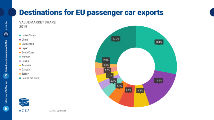
Source: ACEA