One of the key factors that differentiates successful investors from others is the ability to hold investments for the long term. Though assets such as equities can fluctuate in the short term, in the long run they tend to go up. The latest edition of the Vanguard Index chart for the Australian market shows how various asset values have increased over the past 30 years.
The following chart from Vanguard Australia showing the returns of various assets from July 1992 to June 30, 2022 for the Australian market:
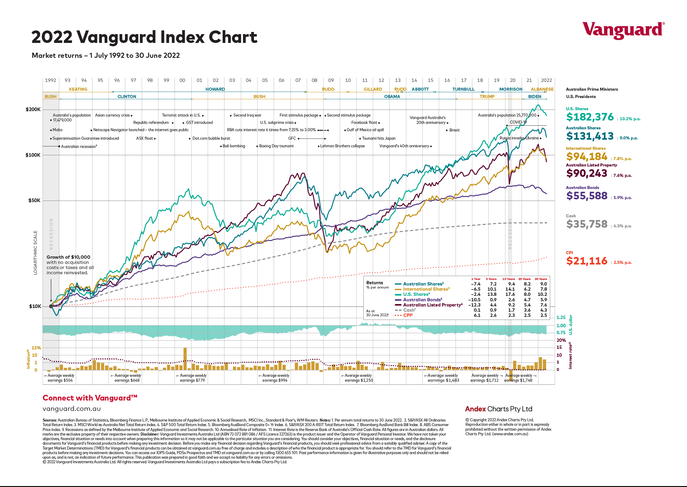
Source: Vanguard Australia
US stocks were the best performers for the period shown. Australian stocks generated better returns then international equities. The chart also shows the leadership periods of various prime ministers of Australia and presidents of the US in addition to other major events.
The below table shows the financial year total returns for various asset classes:
Click to enlarge
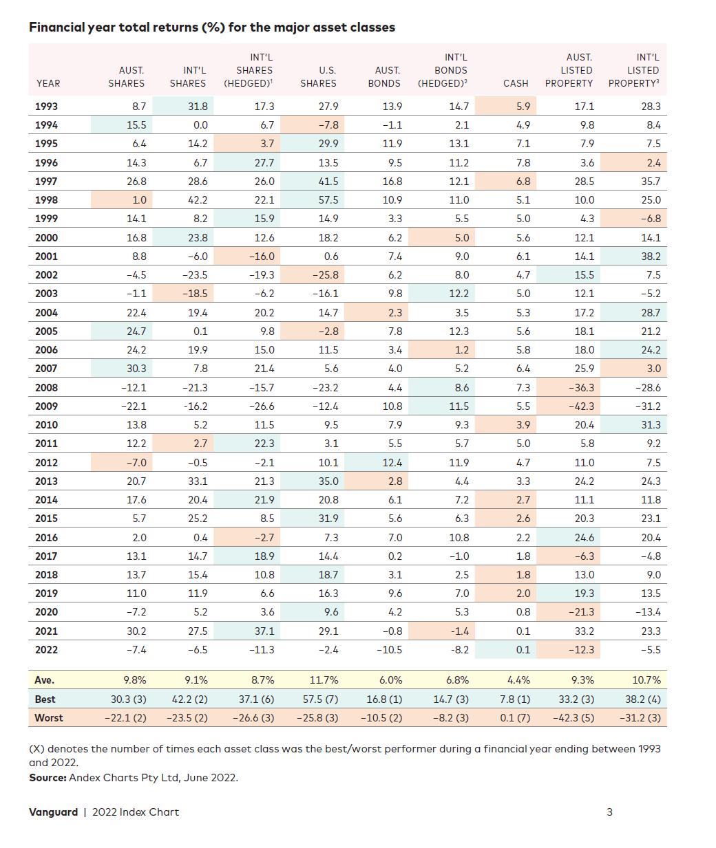
The above table shows the importance of diversification.
Related:
- The Complete List of Australian ADRs
- iShares MSCI Australia ETF (EWA)
- SPDR S&P 500 ETF Trust (SPY)
Disclosure: No Positions