J.P. Morgan Asset Management publishes the Guide to the Markets report each quarter. The latest report for Q1, 2014 is out and investors can find useful information in this 71-page report which is full of interesting charts and tables.
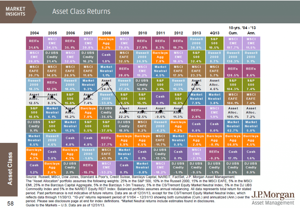
The Asset Class Returns chart for the period 2004 to 2013 is shown below:
Click to enlarge
Source: Guide to the Markets, J.P. Morgan Asset Management
This color-coded chart is modeled similar to the popular The Callan Periodic Table of Investment Returns. The chart above clearly shows the importance for diversification since the performance of asset classes vary every year.
Here are a few observations on the Asset Class Returns chart:
- The S&P 500 had a total return of 32.4% in 2013 which includes price appreciation and dividends. Excluding dividends the return amounted to about 30%.
- Commodities were poor performers last year with the Dow Jones Commodity Index falling 9.5%.
- The MSCI EAFE Index representing developed markets outside of the U.S. fared lower than the S&P 500 with a return of 23.3%.
- The cumulative return for the S&P 500 over 10 years was 104.3%. But emerging markets performed much better with a return of about 198%.Much of the gains came from the years before global financial crisis when commodity prices soared boosting many emerging markets.
- It is interesting that the U.S. and other developed markets had almost the same exact returns over the past 10 years.
- While REITs were the top performers in 2010, 2011 and 2012, last year they had a low return of 2.9%.
Related ETFs:
- iShares MSCI Emerging Markets ETF (EEM)
- Vanguard Emerging Markets ETF (VWO)
- SPDR S&P 500 ETF (SPY)
- SPDR STOXX Europe 50 ETF (FEU)
- SPDR DJ Euro STOXX 50 ETF (FEZ)
- iShares Barclays US Aggregate Bond Fund(AGG)
Disclosure: No Positions

