Equity markets are performing very well so far this year. After a dramatic selloff in July and early August, markets have recovered and continue to reach record highs. Some of the individual stocks have soared much more than than the S&P 500’s 21.0% YTD. With that said, I wanted to see how the three major indices of the US markets have grown this year and the past five years. While the main benchmark of the market is the S&P 500, the NASDAQ and Dow have also had double-digit returns this year.
The following chart shows the price returns of S&P 500 vs. NASDAQ Composite vs. Dow Jones Indices YTD:
Click to enlarge
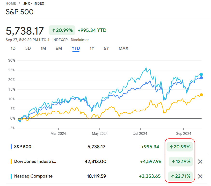
Source: Google Finance
The chart below the 5-year returns for the above three indices:
Click to enlarge
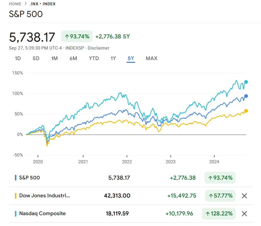
Source: Google Finance
It remains to be seen if the markets would continue to move higher through the last quarter or remain at current levels. With interest rates starting to go down and chances of recession remaining unlikely it may not be a bad idea to nibble at quality names especially when there is any major declines. Valuations no doubt are at stretched for most stocks. So despite consistent high earnings investors may not be willing to bid up stocks even more from current prices.
Related ETFs:
- SPDR S&P 500 ETF (SPY)
- Vanguard S&P 500 ETF (VOO)
- Invesco QQQ Trust ETF (QQQ)
- SPDR Dow Jones Industrial Average ETF Trust (DIA)
Disclosure: No positions