I recently came across the beautiful chart showing the bull and bear markets in Australian Equity Markets. This chart is similar to the chart for S&P 500 that is popular for the US markets. The Australian chart from Vanguard Australia also shows bull markets are longer than bear markets over the long term.
From 1980 thru June, 2022 the average bull market lasted for 7.8 years while the average bear market lasted 0.9 years.
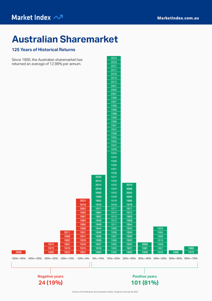
Click to enlarge
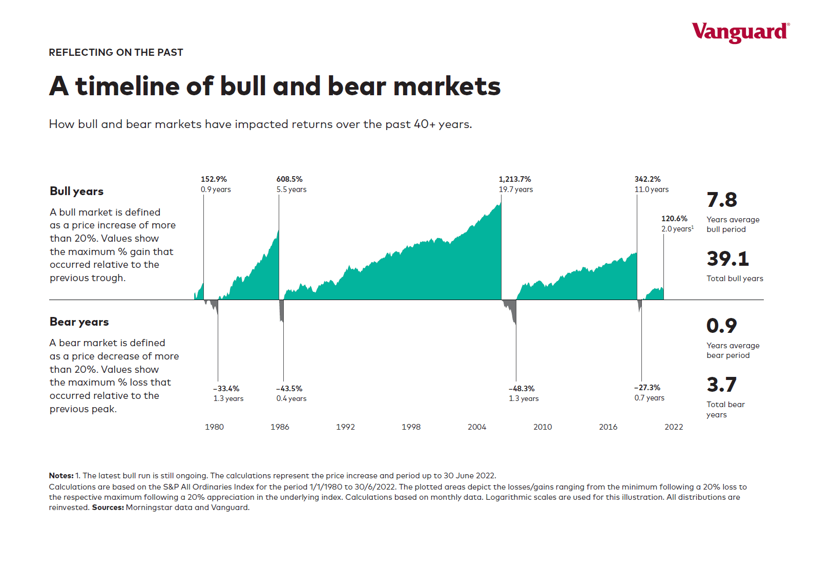
Note: All returns noted are in Australian currency based on the returns of the S&P All Ordinaries Index
Source: Vanguard Australia
Related:
- The Complete List of Australian ADRs
- iShares MSCI Australia ETF (EWA)
Disclosure: No Positions