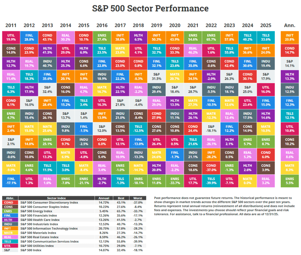
The Callan Periodic Table of Investment Returns for 2016 is not out yet. While we wait for the latest update, the chart for 2015 provides many valuable insights. Similar to the popular Callan chart, there are many types of charts are also online. Recently Fidelity published an interesting chart called a periodic table of annual total returns for US equity sectors in a U.S. Equity Sector 2017 Outlook Report.
U.S. Equity Sector Periodic Table Of Annual Total Returns 1992-2016:
Click to enlarge
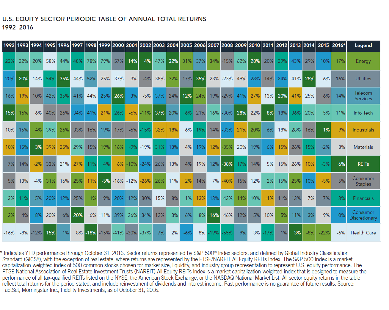
Note: The 2016 returns noted above are year-to-date returns through Oct 31, 2016.
Source: U.S. Equity Sector 2017 Outlook Report, Fidelity
A few observations:
- Utility stocks have performed extremely well during the period shown. For most of the years they have returned a positive total return. Even in 2008 when US markets crashed, the sector was down only 15%. Since then each year they have had a solid performance. This shows that investors cannot go wrong holding US utilities.
- While REITs also declined heavily in 2008, they have recovered strongly in the following years.
- The Energy sector tend to be volatile as prices of crude oil and natural gas are always unpredictable. So even in terms of total returns, their annual performance varies wildly year-over-year.
- Overall this chart shows the importance of diversification among various sectors. For example, when financials fell by 55% in 2008 during the Global Financial Crisis (GFC), US utilities declined by only 15%. Hence portfolio volatility can be reduced greatly by distributing one’s assets among various sectors.
Related: