Five Chinese state-owned companies have announced plans to delist their ADSs from the NYSE. This is another blow for US investors holding these ADSs. Investors have to monitor the developments in the next few days and weeks and take action accordingly. Below is an excerpt from a journal article:
Five Chinese state-owned companies said they intend to delist their American depositary shares from the New York Stock Exchange, as financial regulators in Beijing and Washington remain at loggerheads over U.S. audit requirements.
In separate filings to Hong Kong’s stock exchange Friday, PetroChina Co., PTR -1.65%▼ China Petroleum & Chemical Corp., SNP -1.80%▼ Aluminum Corp. of China Ltd., ACH -0.76%▼ China Life Insurance Co., LFC -1.46%▼ and Sinopec Shanghai Petrochemical Co SHI -1.06%▼. said they have notified the NYSE that they plan to voluntarily delist their American depositary shares.
The companies pointed to limited trading volumes of their U.S. securities, and the administrative burden and costs of maintaining their New York listings. They said they would apply later this month to delist, and the last day of trading of their shares on U.S. exchanges would be in early September.
Source: Five Chinese Companies Say They Plan to Delist From the New York Stock Exchange, WSJ, Aug 12, 2022
More than 250 Chinese firms are listed on US exchanges. Almost all of them face the risk of delisting due to the The Holding Foreign Companies Accountable Act of 2020.
Last year oil major CNOOC Ltd , China Telecom Corp. and China Mobile Ltd. delisted from the US exchanges.
The chart below the returns of the five ADRs planning to delist from NYSE:
Click to enlarge
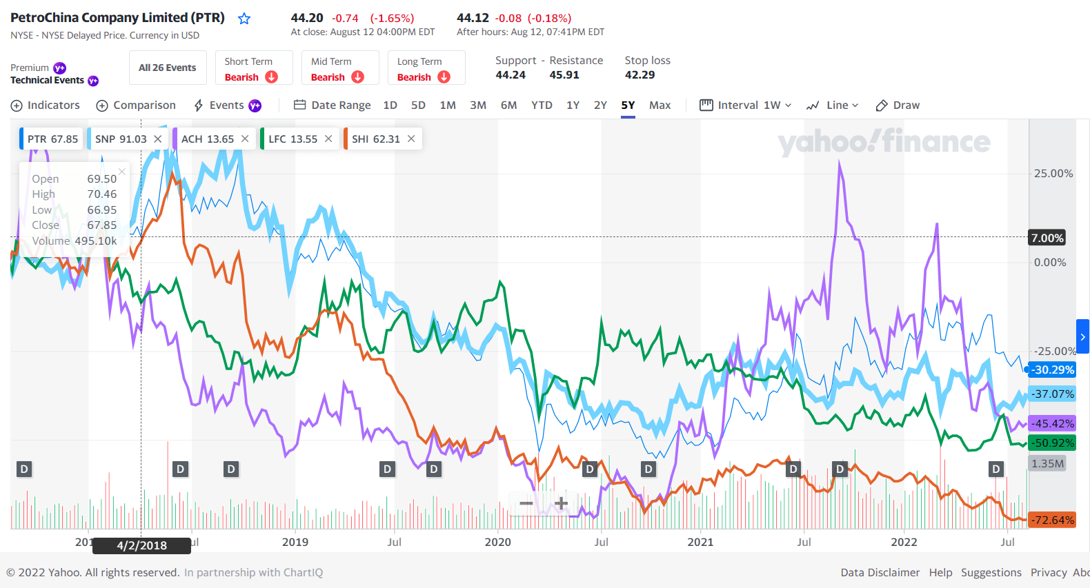
Source: Yahoo Finance
I will soon post an article on the options available for holders of these Chinese ADRs.
Disclosure: No positions