Is democracy necessary for economic growth and rise of equity markets?
The above question is an interesting topic to analyze since the conventional principle accepted by most people is that democracy is the best form of government that is possible and only democracy can bring about stable and solid economic growth. This idea is particularly well entrenched among the believers of Western-style democracies. However democracy as a form of government is not suitable for some countries for a variety of reasons. This is especially true in emerging countries where democracy is still a new concept and many of the institutions needed for the success of this type of government do not exist or have been corrupted by politicians.
In this post, let us take a look at the relationship between democracy and economic, equity markets growth in select Asian countries.
1. Singapore:
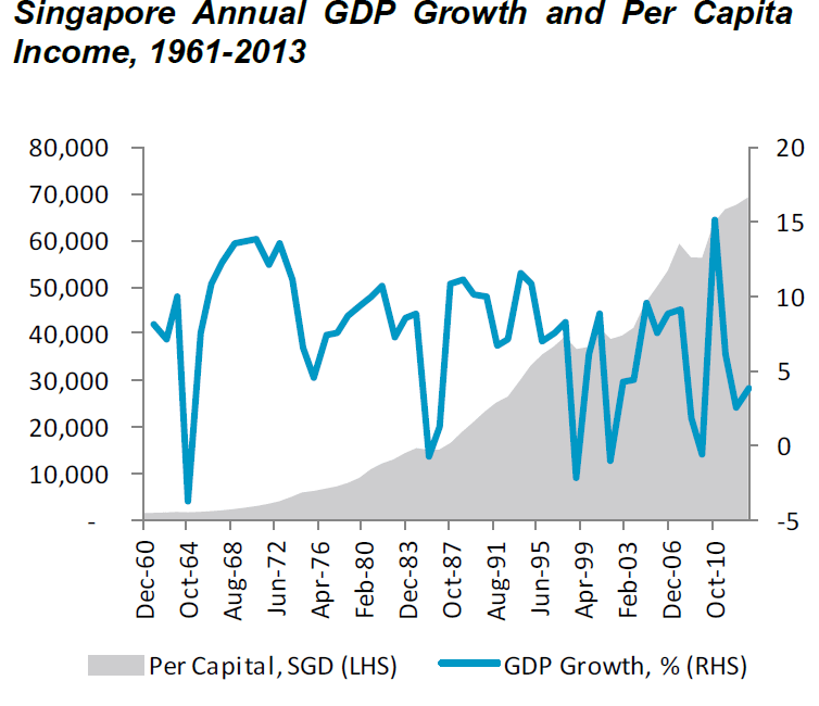
Singapore broke away from the Federation of Malaysia and was a colonial outpost in Asia. The tiny island state pretty much had nothing significant to speak of in terms of industries and commerce. However under the rule of the late Prime Minister Lee Kuan Yew the country’s economy took off to become a developed country now. From 1959 to 1990, he ran the country under the People’s Action Party (PAP) – the party he co-founded. Though Singapore is a democratic country, practically it is a one-party state ruled by the PAP. With one party in power and a strong leader with a vision, Singapore’s per capita soared by over 5,000% in the past 53 years as shown below. Whether Singapore could have achieved such incredible growth with a multi-party system of democracy is open to argument.
Click to enlarge
2. Indonesia and Philippines:
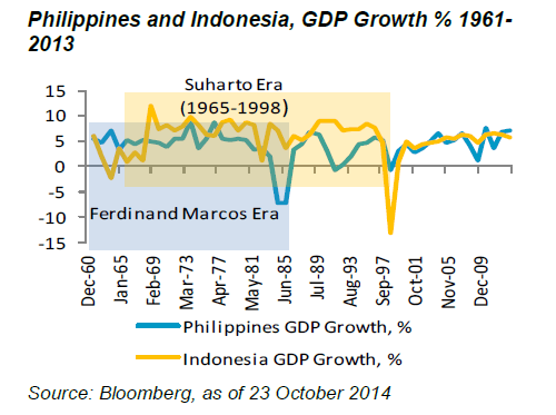
Indonesia was ruled by President Suharto from 1967 to 1998 under “a strong, centralised and military-dominated government.” During his era Indonesia experienced a stable and sustained economic growth. xx was governed by Prime Minister Ferdinand Marcos from 1965 to 1986. He was a dictator and ruled under martial law for most of his time in office.
3. India:
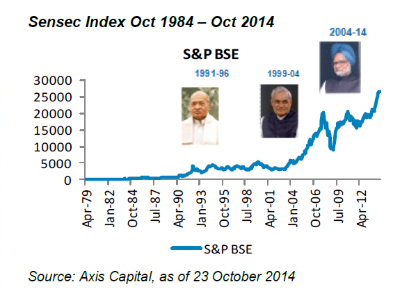
India is a democratic country with thousands of parties. After independence from Britain in 1947, the country was a closed economy and followed Soviet-style economic policies with centralized planning and implementation. Political in-fighting and corruption prevented economic growth and until the 1990s economic growth was abysmal to say the least. Since 1991 political reforms were implemented and the economy was slowly liberalized.
India could not achieve its full economic potential under the previous three administrations due to political in-fighting, corruption and shaky coalitions as the winning party did not secure a majority needed to form a government.The current Prime Minister Narendra Modi’s party won a majority for the first time and India is on track to economic prosperity under his rule.
4. China:
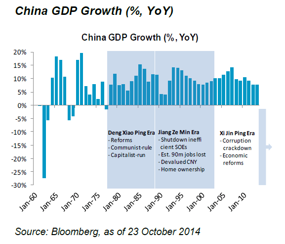
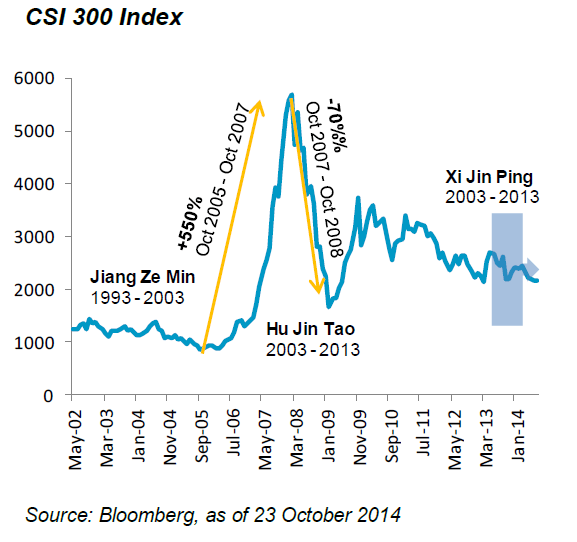
China follows a unique form of government that can be called as “Market Socialism”. Under this type of government the state has a tight grip on politics but allows citizens to enjoy democracy with respect to economic activities. The Communist Party is the sole ruler in China and any mention of democracy or challenge to the communist rule is crushed fiercely. With no political in-fighting and other messy things that go with democracies, the regime is able to implement policies towards its vision of a strong and prosperous country but with one party rule. As the Chinese economy has achieved enviable growth in the past few decades by lifting millions out of poverty, the country’s citizens are comfortable with the communist party running the country. To put it another way, in return for economic growth, jobs and stability, the Chinese are willing to accept a single-party form of government – even if that party is communist. Hence China is a communist country with a capitalist economy.
It is highly unlikely that China could have achieved dazzling economic growth in such a short period time if it were a multi-party democracy.
Source: Evolving Markets Focus – Global Markets and Asian Political Change, Oct 2014, Nikko Asset Management
The key takeaway for investors is that western-style democracy is not a necessary ingredient for economic growth. While that concept may work fine in western countries it will work in other countries such as the ones discussed above. A strong and stable government is important more than democracy for the economic and equity markets growth.
