The economies of Australia and Canada are similar in many ways. For instance,both are resource-based economies. While Australia is dependent on China for the export of minerals such as iron ore Canada is the largest trading partner of the US and exports natural resources like Crude Oil, Natural Gas, Timber, etc, to the US. I wrote an article many years ago comparing the economies of Australia and Canada.
Therefore it is not surprising that the equity markets of these countries tend to follow each other. The following chart shows the long-term returns of the S&P/ASX All Ordinaries Index of Australia and S&P/TSX Composite Index of Canada:
Click to enlarge
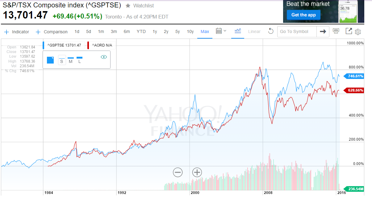
Source: Yahoo Finance
Canada has a large manufacturing sector compared to Australia. Auto manufacturing is a huge industry especially in the province of Ontario.
Related ETFs:
Disclosure: No Positions