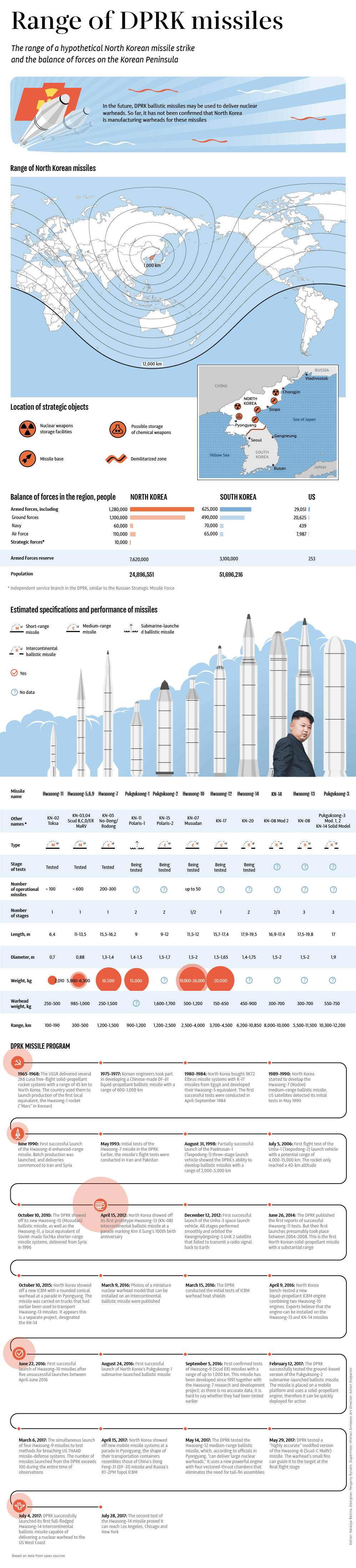
The range of North Korea’s many missiles are shown in the infographic below:
Click to enlarge
Source: Sputnik News
The range of North Korea’s many missiles are shown in the infographic below:
Click to enlarge
Source: Sputnik News
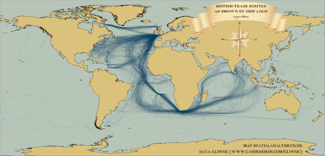
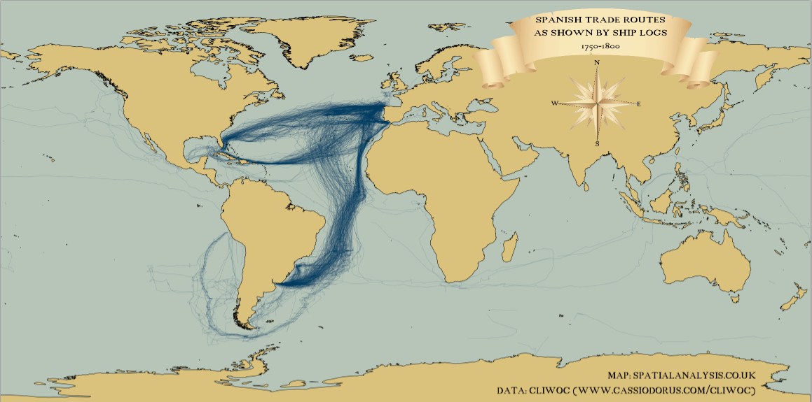
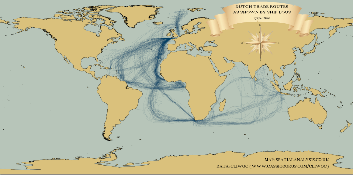
I came across the following maps showing the shipping routes for British, Spanish and Dutch trade from 1750-1800:
Click to enlarge
British Shipping Route
Spanish Shipping Route
Dutch Shipping Route
Source: Spatial
The Dividend Withholding Tax Rates by Country as of Sept, 2017 is shown in the table below:
Click to enlarge
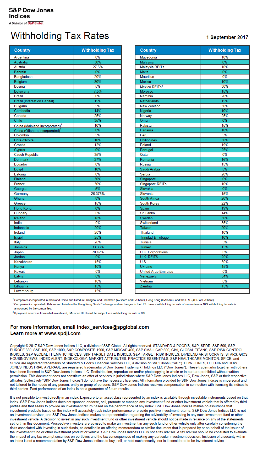
Source: S&P Dow Jones Indices
Download: Dividend Withholding Tax Rates by Country Table
The economy of many of the states in the US are bigger than the economy of some countries. The following chart shows the countries whose economies are smaller than that of Texas:
Click to enlarge

Source: Aron Strandberg @aronstrandberg
You may also like:
The Periodic Table of Commodity Returns for 2017 is shown below. Similar to the Callan chart for equities, this table shows the annual performance of commodities.
Click to enlarge
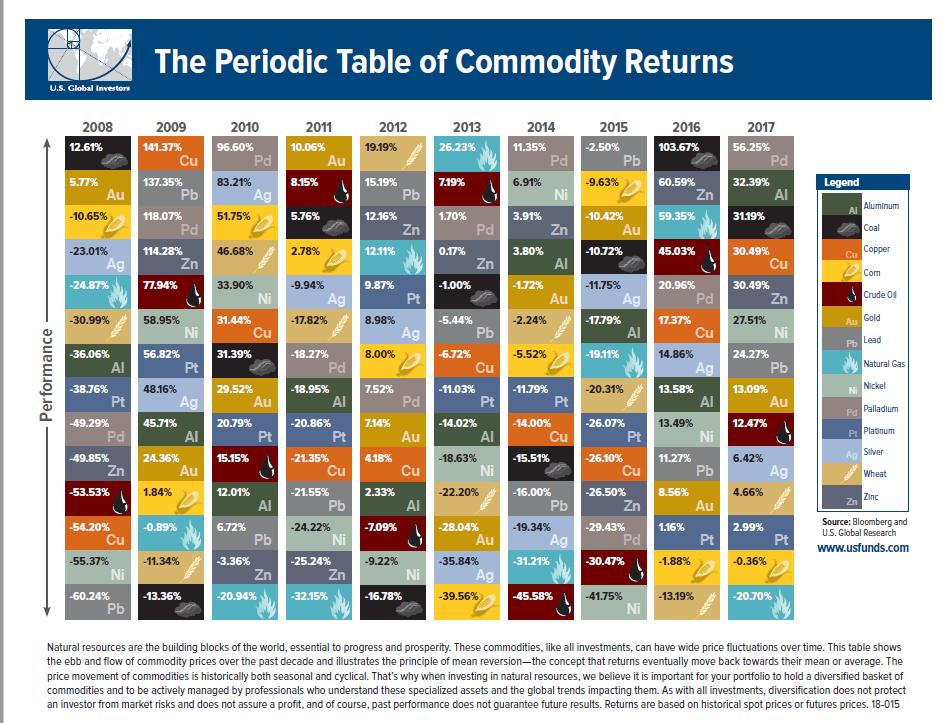
Source: US Funds
Last year Palladium was the top performer with a return of over 56%. Copper, an important metal that is considered as the barometer of global economy, was up a decent 30%. The worst performing commodity in 2017 was natural gas.
Download: The Periodic Table of Commodity Returns 2017 (in pdf)