The Current vs. Past Bull Market Returns: Chart

The current bull market started from the trough of the Global Financial Crisis(GFC) in early 2009. Despite being called a bull market it does not feel like a typical bull market. In fact, experts have dubbed this bull as the “most hated bull market in history”.

The chart below compares the returns of the current bull market against past bull markets:
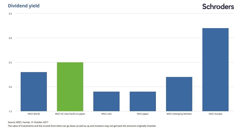
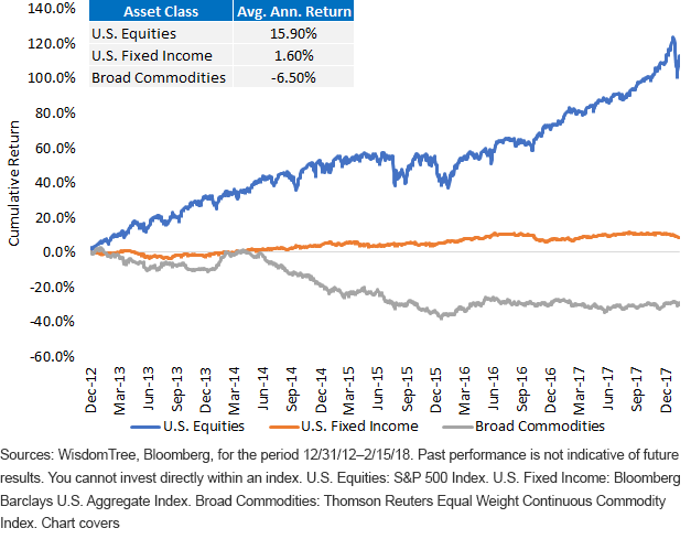
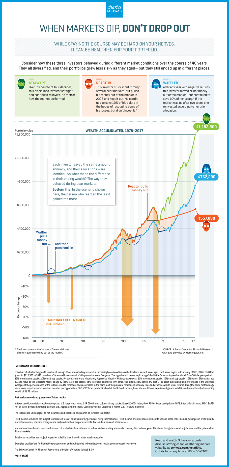
Click to enlarge


Source: The Historic Bull Market Faces Off Against Steel Tariffs, US Funds

Dividend Yield: Asia vs. Other markets

The Dividend Yields offered by Asian firms is higher other equity markets. With a dividend yield higher than 2.5% Asian companies pay the second highest yield after Europe. This rate is also much higher than the dividend yield of American companies.

The chart below shows the comparison of Asian dividend yield to other markets:

Click to enlarge

Source: Why consider investing in Asia now? Seven charts that tell the story, Matthew Dobbs, Schroder’s

The author of the above piece noted that reduced debt with rising earnings has the potential for higher payouts. So investors looking for income may want to consider Asian stocks.

Comparing the Returns of Commodities and U.S. Stocks : Chart

U.S. stocks outperformed commodities in the past five years. As an asset class, commodities are always more volatile than stocks and are not suitable for most investors. Though there are many commodity derivative products such as ETFs that make investing in commodities easier, investing in commodities is not for everybody.

The following chart shows the returns of commodities and US stocks:

Click to enlarge

Source: Will You Miss the Commodity Comeback? by Christopher Gannatti and Florian Ginez, WisdomTree

Related:

When Markets Dip, Don’t Drop Out: Infographic

One of the themes I have discussed many times on this blog is the futility of market timing. Success with equity investing involves holding stocks for the long-term which includes periods of bull markets and bear markets. The following updated infographic from Schwab shows the difference in returns between three types of investors:

Click to enlarge

Source: Charles Schwab